Inspiring
November 19, 2023
Question

Responsive Project in Captivate Classic

  • November 19, 2023
  • 1 reply
  • 520 views

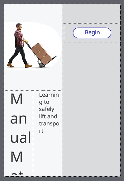
I have given up on the new Adobe Captivate and am re-building my project in Captivate Classic. I created a responsive project in CC19, built my fluid boxes, etc. However, when I change to the phone view, it looks like garbage. See below.
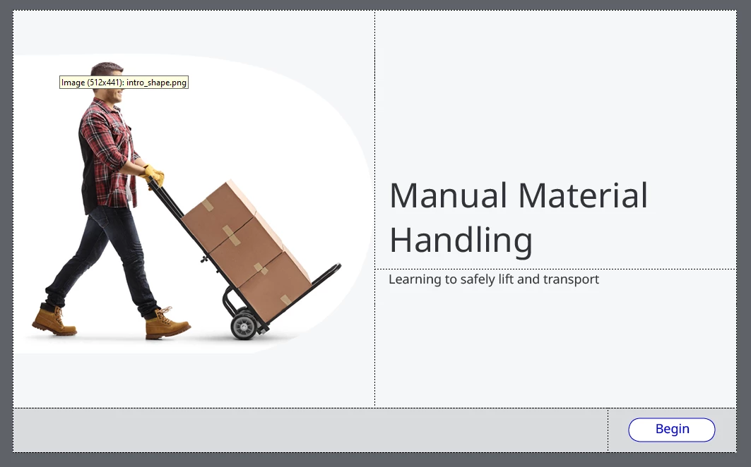
 

Desktop:


Mobile:


I can't figure out what to change to fix this hot mess. I have a few questions:

- Is there an easy (or heck, even not-so-easy) way to get the mobile format looking better? I can't seem to wrap my brain around what is happening here. 

- Can you create different text sizes for the various breakpoints, and if so, how?

    This topic has been closed for replies.

    1 reply

    Lilybiri
    Legend
    November 19, 2023

    Something is awry with your setup of the Fluid Boxes, should need to see more details. I think you kept the option 'Wrap....' everywhere, and need to change that to have a look in mobile that is more acceptable.

    Inspiring
    November 20, 2023

    I realized one step that I missed. I read somewhere that you need to create your first fluid box as 1 horizontal box - I had skipped this step. I added that in and mobile looked a little better:


    Mobile: 


    Then I changed the FB19 to "squeeze in a column" vs. wrap to fit.


    I have two remaining issues:

    1) Font sizing on mobile. The font is too big for the course title. Can you have different font sizes at the different breakpoints? For example, the font size at 48 for desktop for my course title and maybe 28 on mobile? 

    2) The button is squished. Any ideas on how to get it to retain the shape it is at desktop size?

    Lilybiri
    Legend
    November 20, 2023

    For the button: check if 'Maintain aspect ratio is checked. For the surrounding fluid box, preview some padding and be sure to take out . Personally I would also change the level higher fluid box: set wrap options to squeeze in a row. That one should also be horizontal. That will allow the button to remain bottom right. 


    For font size: it is not possible to set specific font sizes for different browser reslutions (that is only possible in Breakpoint Views workflow). Reason is that the font size will smoothly decrease when there is not enough space. However I wonder if you used Preview to see the real result? Just changing the device will not show a WYSIWYG result. I can only recommend to make the shape or the caption just big enough to have the title in the desktop font size.