Known Participant
September 16, 2020
Answered

Responsive project quiz formatting issues
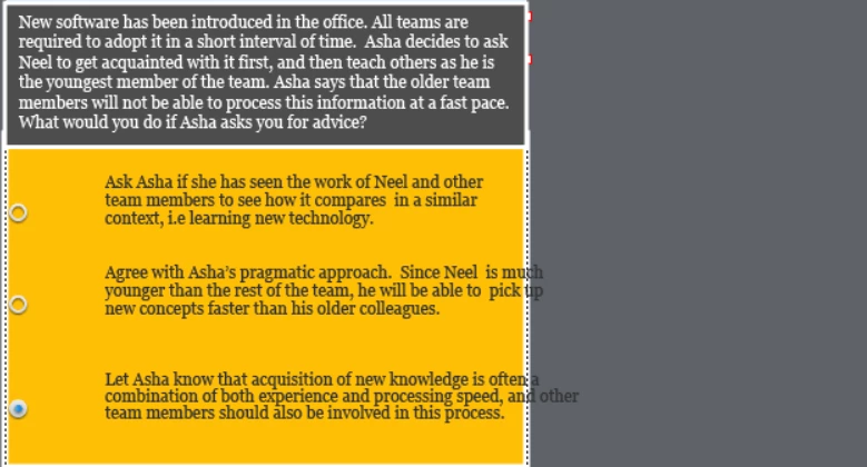
  • September 16, 2020
  • 2 replies
  • 757 views

Hi,


I'm working on a responsive project which has quiz questions. The client wants to see the answer choices in one single line, instead of multiple lines. When I enlarge the textbox to accommodate the answer in one line, it looks fine in the desktop version. But when I test in the mobile version, the formatting gets messed up. I have included screenshots below. Anyway to resolve this issue? Thanks


    This topic has been closed for replies.
    Correct answer Lilybiri

    Are you using fluid boxes? In that case you cannot force the answers to one line if the space available on the mobile device is too small. You can decrease the minimum font size (default = 14pt, but you can decrease to 10 or even 😎 but at a certain width of the browser (which can be as low as 320px) will still be insufficient. 


    2 replies

    kdmemory
    Inspiring
    September 16, 2020

    Hi Singru,

    first of all, Lilibiri is right. When you have long text and the viewport gets smaller, the text MUST break into more lines. If your client really demands to keep it still in one line, well, that's Mission Impossible.

    Then, secondly, where did you test the shrinking of the viewport (screen)? Is your screenshot from Captivate or from some mobile simulator in your browser, like for example Responsive Design Mode in Firefox? I guess you should test the particular viewport output on a genuine device like tablet (i.e. iPad) or mobile phone to see a realistic result. I'm saying this because I can't believe that i.e. in the second line of the third answer option, where the words ".. and other" do not break to the next line are really from a genuine device.

    Furthermore, and this seems to me most essential, in my experience as an instructional designer questions and answers in a test should be as concise as possible. The question here and especially the answers are too wordy, too wounded. This can annoy and confuse test participants. It all depends of course on the overall context, what was before and what come after. But I'm convinced that short and sweet is always better.

    So, just as an alternative approach within the given context, as far as I can tell, the options to select could be simply:

    Question: blah blah blah .. who should be introduced first to the new software?

    • the team member with the highest experience level
    • the youngest team member
    • all team members simultaneously

    Think the question context through once again and dicuss it with your client.

    Klaus

    singruAuthor
    Known Participant
    September 19, 2020

    Hi Klaus,


    These are fantastic suggestions for someone like me who is a beginner in Captivate.  I agree that the questions and answers are too wordy. I will communicate this point to our researches who develops the quiz content. Really appreciate your advice!


    Yes, I agree with all of Lilibiri's points. Her suggestions always help beginners like me immensely! Her suggestion about the minimum font size solved a lot of my formatting issues. So thanks again, Lilibiri.

    Lilybiri
    LilybiriCorrect answer
    Legend
    September 16, 2020

    Are you using fluid boxes? In that case you cannot force the answers to one line if the space available on the mobile device is too small. You can decrease the minimum font size (default = 14pt, but you can decrease to 10 or even 😎 but at a certain width of the browser (which can be as low as 320px) will still be insufficient. 


    singruAuthor
    Known Participant
    September 16, 2020

    Hi


     The three answer options are all in one fluid box, not in three separate fluid boxes.


    Thanks

    Lilybiri
    Legend
    September 16, 2020

    I know very well the setup of master slides in a Fluid Boxes project, as you may read in these blog posts:

    http://blog.lilybiri.com/fluid-boxes-and-master-slides

    http://blog.lilybiri.com/quiz-slides-with-fluid-boxes


    Did you try my suggestion for decreasing the minimum font size?