
Participant
July 18, 2014
Question

Responsive Projects not working on mobile devices

  • July 18, 2014
  • 2 replies
  • 312 views

Looking for some advice on getting responsive projects to show properly on mobile devices. I have attached a link to a blank demo presentation that will respond to my browser on my computer but when I send it for review on mobile devices it will not adjust as required. Has anyone seen this? I really dont want to build a complete e-learning module only to find out it doesnt work correctly.

Here is the link to the actual presentation as well as a screen shot from my iphone...
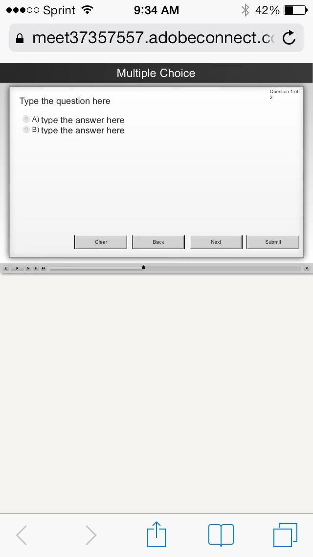
https://meet37357557.adobeconnect.com/tuxdccs.66w5ro/

    This topic is closed to new replies. Start a new post to keep the conversation going.

    2 replies

    edwinaj45170818
    Participant
    August 23, 2018

    I've created a responsive project from MS powerpoint in Captive 2019 (trial version) which works beautifully on my desktop - but like you the scaling is not quite there and the animations don't work on my iPhone 6plus. All I get on the mobile is how the slide looks before the animated reveals.

    I've published to swf and html and clicked scalable html content but no joy. Can anyone help??

    TIA

    SubseaengAuthor
    Participant
    July 18, 2014

    Apart from these issues, the following features are not supported:

    • Importing of PowerPoint slides
    • Line Shape
    • Custom Shapes (polygon shapes)
    • Drag-and-drop interaction
    • Likert Question slide
    • Publish to mp4 (publish to YouTube).
    • Tablet and Mobile views in Adobe Connect