May 24, 2016
Answered

Responsive Tables - Adobe Captivate 9 Responsive Project

  • May 24, 2016
  • 2 replies
  • 1479 views

Hi ,

I am using Adobe captivate 9   to create an e-leaning courses , I am building a responsive project ...


my question is about responsive tables , is there a way to insert a responsive table where mobile devices get a reformatted and easier to explore table:

by changing its layout

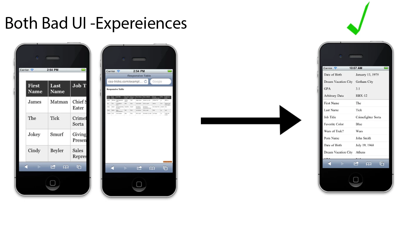
Or displaying a mini tableview with scroll bars  to display the full content.

Or The only way is to  design my tables manually for each device  in adobe captivate 9

Thanks

Slim Arfaoui

This topic has been closed for replies.
Correct answer Lilybiri

No responsive tables in Captivate. You will have to change the layout in the Mobile breakpoint view. Scrolling is possible when you have a slide that is higher than the default height of mobile breakpoint.

2 replies

May 24, 2016

Thanks @Lilybiri   ! that is  what I was expecting ... no responsive tables in captivate

Lilybiri
LilybiriCorrect answer
Legend
May 24, 2016

No responsive tables in Captivate. You will have to change the layout in the Mobile breakpoint view. Scrolling is possible when you have a slide that is higher than the default height of mobile breakpoint.