Inspiring
April 12, 2017
Answered

Responsive with wider than 1024

  • April 12, 2017
  • 2 replies
  • 635 views

Hello,

Captivate 2017 user here.

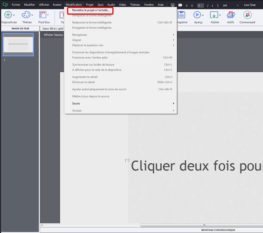
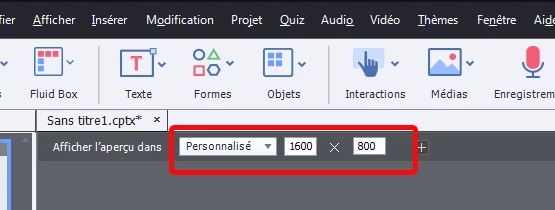
Is there a way to make a responsive project with a desktop width higher than 1024px? I have a project which has a largest size of 1600 px in width, and I would like to make this responsive so that it doesnt have a squashed look on a ipad.

Thanks for any tips!!

- Ryan

    This topic has been closed for replies.
    Correct answer laurent_machado

    hello,

    excuse for the french screenshot

    You can try to click on Modify /  rescale project  ,,, insert your values

    and it should work :

    Have a nice day

    ps: do some test in real, on all device before launching production

    2 replies

    Sankaram
    Adobe Employee
    Adobe Employee
    April 12, 2017

    Hi Ryan,

         Create a new responsive project. Go to Modify and Rescale the Project to 1600 width. Project will be rescaled and adding new slide will honor the new project width. You can add new preview width to 1600 and start using it.

    Thanks,

    Sankaram,

    laurent_machadoCorrect answer
    Participating Frequently
    April 12, 2017

    hello,

    excuse for the french screenshot

    You can try to click on Modify /  rescale project  ,,, insert your values

    and it should work :

    Have a nice day

    ps: do some test in real, on all device before launching production