If you use media query selectors in the CSS after you publish the project you can have finer control over the fonts sizes in any given device dimension. How do you use media queries you say, eyes agog with wonder? Glad you asked, lets give it a whirl!
First we're going to preview the project in a browser and inspect the TOC elements to get their CSS class names. We're also going to make note of the name of the CSS file that has the element rules.
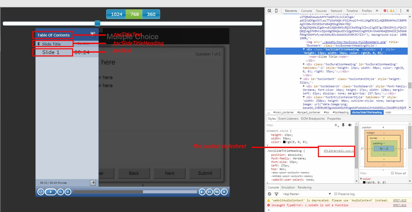
So we find that the font sizes for each of these three items are controlled by the following CSS classes:
.tocTitleText - "Table of Contents"
.tocSlideTitleHeading - "Slide Title"
.tocText - "Slide"
And the CSS for these classes is located in CPLibraryAll.css (which gets put into the assets/css folder of the published project).
So once we're done tinkering with our project and we're ready to add the media query icing to our training cake, publish the project and navigate to the assets/css folder and open up that CPLibraryAll.css file in your favorite text editor. Most of the CSS has been compressed up there at the top but fear not, we're just going to scroll to the bottom of the file and create some new stuff. Here's some more info on media queries if ya'll are curious. That's just the first random link on the topic that I thought was helpful, there are many others if you google it. Now back to the program!
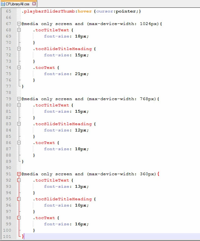
At the bottom of the CSS file add those three media queries, I'll paste them in here so you can just grab them easy:
@media only screen and (max-device-width: 1024px){
.tocTitleText {
font-size: 18px;
}
.tocSlideTitleHeading {
font-size: 15px;
}
.tocText {
font-size: 21px;
}
}
@media only screen and (max-device-width: 768px){
.tocTitleText {
font-size: 15px;
}
.tocSlideTitleHeading {
font-size: 12px;
}
.tocText {
font-size: 18px;
}
}
@media only screen and (max-device-width: 360px){
.tocTitleText {
font-size: 13px;
}
.tocSlideTitleHeading {
font-size: 10px;
}
.tocText {
font-size: 16px;
}
}
Now, you'll probably want to change those font-size values to something more akin to what you were going for but stick to the same concept: smaller fonts for the smaller device size, larger fonts for the larger device sizes. My values here are pretty subtle so don't be afraid to experiment, and I used pixels (px) instead of point (pt) sizes so you might want to change that as well. Regardless, feel free to go back into this file and adjust the sizes more to your liking if you preview it and it isn't quite up to snuff.
So it's probably a little obvious by the text in those entries that we've created rules for those three classes that only apply in certain situations, that's what media queries do best. In this case we have a set of queries, one each for when the device or viewing dimensions hit the standard device sweet spots: 360, 768, and 1024 pixel widths respectively. Lets check out a screengrab of it in action:
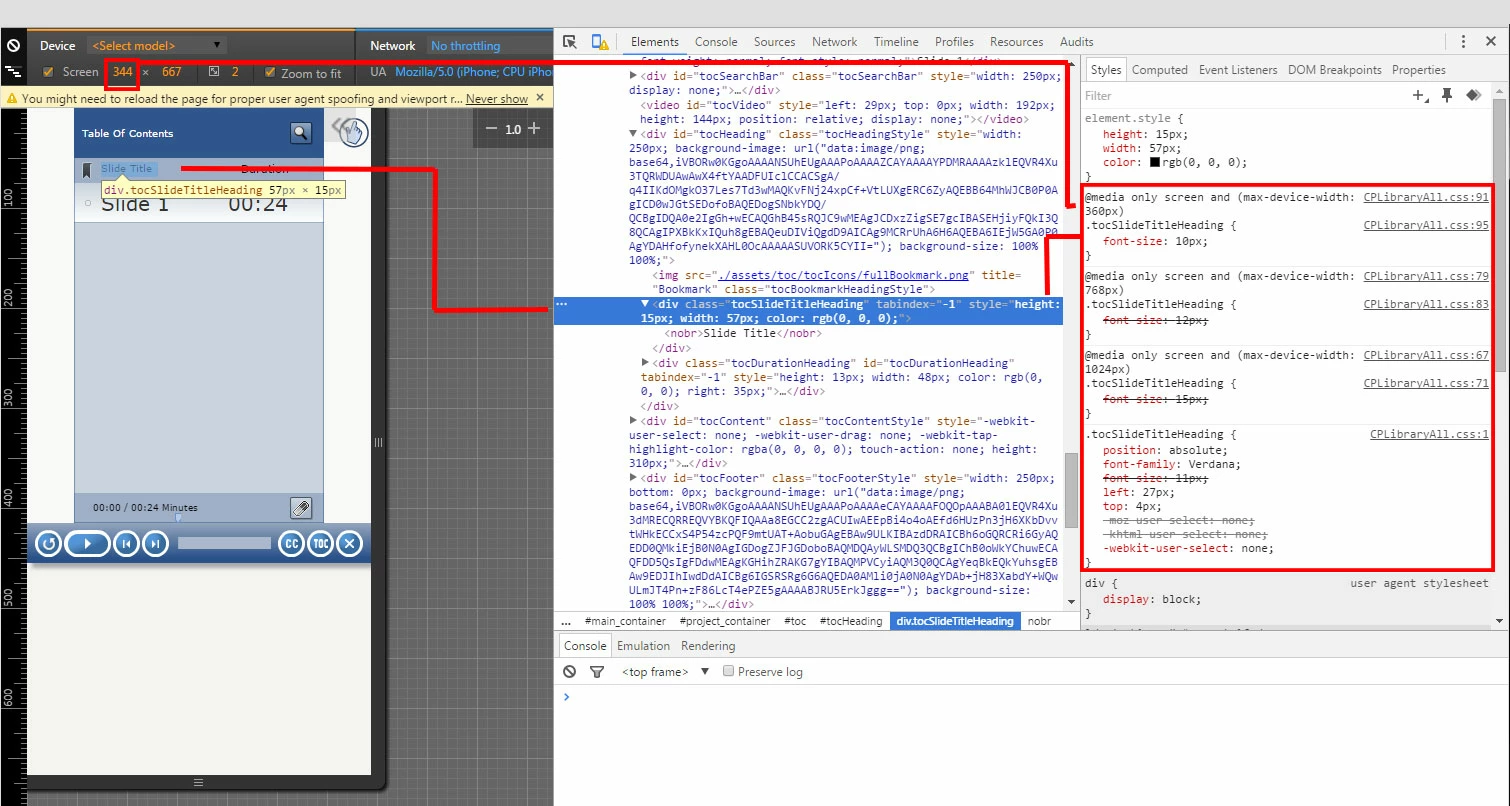
We can see here that at a 344 device width, the max-device-width: 360px media query has kicked in and has overridden the class selectors. In the example I've highlighted the tocSlideTitleHeading to show the connection between how it looks and how the media query has adjusted the font size.
My experience with Cap has been that if you effect this kind of change (introducing code or settings directly into files that Cap writes out when publishing) its best to do it once you're all done with the project. I can't say for certain but I suspect if you make the change to the CSS file then go back and edit the project in Cap and re-publish it your media query stuff will get wiped out and you'll have to put it back in. Just something to keep in mind.
So there ya go! Media queries, FTW!
-Jord

 AdChoices