

rchil
Known Participant
June 14, 2017
Question

TOC checkmark alignment

  • June 14, 2017
  • 2 replies
  • 477 views

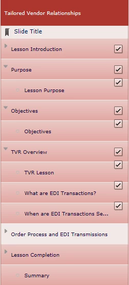
When testing this file (from this slide, next 5 slides) the checkmarks are aligned center in the box. When publishing to HTML, the checkmarks in the sub-categories are misaligned. The customer is complaining but I don't see any way to adjust the alignment of the checkmarks in the Table of Contents.

I have attached a screenshot.

Thank you.
    This topic has been closed for replies.

    2 replies

    BenRogers
    Participant
    November 21, 2017

    In case anyone else has this problem, here's a workaround: https://elearning.adobe.com/2017/11/fixing-alignment-of-toc-checkmarks/ 

    This does appear to be a bug with Captivate 9 HTML5 output, but the fix is fairly simple and resolves the misalignment.

    RodWard
    Community Expert
    Community Expert
    November 21, 2017

    Ben,

    Your workaround is much appreciated.  Please make sure you log a bug report with Adobe to draw the attention of the Captivate development team to this code fix.  I think it should be a standard part of the way Captivate publishes code into the CPM.js file.

    RodWard
    Community Expert
    Community Expert
    June 14, 2017

    The Preview Next 5 Slides will be showing you an SWF preview of the content.  What you see in HTML5 is not guaranteed to be the same because HTML5 output assumes many users will be on handheld devices and therefore require bigger buttons in the TOC than would be necessary with a mouse-driven user.

    I think you should log this as a bug.  Someone else meantime may be able to suggest where in the HTML5 output you can inject some CSS to move those checkboxes in to the middle of the line.

    rchil
    rchilAuthor
    Known Participant
    June 14, 2017

    OK - thanks. Yes, I am aware that the Preview is using SWF output. I would like to try to adjust the CSS but wouldn't know where to start.