Inspiring
December 14, 2022
해결됨

Footer will not stay at the bottom, ignores text container div

  • December 14, 2022
  • 1 답변
  • 508 조회

 I tried to create a template with a mobile responsive nav bar and a vertical nav bar. The vertical nav bar disappears in tablet and mobile view with a media query (as planned). I then added a container for content: text and images, etc. It stays to the right of the vertical nav bar in desktop view, then expands in mobile view.  That all worked well. My problem is with the footer.  In position: absolute, It will stay below the vertical nav bar, but it will ignore the container div with the text inside. In mobile view, the footer simply goes to the top.  I tried many solutions from videos and how-to websites, including the implementation of wrappers, flex and grid. Nothing worked. The solutions usually made things worse. Please advise on any possible coding solutions. (not bootstrap). Thanks. 


The CSS and HTML are quite long. I will leave the link, instead. The footer class is “foot”.


www.atnuke(dot)com/nav(dot)html

    이 주제는 답변이 닫혔습니다.
    최고의 답변: Nancy OShea

    Don't use absolute positioning.  It removes content from the normal document flow.


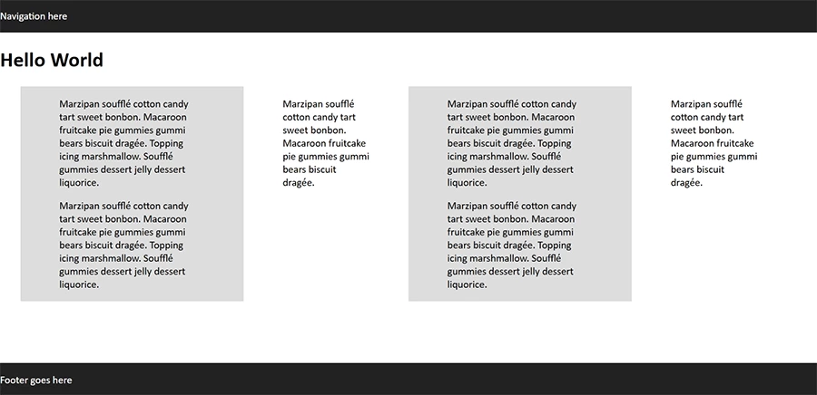
    This footer on the bottom example uses CSS flexbox.


    <!doctype html>
    <html lang="en">
    <head>
    <meta charset="utf-8">
    <title>CSS Flexbo Footer at Bottom</title>
    <meta name="viewport" content="width=device-width, initial-scale=1">
    <style>
    body {
    margin:0;
    min-height: 100vh;
    display: flex;
    flex-direction: column;
    }
    main {
    display:flex;
    margin: 0 auto;
    width:95%;
    }
    .col {padding:0 5%;}
    .light {background:#DDD;}
    .dark {background:#222; color:#FFF}
    
    footer {
    margin-top:auto;
    }
    /* Special Rules for mobiles */
    @media only screen and (max-width: 800px) {
    main {flex-wrap:wrap}
    }
    </style>
    </head>
    <body>
    <nav class="dark">
    <p>Navigation here</p>
    </nav>
    <header>
    <h1>Hello World</h1>
    </header>
    <main>
    <div class="col light">
    <p>Marzipan soufflé cotton candy tart sweet bonbon. Macaroon fruitcake pie gummies gummi bears biscuit dragée. Topping icing marshmallow. Soufflé gummies dessert jelly dessert liquorice.</p>
    <p>Marzipan soufflé cotton candy tart sweet bonbon. Macaroon fruitcake pie gummies gummi bears biscuit dragée. Topping icing marshmallow. Soufflé gummies dessert jelly dessert liquorice.</p>
    </div>
    <div class="col">
    <p>Marzipan soufflé cotton candy tart sweet bonbon. Macaroon fruitcake pie gummies gummi bears biscuit dragée. </p></div>
    </main>
    <footer class="dark">
    <p>Footer goes here</p>
    </footer>
    </body>
    </html>


    1 답변

    Nancy OShea
    Community Expert
    Community Expert
    December 14, 2022

    Don't use absolute positioning.  It removes content from the normal document flow.


    This footer on the bottom example uses CSS flexbox.


    <!doctype html>
    <html lang="en">
    <head>
    <meta charset="utf-8">
    <title>CSS Flexbo Footer at Bottom</title>
    <meta name="viewport" content="width=device-width, initial-scale=1">
    <style>
    body {
    margin:0;
    min-height: 100vh;
    display: flex;
    flex-direction: column;
    }
    main {
    display:flex;
    margin: 0 auto;
    width:95%;
    }
    .col {padding:0 5%;}
    .light {background:#DDD;}
    .dark {background:#222; color:#FFF}
    
    footer {
    margin-top:auto;
    }
    /* Special Rules for mobiles */
    @media only screen and (max-width: 800px) {
    main {flex-wrap:wrap}
    }
    </style>
    </head>
    <body>
    <nav class="dark">
    <p>Navigation here</p>
    </nav>
    <header>
    <h1>Hello World</h1>
    </header>
    <main>
    <div class="col light">
    <p>Marzipan soufflé cotton candy tart sweet bonbon. Macaroon fruitcake pie gummies gummi bears biscuit dragée. Topping icing marshmallow. Soufflé gummies dessert jelly dessert liquorice.</p>
    <p>Marzipan soufflé cotton candy tart sweet bonbon. Macaroon fruitcake pie gummies gummi bears biscuit dragée. Topping icing marshmallow. Soufflé gummies dessert jelly dessert liquorice.</p>
    </div>
    <div class="col">
    <p>Marzipan soufflé cotton candy tart sweet bonbon. Macaroon fruitcake pie gummies gummi bears biscuit dragée. </p></div>
    <div class="col light">
    <p>Marzipan soufflé cotton candy tart sweet bonbon. Macaroon fruitcake pie gummies gummi bears biscuit dragée. Topping icing marshmallow. Soufflé gummies dessert jelly dessert liquorice.</p>
    <p>Marzipan soufflé cotton candy tart sweet bonbon. Macaroon fruitcake pie gummies gummi bears biscuit dragée. Topping icing marshmallow. Soufflé gummies dessert jelly dessert liquorice.</p>
    </div>
    <div class="col">
    <p>Marzipan soufflé cotton candy tart sweet bonbon. Macaroon fruitcake pie gummies gummi bears biscuit dragée. </p></div>
    </main>
    <footer class="dark">
    <p>Footer goes here</p>
    </footer>
    </body>
    </html>


    Nancy O'Shea— Product User & Community Expert
    Inspiring
    December 14, 2022

    Oh thanks very much, I will try that.