Inspiring
September 6, 2024
Answered

Create warnings and cautions with a border

  • September 6, 2024
  • 5 replies
  • 1321 views

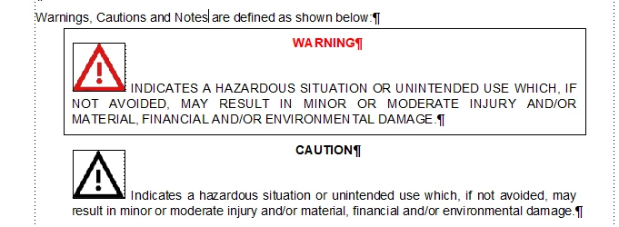
Hi all, I'm looking for suggestions on how I can create warnings and cautions that will look like the Warning in my example with a border around it. I've created this example by just drawing a rectangle for display purposes but obviously that method doesn't automatically move with the text. I'm trying to avoid using tables to achieve this as they don't publish to HTML in a way that works well. You can see by the text symbols that there's two separate paragraph styles involved, as well as an inline image. I'd like the output to be centred with large left and right indents for both PDF and HTML5 (and that's where I struggle with the tables). Does anyone have any ideas? 

    This topic has been closed for replies.
    Correct answer andreas_5547

    Hi Matt,

    sorry for my late feedback. Now I'm back from vacation.

    Thank you very much for your tip with the pseudo elements. I will try to use a pseudo element "::before" for the class of my signal words in warning hints like this:

    p.SafetyHint__SignalWord::before {
        content: "";
        display: inline-block;
        with: XXpx;
        height: YYpx;
        background-image: path/to/image.svg /* or use of data-uri */
    }

    While signal word itsself is part of content, I can change the icon for better representation.

    5 replies

    Dave Creamer of IDEAS
    Community Expert
    Community Expert
    September 9, 2024

    Here is a sample file with a number of variations using reference page graphics, character styles, and paragraph styles. Let me know if you have any questions.


    David Creamer: Community Expert (ACI and ACE 1995-2023)
    Inspiring
    September 9, 2024

    Thanks Dave, but I don't think the system I'm on will allow random downloads from the internet.

    Dave Creamer of IDEAS
    Community Expert
    Community Expert
    September 9, 2024

    If you can recieve email attachments, message me by clicking on my name and give me your email address.

    Here is a screen capture of most of the examples. The first two are automatically formatted with a single paragraph style (other than the content of the message); the last three are automatically formatted with a table style. 

    David Creamer: Community Expert (ACI and ACE 1995-2023)
    Community Expert
    September 6, 2024

    I have been playing around with FM's builtin css editor and got this. The warning icon + text reside in an anchored frame set to below current line with a forced return. Maybe it's too cumbersome and the table solution is better...


    Bjørn Smalbro - FrameMaker.dk
    Inspiring
    September 8, 2024

    Thanks for trying Bjorn. Yes, I think tables might be the logical way.

    Inspiring
    September 6, 2024

    Hi ArmadilloC,

    unfortunately I don't have any ideas how to build warnings without tables. Thats why I use tables. With some styling in FM and the CSS it's possible:

    In FM I use tables with one col and two rows and table styles to control the styling of warning hints:

    You can set the table position to centered. Margins left and right depend on the table width.

    In HTML output, I added some custom CSS to control the positioning of the tables:

    Reduce the width from 100% (e. g. 80%)

    add for table "margin: 0 auto;" (Shorthand for: margin-top: 0; margin-right: auto; margin-bottom: 0; margin-left: auto:)

    The keyword auto means that the browser calculates the remaining space. Result: Table is centered in parent container.


    Inspiring
    September 9, 2024

    Thanks Andreas, I think that code is the key to my problems. Looks like it's back to tables.

    Community Expert
    September 6, 2024

    Regarding the HTML5 output, you can apply a border in the styling like this:

    This will give you an output like this:

    I have not made a complete setup with "icons and stuff", but this is how you can make the html5 output work. If you want something similar like an option in pdf output, I would suggest using conditions.

    Bjørn Smalbro - FrameMaker.dk
    Matt-Tech Comm Tools
    Community Expert
    Community Expert
    September 10, 2024

    I think Bjorn has given you the direct answer. 

    Andreas shows you how you can work it with tables, but I suspect that (like me) you would prefer to stay away from using tables for this.

    A third option: I like to use paragraphs with a prefix (FontAwesome) for my warnings, notes, and cautions, and use CSS to get as close to Andreas' look using CSS.

    Not exactly the same look, but cleaner under the hood and across varied browsers and screen resolutions.


    -Matt Sullivan, FrameMaker Course Creator, Author, Trainer, Consultant
    Inspiring
    September 10, 2024

    Thanks Matt, I really like this as a preferred option and it's what I did when using Madcap Flare. The inability to use an image in a prefix in the .css is a real sticking point though. It was as easy as this in Flare

    p.Warning
    {
    background-repeat: no-repeat;
    height: 60px;
    font-weight: bold;
    margin-bottom: 6pt;
    page-break-inside: avoid;
    background-position: 0% 0%;
    font-size: 16pt;
    margin-top: 4pt;
    margin-bottom: 4pt;
    background-image: url('../Images/03000006.png');
    padding-left: 60px;
    }

    Also for warnings I think we are going to have to tailor the image used to match the warning type so that's annoying.

    Community Expert
    September 6, 2024

    Hi,

    Tables should work well. You can set left and right indentation as you like.

    Additionally you could put your icon into column 1 and the signal word and the text into column 2. Then you would not have this space between the signal word and the text.

    Best regards, Winfried