jbarkerhill
Inspiring
July 19, 2022
Answered

Creating a Caution Table, having issues

  • July 19, 2022
  • 3 replies
  • 1381 views

Hi, 


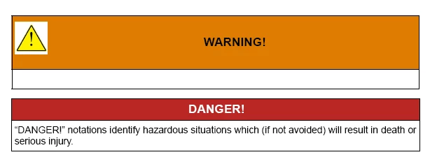
I'm trying to create table styles for all the notations within my manuals (Danger, Warning, Caution, Note).


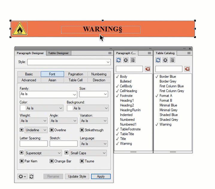
I currently have a decent looking format, but want to add a caution logo on 3 of the tables (Danger, Warning, Caution). I'm trying to figure out a good way to do that. My currenty method I'm trying is:


- Add caution logo to reference page, within a graphic frame

- On body page, create a table with two columns in the header

- In the left column of the header, use a paragraph styles that uses Frame Above Pgf and references the Caution logo


It should work, but FM is glitching out and showing a white background on the logo


I altered the logo in Photoshop so that it's transparent and doesn't have a white background. But FM isn't honoring the transparent background


Also, using the Frame Above Pgf feature adds a bunch of extra space to the header I don't want. 


The white background on the logo shows up in the outputted PDF also, so it's not just a display artifact in FM


Here's proof that the logo has a transparent background, which works in Word:


Any suggestions for adding a Caution logo to my Caution tables so that the logo populates automatically when I insert the table, and also so that the logo doesn't have a white background?


Thanks 

    This topic has been closed for replies.
    Correct answer Barb Binder

    I recieved a call and forgot to hit post, but here is my approach.


    Assuming you want the black lines that surround the warnings, you will need a table. Also, I grabbed a graphic, but you can use Bob's recommendation of the glyph, as well.


    • Put all of the elements in the named frame on the reference page: gylph/image, text and background color. Adjust the spacing/position there. 
    • Back on the body pages, add the 2-row, 1 col table. 
    • Create a paragraph style.
      • Anchor below current pfg, not above. 
      • Create a paragraph style and set the type size to 2, the table cell margins (still in para designer to -2, 0, 0, 0). 
    • Create a table style and set the cell padding to 0, 0, 0, 0.

    ~Barb


    3 replies

    Barb Binder
    Community Expert
    Barb BinderCommunity ExpertCorrect answer
    Community Expert
    July 19, 2022

    I recieved a call and forgot to hit post, but here is my approach.


    Assuming you want the black lines that surround the warnings, you will need a table. Also, I grabbed a graphic, but you can use Bob's recommendation of the glyph, as well.


    • Put all of the elements in the named frame on the reference page: gylph/image, text and background color. Adjust the spacing/position there. 
    • Back on the body pages, add the 2-row, 1 col table. 
    • Create a paragraph style.
      • Anchor below current pfg, not above. 
      • Create a paragraph style and set the type size to 2, the table cell margins (still in para designer to -2, 0, 0, 0). 
    • Create a table style and set the cell padding to 0, 0, 0, 0.

    ~Barb


    ~Barb at Rocky Mountain Training
    jbarkerhill
    Inspiring
    July 19, 2022

    Awesome, thanks to all for the advice 🙂


    I'll try Barb's method and report back if it works for me 

    jbarkerhill
    Inspiring
    July 20, 2022

    The method from Barb seems to have worked 

    The formatting for the heading of the table populates automatically when I insert the table


    To be determined if it works consistently 


    Thanks for the help 🙂 

    Bob_Niland
    Community Expert
    Community Expert
    July 19, 2022

    Simplicate and add deletions.

    The alert symbol no longer needs to be done as art (and was never ideal as raster art). The glyph is now part of Unicode:
    ⚠ U+26A0 WARNING SIGN
    Find a font that populates it, and renders it in your desired style. It's inherently transparent, and the stroke can be colored as desired (perhaps white over safety red for DANGER).

    The admonishments don't have to be tables. I used to do them as named frames on a Reference Page (as as EPS vector art in those days). They might even be done as a Variable these days.

    Also review your colors. Check whatever safety standards apply to the field of interest for the document, and of course ANSI Z535.1 and/or ISO 3864.2. Since I last had to try to harmomize those, the stds committees may have narrowed the gap, and perhaps even provided useful color specs for electronic publications (such as sRGB primaries).

    jbarkerhill
    Inspiring
    July 19, 2022

    Might have found a solution:


    Set the background color of the graphic frame to same color as the heading of the table 


    Still need to address all the extra space from using Frame Above Pgf

    jbarkerhill
    Inspiring
    July 19, 2022

    It looks pretty good in outputted PDF

    I used "Straddle" feature to merge the body cells of the table.

    Also used tab in top ruler to center the text in header, since with having two columns the text is off center. 


    I don't understand why, in the Paragraph designer, the Space above and below text options have no effect. I think I read that those features don't work on the first line of a paragraph. How am I supposed to remove excess space before a paragraph? 

    Dave Creamer of IDEAS
    Community Expert
    Community Expert
    July 19, 2022

    What format is your graphic in?


    As to the spacing, check your table and cell insets. Paragraph space only works when there is another paragraph above or below. Your style with the symbol is sitting in a cell all by itself. 


    I uploaded some files you might want to inspect at:

    https://www.ideastraining.com/PDFs/WarningCaptionStyles.fm


    David Creamer: Community Expert (ACI and ACE 1995-2023)