Participant
September 8, 2025
Question

How can I change "exclude" .fm Icons to stand out from regular?

  • September 8, 2025
  • 3 replies
  • 221 views

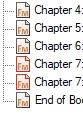
Does anyone know how to change the .fm icons so that excluded files are more visually distinct from non-excluded ones? In the example below, both Chapter 7 files are excluded, but the difference is barely noticeable. If you're color-blind, you might not be able to tell at all. I'd really like to change the excluded icon to something more obvious (like an inverted icon) instead of relying on a barely-noticable color change.


Note: I saw a reference to looking up .dll information on this issue, but that didn't help. If there's a more direct solution, please advise.


Thanks in advance.


    3 replies

    Dave Creamer of IDEAS
    Community Expert
    Community Expert
    September 9, 2025

    I put them in a Group labeled "Exclude".


    David Creamer: Community Expert (ACI and ACE 1995-2023)
    Participant
    September 11, 2025

    Great Idea! Thanks Dave!

    frameexpert
    Community Expert
    Community Expert
    September 8, 2025

    I agree that this is a problem. The only way to do it would be a resource editor, which may not be simple.

    Here is a script hack that you might find useful. Run this and it will select any excluded components in the book.

    main ();
    
    function main () {
        
        var book;
        
        book = app.ActiveBook;
        if (book.ObjectValid () === 1) {
            processBook (book);
        }
    }
    
    function processBook (book) {
        
        var bookComp;
        
        // Loop through all of the components in the book.
        bookComp = book.FirstComponentInBook;
        while (bookComp.ObjectValid () === 1) {
            // Select excluded components; deselect regular components.
            bookComp.ComponentIsSelected = bookComp.ExcludeBookComponent;
            bookComp = bookComp.NextBookComponentInDFSOrder;
        }
        
        book.IsInFront = 1;
    }
    Participant
    September 11, 2025

    Thanks for the script. I'll see what I can do to test this.

    Barb Binder
    Community Expert
    Community Expert
    September 8, 2025

    Ugh. I don't have an answer for you, but this is a pet peeve for me, Jeffrey.


    The red outline is subtle enough that I miss it sometimes and I don't have red-green color blindness. This comes up regularly with my male students, and not just here. FrameMaker's auto-spell check uses red for typos and green for everything else, and track text edits also defaults to red and green (though the colors can be reconfigured for track text edits).


    Considering that red-green color blindness affects about 8% of the male population worldwide (1 in 12 men), I do wish that the FrameMaker team would offer some accessibility alternatives within the application. (And yes, I know that women can have it too—I think it's closer to 0.4%—but it doesn't seem to be the recurring issue in my classes as it is for my male students.)


    Consider filing a feature request on Tracker. I'd vote for it!


    ~Barb

    ~Barb at Rocky Mountain Training
    Participant
    September 11, 2025

    Thanks Barb! I'm glad I'm not the only one! Thanks for the response. I think I'll do that request per your suggestion!