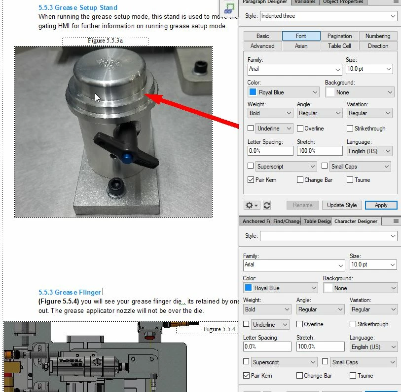
i am geting inconsistent fonts in framemaker, see this page i attached an attachment the top Title 5.5.3 Grease Setup Stand appears bolder and darker then lower one 5.5.3 Grease flinger . anyone know why this could be? I have related font style in the snip. thanks!
Sorry, can't tell - I'm partially colourblind, so it's not registering any difference to me - look to see if you've got an override on the paragraph tag (it will show a little asterisk down in the bottom left corner)
i dont see an override as being active. i can maybe push the document through with it as is. wondering if someone else can pull up the attachment and see if there is a difference. any other causes you are aware of that would create a color indifference
I'm not seeing any font difference - are you saying that the "5.5.3 Grease Flinger" should read "5.5.4 Grease Flinger"? If it should, then it probably indicates an issue with your auto-numbering building blocks.
when i convert this to a pdf it shows lighter on the bottom sections. it appears this way on both my screens (using dual screens) im taking it as my screens maybe go lighter on the bottom of the scrolling and its not a editing issue after all
I locked your other thread - you can add images by using the picture icon. What's the issue here? Are you using the same paragraph tag for both the "5.5.3." bits of text?
yes i am, and on several pages its lightening the second paragraph tag . how can i fix this? the second number should be 5.5.4 which i corrected. but on 10 pages i am having this issue. i am semi new to framemaker and did it this way for table of contents purposes