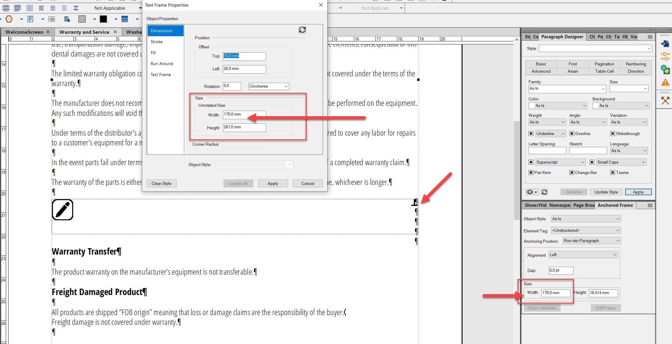
The visual presentation of Anchored Frames inside Text Boxes seems to be incorrect
I'm posting this in here only to learn if this is either the normal way of visualizing the guidelines for overlapping text boxes and anchored frames or if I'm making a mistake or if this is an actual error in Framemaker.
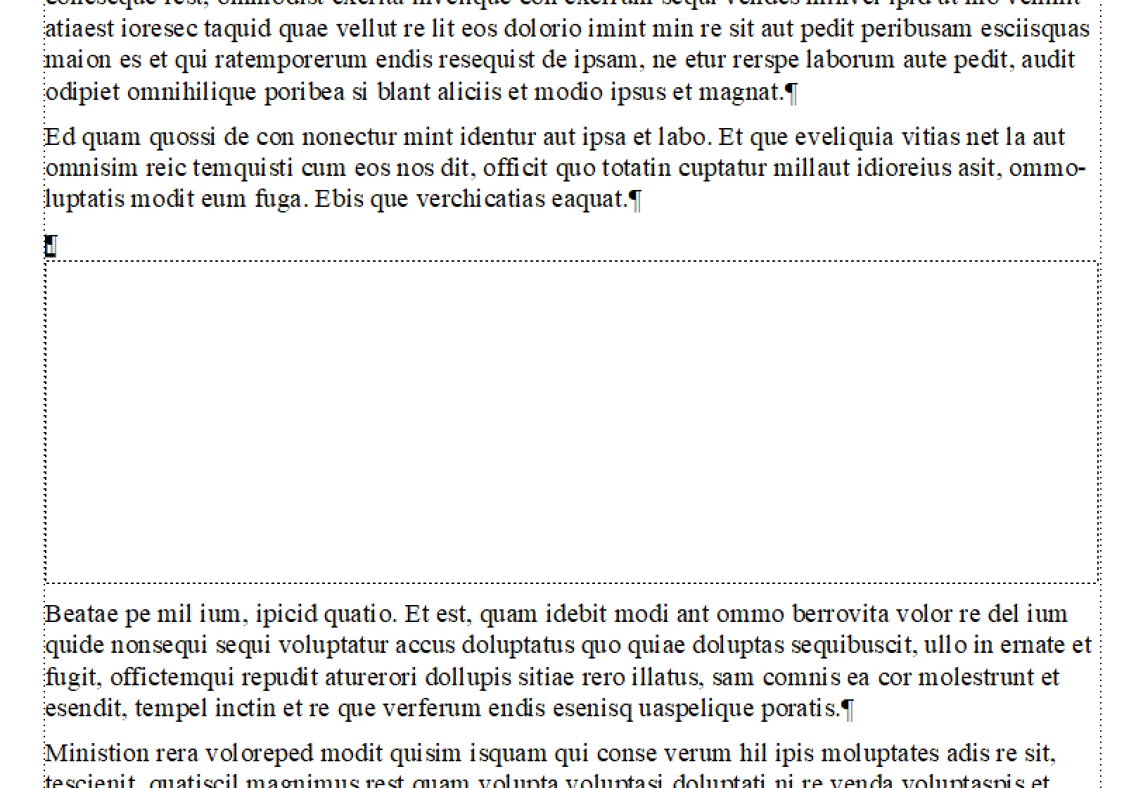
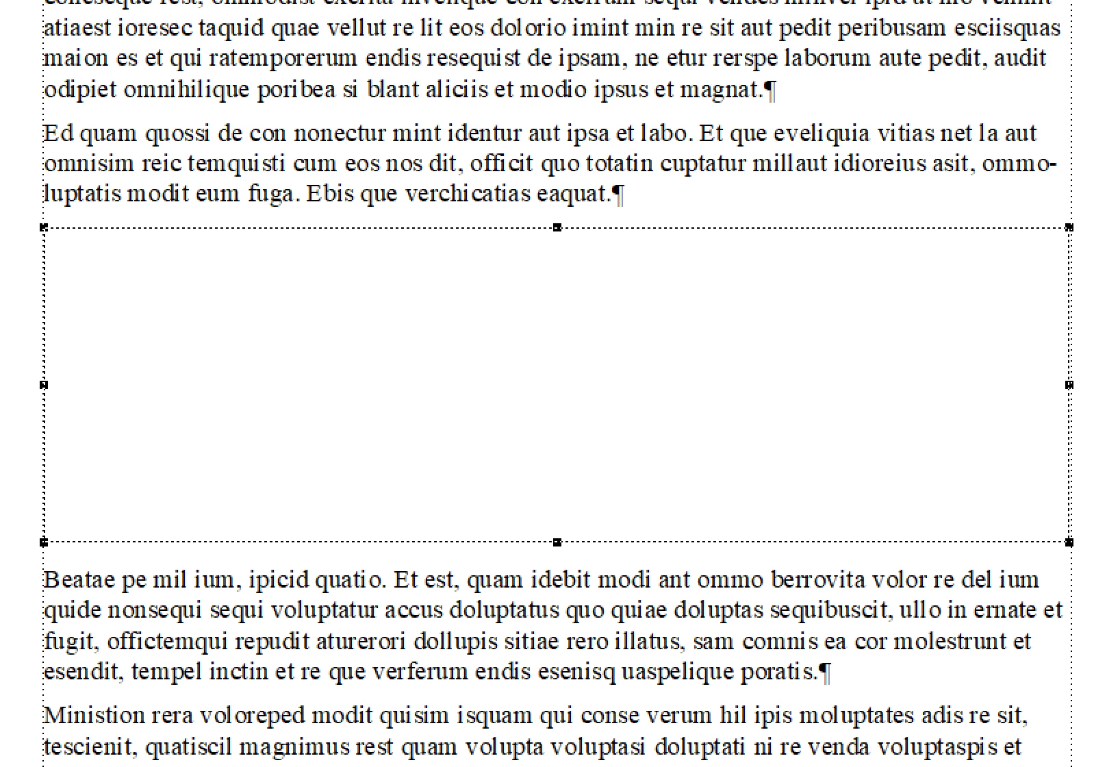
When I define an anchored frame inside a text box which has the same width with the text box then Framemaker does show the guidelines of the text box and the anchored frame not exactly on top of each other but a little bit shifted from each other.
I couldn't find a specific tool to align the left line of both the text box and the anchored frame so I did align them on each other visually and manually. I think that I've managed to align the left lines of both these elements but the right line of the anchored frame doesn't exactly match to the text box whereas their widths are defined exactly as the same value.