Known Participant
November 30, 2018
Answered

Crafting & Exporting Consistent & Appealing Button Theme!

  • November 30, 2018
  • 1 reply
  • 557 views

Is there a shortcut or way to do this rather than manually for each button? I am going to be creating many titles and buttons under this format. Thank you!

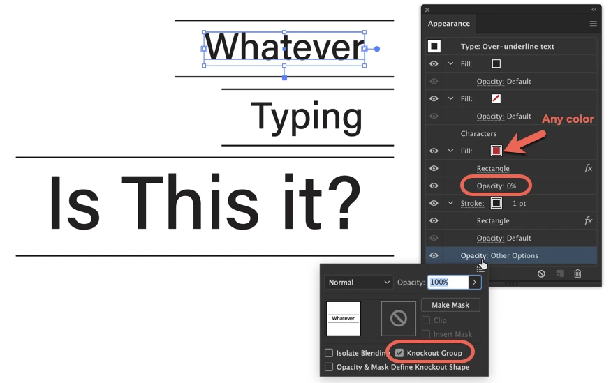
  1. 1) Would I space lines based off of x-height, ascenders or descenders? Is there a tool on Illustrator to help me this, or would I need to do it all or partially by eye. The idea is to keep this motif consistent for the brand identity. 
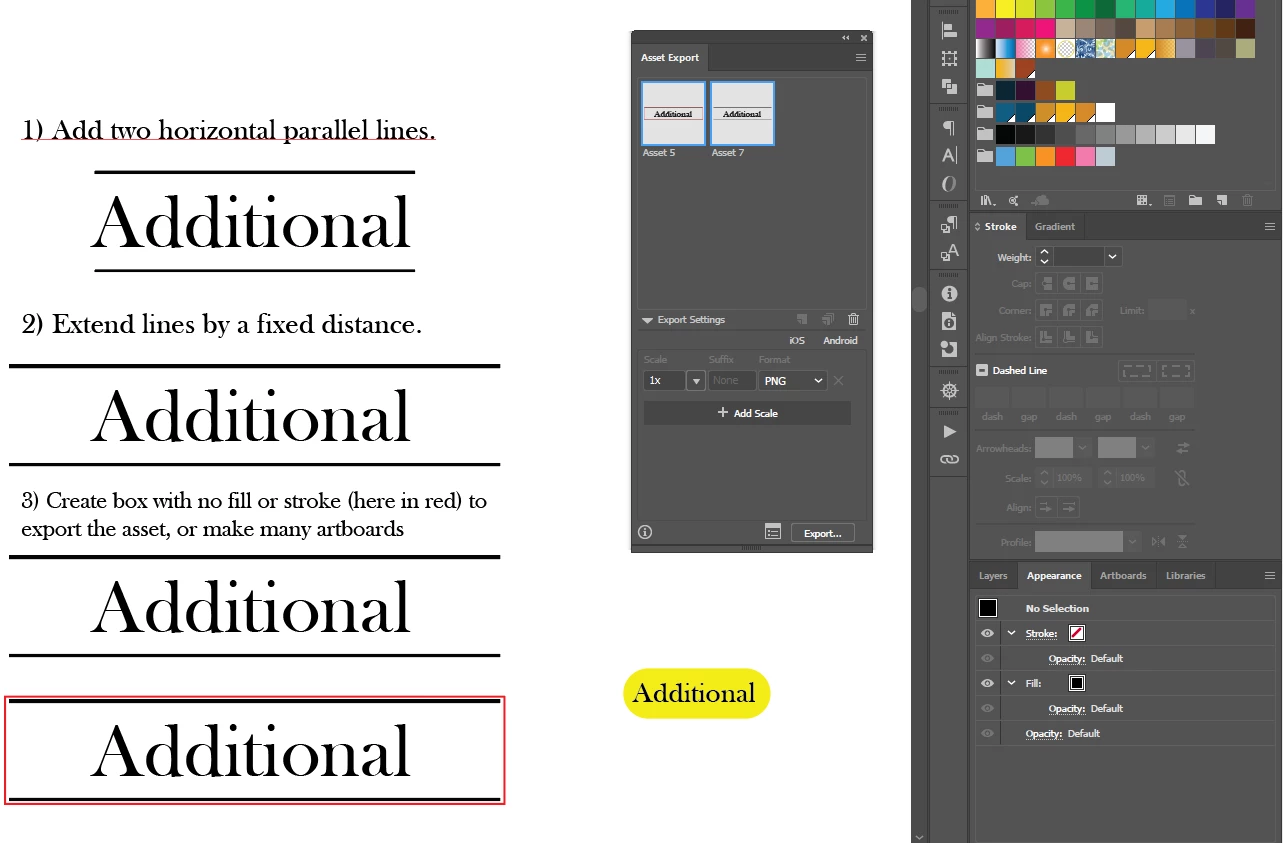
  2. 2) I could then add a fixed amount to the width of the two joined lines, with the anchor set to the center of the object.
  3. 3) To export these for the web, would it be easier to put transparent boxes around each item or to make many artboards? My concern is that each button should be consistent and with different length of words, a constant method must be adhered to.

Thank you!

PS I made this yellow button which expands by adding 2 fills and converting the bottom to a rounded rectangle. Is there a way to then do this with a regular rectangle, and only keep the the top and bottom lines? If so, the button would stretch/format automatically!

    This topic has been closed for replies.
    Correct answer tromboniator

    This may be close to what you're looking for:

    This involves creating a Graphic Style to apply to whatever text you want to make in this style.

    1) With text selected, in the Appearance panel flyout menu (upper right corner) click Add New Fill and apply the color you want the text to be.

    2) Add New Stroke in the Appearance panel, drag below the fill from step 1, apply color.

    3) Click on Add New Effect button, choose Convert to Shape > Rectangle. Adjust width and height to placement you want top and bottom line segments to appear, and stroke weight

    4) Add New Fill, drag it below fill from 1 but above stroke from 2. Apply any color that makes step 5 easier for you.

    5) Apply Convert to Shape > Rectangle. Adjust width and height to cover vertical segments of 2, but not cut into the horizontal segments. This is a bit fussy, but I think it's worth the trouble if you will use this a lot.

    6. Set the opacity of this fill (click the disclosure arrow to the left of Fill) to 0%

    7) Click on Opacity at the very bottom of the Appearance panel and click in the box for Knockout Group until the check/tick mark appears.

    8. Drag the text onto the Graphic Styles panel to create a new style, double-click to name if you wish.

    Type anything you wish (point type works best for this) and, with type selected, click on the style in the Graphic Styles panel to apply.

    you might have to add transform effects to move the added stroke and fill rectangles up or down as you want them, and readjust heights, etc. but this seems to do what you want as I understand it. I've been known to be wrong before!

    Peter

    Edit: It just occurred to me that using a fill rather than a stroke in step 2 would make step 5 less fussy, as there would be no gap to cover, nor awkward L shapes to deal with.

    1 reply

    tromboniator
    Community Expert
    tromboniatorCommunity ExpertCorrect answer
    Community Expert
    December 1, 2018

    This may be close to what you're looking for:

    This involves creating a Graphic Style to apply to whatever text you want to make in this style.

    1) With text selected, in the Appearance panel flyout menu (upper right corner) click Add New Fill and apply the color you want the text to be.

    2) Add New Stroke in the Appearance panel, drag below the fill from step 1, apply color.

    3) Click on Add New Effect button, choose Convert to Shape > Rectangle. Adjust width and height to placement you want top and bottom line segments to appear, and stroke weight

    4) Add New Fill, drag it below fill from 1 but above stroke from 2. Apply any color that makes step 5 easier for you.

    5) Apply Convert to Shape > Rectangle. Adjust width and height to cover vertical segments of 2, but not cut into the horizontal segments. This is a bit fussy, but I think it's worth the trouble if you will use this a lot.

    6. Set the opacity of this fill (click the disclosure arrow to the left of Fill) to 0%

    7) Click on Opacity at the very bottom of the Appearance panel and click in the box for Knockout Group until the check/tick mark appears.

    8. Drag the text onto the Graphic Styles panel to create a new style, double-click to name if you wish.

    Type anything you wish (point type works best for this) and, with type selected, click on the style in the Graphic Styles panel to apply.

    you might have to add transform effects to move the added stroke and fill rectangles up or down as you want them, and readjust heights, etc. but this seems to do what you want as I understand it. I've been known to be wrong before!

    Peter

    Edit: It just occurred to me that using a fill rather than a stroke in step 2 would make step 5 less fussy, as there would be no gap to cover, nor awkward L shapes to deal with.

    Srishti_Bali
    Legend
    December 5, 2018

    Hi there,

    I would like to know if the steps suggested by Peter worked for you, or the issue still persists.

    Kindly update the discussion if you need further assistance with it.

    Thanks,

    Srishti

    Known Participant
    December 5, 2018

    I was just logging on now to give it a try and see you beat me Srishti.

    Peter, your suggestion worked perfectly! Thank you so much. This is incredible information.

    Today was the day I was going to experiment your method and I am very pleased it worked.