Participant
August 19, 2022
Answered

Files look fine but when I go to use them, the stoke and letters are different

  • August 19, 2022
  • 2 replies
  • 234 views

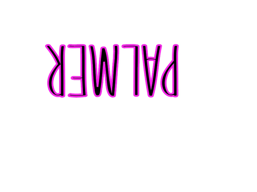
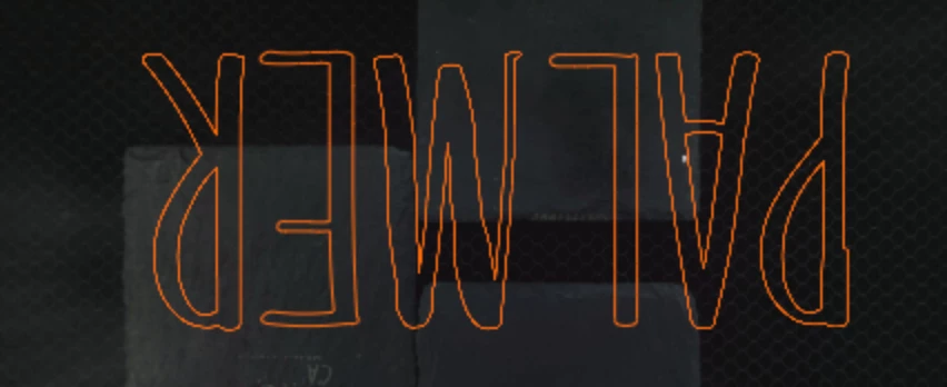
I've been putting text in with a .25 stroke for years, now suddently the stroke lines seem much thicker and the text looks fine when in illustrator, but when I export as an svg as I've always done, the letter are super warped. They're different every single time I export, even if I make no edits and just export again. The white background one shows how it's fine, then the 2nd image shows how it warps.

This topic has been closed for replies.
Correct answer Monika Gause

Decimal setting of 2 is very low. That can visibly shift points.

2 replies

Participant
August 19, 2022

It's text with .25 stroke. I've done this for years and no issues until recently. 

Monika Gause
Community Expert
Monika GauseCommunity ExpertCorrect answer
Community Expert
August 19, 2022

Decimal setting of 2 is very low. That can visibly shift points.

Participant
August 19, 2022

Ok, I'll try that, ty

Monika Gause
Community Expert
Community Expert
August 19, 2022

Please show us the appearance panel.

Please mark the places where it doesn't match your expectations.

How do you draw this?

How do you export it? Which settings? Is the precision ("Decimals") sufficient?