Answered
Help with logo vectorization
Hey all,
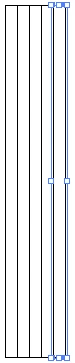
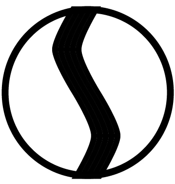
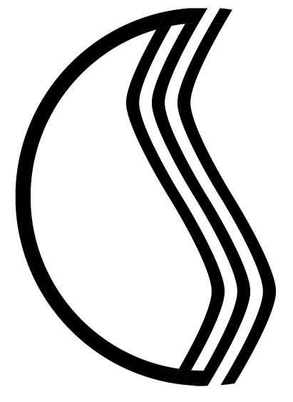
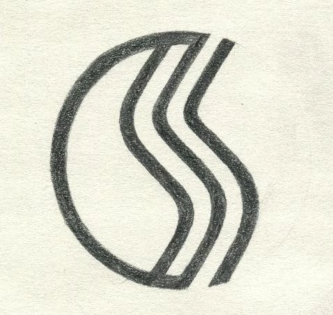
I'm doing a logo design for a company. Here's a sketch of the logo:
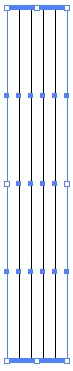
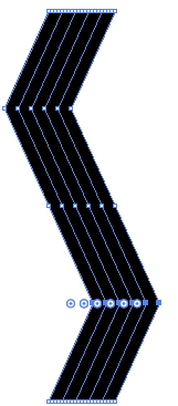
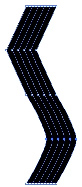
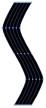
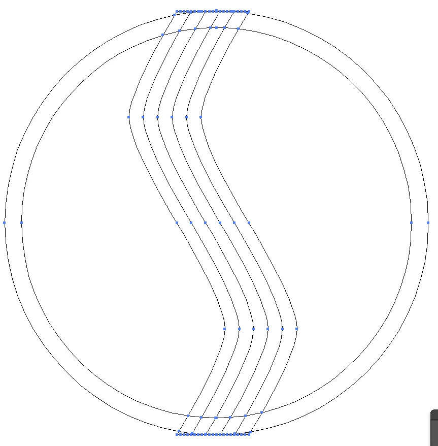
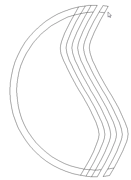
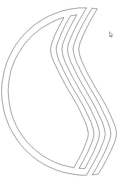
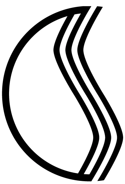
I want to have both the white and black lines on the same weight (unlike the sketch). So when I try to vectorize it, i decided to take the middle black line, trace it until halfway down, copy and mirror it down, add white stroke, expand, add black stroke, then the rest of it.
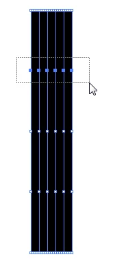
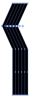
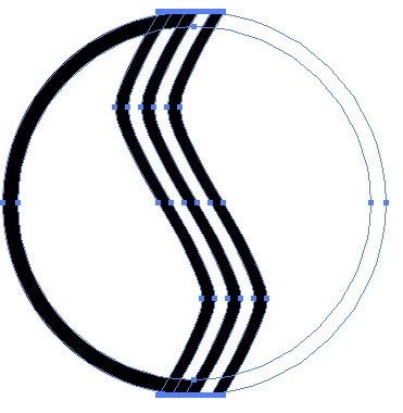
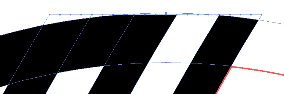
but instead what happens is the following:
The outermost strokes always turns out to have this weird ugly angles. If i modify it at this point the monoweight line effect is gone. I tried it with 4 different line weights and it always came out wrong. I have been using illustrator for a while but somehow this type of problem avoided me.
Does anybody have any advice about this? Thanks!