Participant
July 19, 2021
Question

How can I keep top third of text untouched while curving bottom half?

  • July 19, 2021
  • 1 reply
  • 1368 views

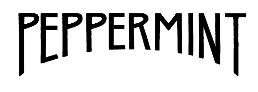
My client wants a lower arc but wants the top third of the text to remain untouched. Her designer did some major manipulation to the point where her font is no longer a font but rather pieces. Which means each time a new product is introduced, the title takes an absurd amount of time. Is there a way to achieve this effect with live type? Perhaps with envelope distort? I've played around but never quite get there. 

Thanks in advance for any advice.

This topic has been closed for replies.

1 reply

Jacob Bugge
Community Expert
Community Expert
July 19, 2021

Sue,


"Is there a way to achieve this effect with live type? Perhaps with envelope distort?"


I am afraid the long answer is no.


But there is a way. We have, or had, a few threads about exactly this; I am trying to see whether I can provide links.


Participant
July 19, 2021

That would be helpful, thanks. I've searched but not found anything that fits what I'm trying to do so if you know other threads, I'd appreciate it.

Jacob Bugge
Community Expert
Community Expert
July 19, 2021

Sue,


I am afraid that those threads were deleted, together with countless other fine old threads, two thirds of all threads up to late 2019 lost.


So this is the new thread about it.


Some cases are easier, some are more tedious, exact ways and possibly needed adjustments depending on the letters involved. See a few general considerations at the bottom.


For the PEPPERMINT case you can proceed as follows (Smart Guides being your friends, and keep backups of important stages), the troublesome letters being the Es and the N (without them you could skip the last part of 2), and 3) and the first part of 5) along with all the rest from 6) on):


1) Outline the Type and and make sure they are Ungrouped;

2) Create a stroke/nofill ellipse with its top part where you wish the letters to end at the bottom (you can easily make out the ellipse used for the PEPPERMINT sample), then copy it twice so you have three ellipses and lock two of them;

3) Select the third ellipse from 2), then use Offset Path (Object>Path) with an offset equalling the stroke width of the letters to create a larger ellipse, then hold Ctrl/Cmd and press 8 to turn them into a Compound Path, then switch from stroke to fill/nostroke, then hide it;

4) Switch to the Direct Selection Tool and ClickDrag beneath the top third covering the bottom parts of all the letters, then use the Down Arrow or ShiftClickDrag them down by one of the Anchor Points so all the bottom Anchor Points get below the upper part of the original (smaller) ellipse(s) from 2);


5) Lock the N, then unlock the original ellipse and hold Ctrl/Cmd and press C then X then F to bring it to the front in the stacking order (you can see it in the Layers panel), then use

Divide Objects Below (Object>Path) and delete the bottom parts of the letters;


Now you have all the final shapes of the letters with nicely (elliptically) rounded bottom ends, except for the Es (which lack their bottom arms/bars) and the N;


6) Lock all the (other) letters and unlock the other original ellipse from 2) and unlock the N;


7) With the Direct Selection Tool Click and then ShiftClickDrag the bottom left Anchor Point of the N up to snap to the ellipse, then repeat for the next one (now you have shortened the stem to the left), then repeat for the righmost one on the stem to the left;

😎 With the Direct Selection Tool ClickDrag over the last two lower Anchor Points on the stem to the left, then ClickDrag them by the bottom one to snap to the ellipse;

9) Select the ellipse and use Divide Objects Below (Object>Path), then ShiftClick the tiny bits of the N below the curve of the ellipse and delete them;


Now you (almost) have the final shape of the N, the middle diagonal stroke being a bit thinner/tapered than the stems, you can adjust that by moving the relevant Anchor Points up/down (select with the Direct Selection Tool and Up/Down arrow or ShiftClickDrag);


10) Unlock the Es and lock the N (so you have the Es unlocked and the other letters locked) and show the Compound Path ellipse from 3);

11) ClickDrag over the (lower parts of the) Es and the ellipse, then use Divide in Pathfinder, then Ungroup;

12) Delete the lower parts of the Es;

13) For each E ShiftClickDrag with the Line Segment Tool downwards from the righmost end of the middle bar to cross the ellipse shape, and use Divide Objects Below (Object>Path) for vertical ends on the lower arms/bars; or for perpendicular ends Direct Select the outer path of the ellipse and cut it at the intersection (Scissors Tool), then delete the vertical line and create the cut line with the Line Segment Tool based on the Handle;

14) Deselect and then ShiftClick the ellipse shape between the Es and at the bottom and press Delete, this should rid you of the ellipse shape outside the Es;

15) ClickDrag over the bottom part of each E and use Unite/Add to shape area in pathfinder;


Now you have the final shape of the Es/all letters;


16) Unlock all locked letters and switch from stroke to fill.


A few general considerations and comments:


It is possible to keep the appearance of the text with fill/nostroke paths; in some cases it may be convenient to switch to stroke/nofill while adapting to clearly see borders/overlaps/adjacent paths (as in 9) and 12) - 15) above).


It may very well be convenient to keep a spare set of ellipses (as in 2) - 3)) to copy from according to need rather than having to foresee the required number(s) through a more detailed planning of the whole adaptation, thereby enabling a more relaxed adaptation as needs become apparent/obvious.


Similar ways can be used in connexion with other bounding shapes, such as chevrons which also appeared in the old threads. Some of those were inspired by vintage designs, from the days where the designer had to (know how/find ways to) design, in all details.


This kind of artwork is highly customized and requires care and time, the reward being its standing out.


Edit: Edited for completion/elaboration.