The issue of dsitortion has to do with how the shapes end result looks same, but looking at handles you can see is different.
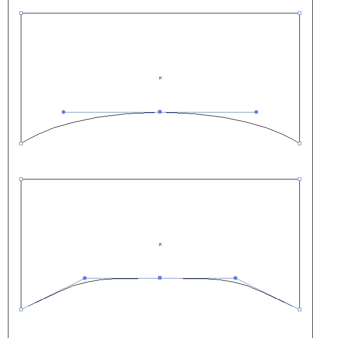
You can see the difference here
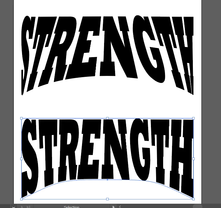
You can add an extra point to top middle and pull handles to improve distortion. Going back & forth you may get a decent result, but the add anchor points technique seems to help best. Anyone else have suggestions about distortion, please add to this as curious how others deal with this struggle.
A long time ago we had a Torries wheel that did this photographically where the art was exposed while the Torries wheel changed direction. While that wasted lots of film and chemicals and a large darkroom, but it seems to give a more uniform result.