Illustrator CMYK exporting incredily oversaturated once exported as a .pdf or leaving adobe software
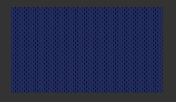
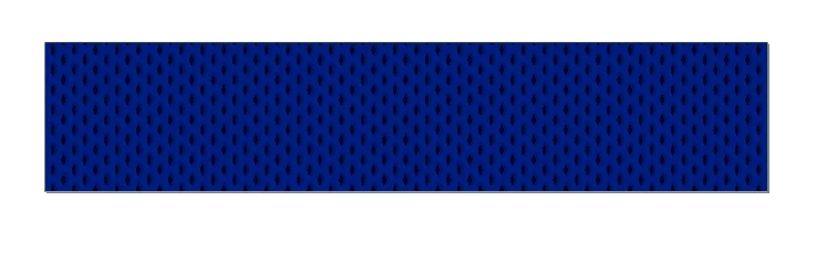
I am working with a provided .psd file from a client to use as a background in signage design, as seen in the first image below. The document is in cmyk. We create our signage in illustrator, so I pull the .psd into illustrator and design from there. There are slight color changes from photoshop to illustrator, but nothing to bat an eye at. However, whenever I finish my designs in illustrator and export the document as a .pdf file, if the file is viewed or opened in ANY software that is not Adobe software, it looks like the second image below. Display is not the only issue, because in print we inconsistently get variations of this saturated color. I want to know how I can prevent these inconsistencies and get these cmyk color profiles in illustrator to accurately translate in print, and I don't know why they wouldn't be in the first place. This issue does not occur if we export from photoshop, so I would assume this has something to do with bringing in this .psd into illustrator and then saving, even though they both are being saved as cmyk files. Any solutions?