Puraart
Participant
February 8, 2017
Answered

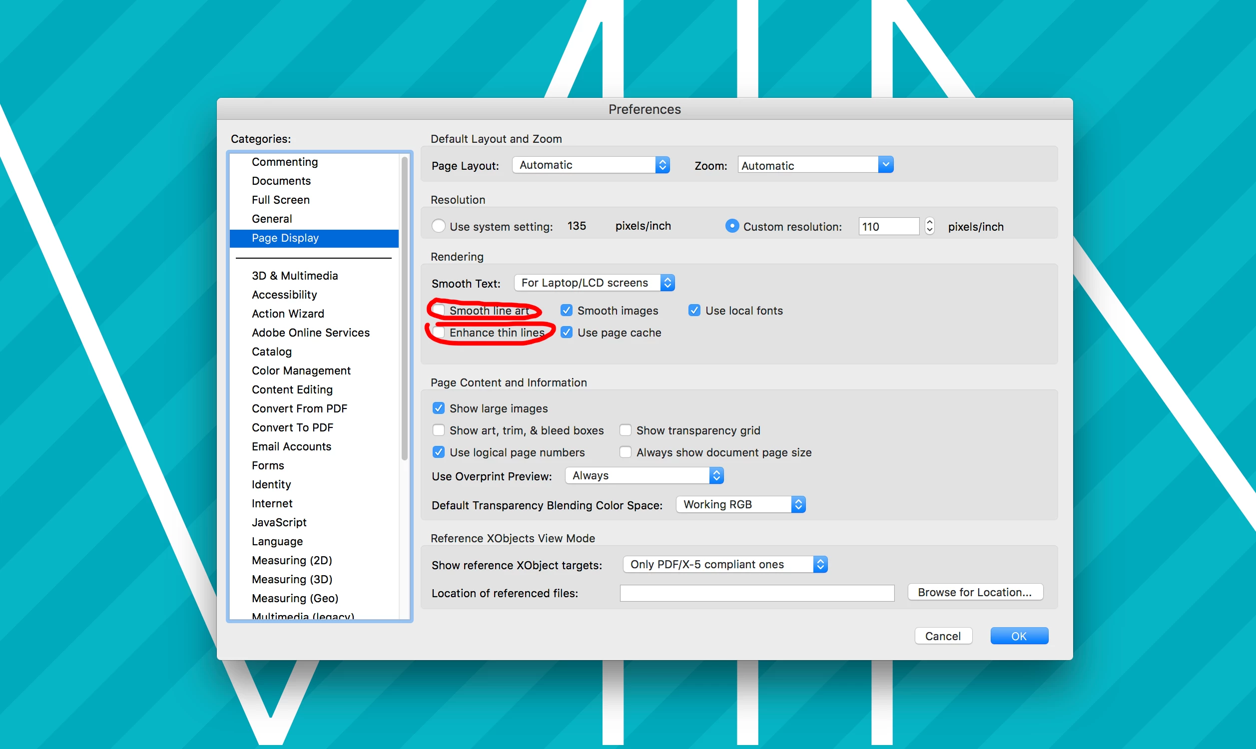
Jagged lines when I save my file

  • February 8, 2017
  • 2 replies
  • 14638 views

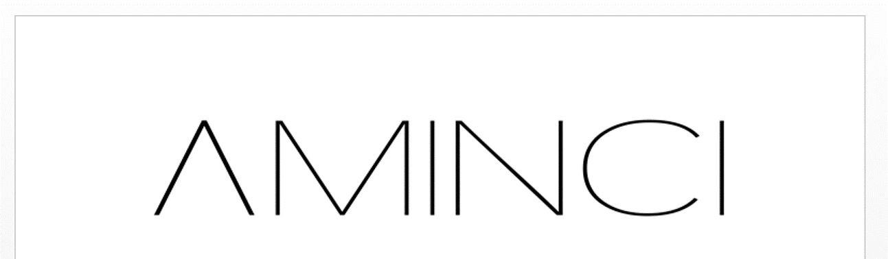
I made a logo using both font (transformed to curves) and shapes. Most of it is diagonal lines, and while they look good in illustrator and when saved as images, the lines get jagged or blurred in pdf format and in word documents or when the image is viewed in large sizes. Sometimes you can even see the pixels, and it was distorted in the brand registration document too, even though it looked fine when it was first uploaded.

I saved the images in png format with the highest possible ppi (2400), high resolution export settings and large dimensions (7790x2089), and am not sure what else to do to fix it. Does anyone know why this is happening?

PNG Image (slightly distorted already)

PNG image in a word document

    This topic has been closed for replies.
    Correct answer Mike_Gondek10189183

    So you have a .pdf that looks jagged when viewed in Acrobat.  Open the .pdf in illustrator and view at 100%.

    • if this looks good in Illustrator your problem is in your view settings in Acrobat.
    • If this looks bad in Illustrator your problem is with the pdf itself

    We do not know how you created  the your .pdf and this could even be bitmapped.. The aqua colored lines in your sample are jagged also, so at this point am doubtful this is about your AMINCI logo.

    I recreated your art and could not find any of the settings causing this to happen on Ultra Thin type.

    The ones I suspectedcoudl be part of the issues are:

    Enhance Thin Lines usually makes them bolder

    Smooth Text- Specifies the type of text-smoothing to apply.

    Smooth Line Art- Applies smoothing to remove abrupt angles in lines.

    Smooth Images- Applies smoothing to minimize abrupt changes in images.

    Please provide a sample of your file, and tell us what settings you used to create your .pdf.

    2 replies

    Kris Hunt
    Legend
    February 8, 2017

    PNG Image (slightly distorted already)

    I am seeing no distortion of jagginess whatsoever on my Retina screen.

    Mike_Gondek10189183
    Community Expert
    Community Expert
    February 8, 2017

    What is your final output device for this image, why are you going with .png? We need to know whether the purpose of this is for printing, or a digital display.

    When you look at bitmapped images you want to review at 1 pixel data  to 1 pixel of digital monitor, otherwise 100% view in Photoshop. I do not see any problem with the images you posted, but then I do not know exactly how you viewed the image, as you may have bene zoomed in or out.

    If you were to output this as a vector to make plates your resolution is typically between 2400 dpi and 3396 dpi for linework and 300dpi for continuos tone.

    Puraart
    PuraartAuthor
    Participant
    March 3, 2017

    @ Mike Gondek2

    Hi Mike

    The purpose is digital display, I'd use the vector format for printing.

    Got some screenshots from how it looks in pdf format, which is my biggest problem - the ones I sent before were mostly fine, just a bit blurry. These are zoomed in views and a 100% view, all of them looked very jagged, as opposed to normal fonts in the same document. (This was a PowerPoint converted to PDF, with the logo in PNG format)

    I'm worried that this is some problem with the logo itself and not just the visualization, and that it will affect future materials both in digital display and print. It could be just the PDF display, since the background lines are supposed to be straight too and also appear jagged, but I haven't had this problem with any other logo I've ever used.

    Mike_Gondek10189183
    Community Expert
    Mike_Gondek10189183Community ExpertCorrect answer
    Community Expert
    March 4, 2017

    So you have a .pdf that looks jagged when viewed in Acrobat.  Open the .pdf in illustrator and view at 100%.

    • if this looks good in Illustrator your problem is in your view settings in Acrobat.
    • If this looks bad in Illustrator your problem is with the pdf itself

    We do not know how you created  the your .pdf and this could even be bitmapped.. The aqua colored lines in your sample are jagged also, so at this point am doubtful this is about your AMINCI logo.

    I recreated your art and could not find any of the settings causing this to happen on Ultra Thin type.

    The ones I suspectedcoudl be part of the issues are:

    Enhance Thin Lines usually makes them bolder

    Smooth Text- Specifies the type of text-smoothing to apply.

    Smooth Line Art- Applies smoothing to remove abrupt angles in lines.

    Smooth Images- Applies smoothing to minimize abrupt changes in images.

    Please provide a sample of your file, and tell us what settings you used to create your .pdf.