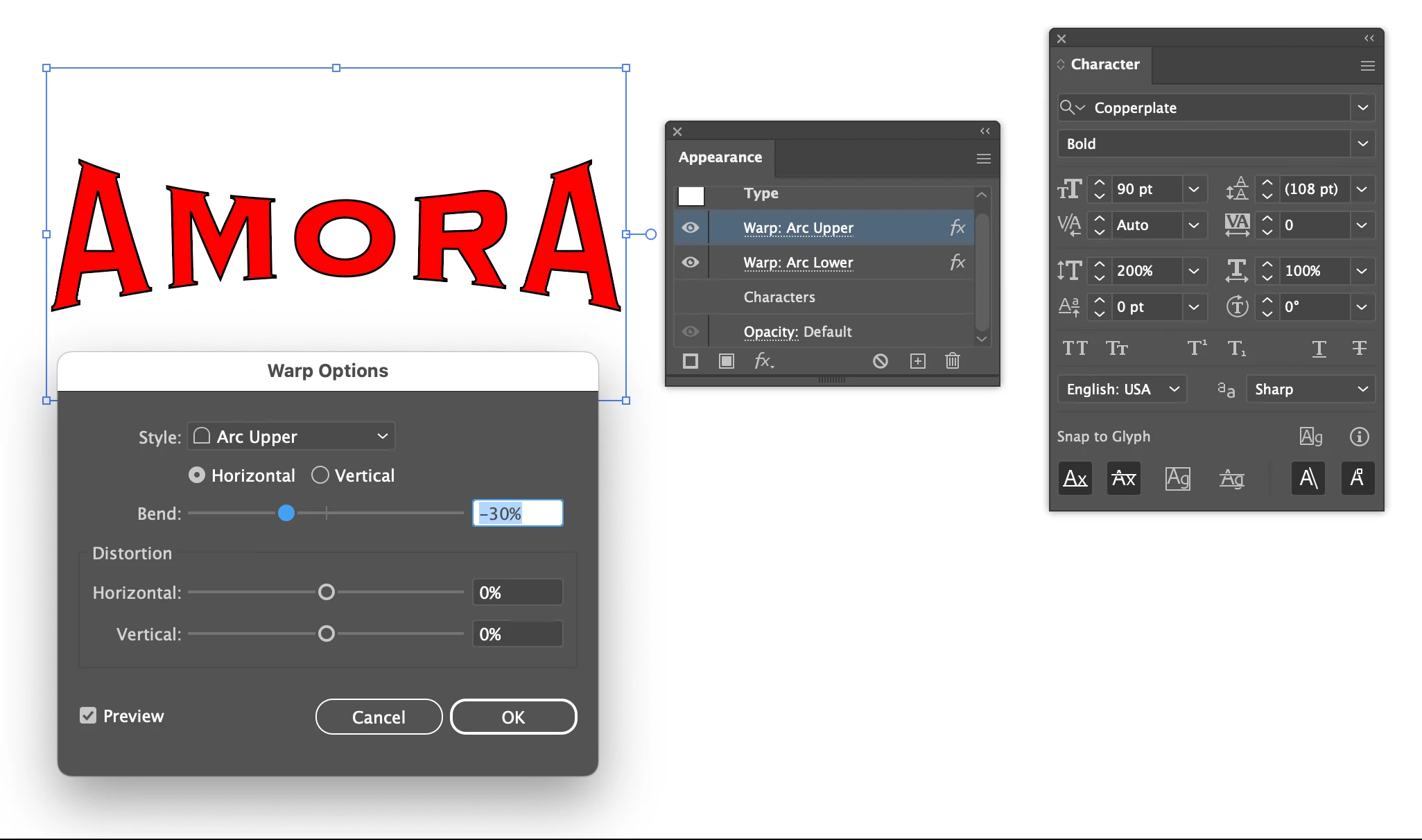
I'm trying to achieve a specific effect on a word for a logo design, but I'm struggling to get the result I want. I've tried using the Warp tool without success.
If anyone has any advice or suggestions, I'd really appreciate your help.
Based on the way the "Amora" letters appear in the posted PNG image it looks like they were drawn manually. Even though the letters appear warped the letter strokes are still fairly uniform, which is impossible to maintain via any distortion effect. The middle cross bar on the "R" is at an upward angle even though it is at a position where the angle should be going horizontal or downward. The blue outline around the letters is also uniform in thickness, along with having sharp serif points at various locations. The only way to duplicate the lettering accurately is by tracing it manually.
If Envelope with warp doesn't work, then probably you have to do it manually. The envelope will always also cause some unwanted distortion. It would help if you could post your result and tell us what specifically you do not like.



 AdChoices