
Participant
October 13, 2022
Answered

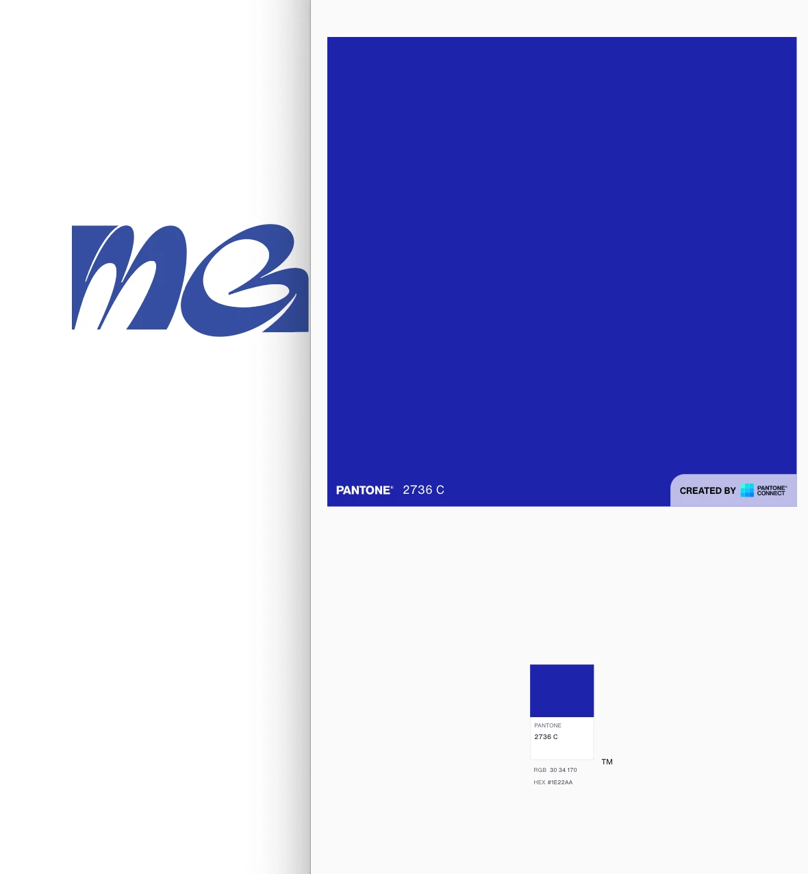
My color in illustrator is not as saturated as it should be. How do I fix?

  • October 13, 2022
  • 3 replies
  • 637 views

You can see the illustrator version of this PMS color is faded. See attached  screenshot. I've tried to update my color setting based on other discussion advice, but it still doesn't look as saturated and vibrant.


Thanks!
This topic has been closed for replies.
Correct answer barbara_a7746676

Some things to check:

Transparency setting that is less than 100%

Transparency set to Normal

If Illustrator file RGB or CMYK

3 replies

Monika Gause
Community Expert
Community Expert
October 13, 2022

Are you going to print this using a spot color?

This color will only be vibrant when viewed on screen or when printed using a spot ink on an adequate paper stock.

Ton Frederiks
Community Expert
Community Expert
October 13, 2022

Did you check Overprint Preview? 

Overprint Preview gives a better approximation of the spot color on screen.

barbara_a7746676
Community Expert
barbara_a7746676Community ExpertCorrect answer
Community Expert
October 13, 2022

Some things to check:

Transparency setting that is less than 100%

Transparency set to Normal

If Illustrator file RGB or CMYK

Participant
October 14, 2022

Thank you! RGB changed it.