Lukek123
Inspiring
March 23, 2021
Answered

Pantone Colours brighter in overprint view?
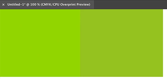
  • March 23, 2021
  • 2 replies
  • 2672 views

Hi all,


I am working on a design in Illustrator which uses Pantone Solid Coated colours, I am in CMYK colour mode as the artwork will be printed across packaging.

However when I either

  • save out as a PDF in PDF/X-4:2010
  • OR click Overprint Preview

the colours appear brighter on the document, why is this? As I assume they will not print this way but just curious as to why this occurs?


As when I save the PDF out in PDF/X-4:2010 but change the output colour conversion to Document CMYK - Coated FOGRA39, the colours appear as they should on the PDF.


Can anyone help?


Thanks in advance!

This topic has been closed for replies.
Correct answer Ton Frederiks

Overprint Preview tries to show your spot colour as accurate as possible.

Normal preview shows how the spot would look when converted to CMYK.

2 replies

Ton Frederiks
Community Expert
Ton FrederiksCommunity ExpertCorrect answer
Community Expert
March 23, 2021

Overprint Preview tries to show your spot colour as accurate as possible.

Normal preview shows how the spot would look when converted to CMYK.

Lukek123
Lukek123Author
Inspiring
March 23, 2021

Hi Ton,


So when you are in CMYK colour mode the only way to truely see how the Pantone will look is to go into the Overprint Preview? However the print will look as it does in normal view as it would be printed in CMYK?


Thanks for the response

Ton Frederiks
Community Expert
Community Expert
March 23, 2021

Pantone colors are special mixes of special inks to achieve colors that are not possible with normal CMYK inks and Overprint Preview simulates those inks on your screen.

When printed on a printing press they are added to the 4 process colors as a special ink.

When printing on a color printer they are simulated with the inks in the color printer.

Monika Gause
Community Expert
Community Expert
March 23, 2021

When you print them,  you will use the Pantone ink. So it depends on the quality of the ink and substrate.


In Overprint preview, Illustrator tries to emulate that.

Lukek123
Lukek123Author
Inspiring
March 23, 2021

Hi Monika,


Thanks for getting back to me, just seemed VERY bright if it is meant to be emulating a print it looked more like a RGB colour. However I have noticed it is not every Pantone colour, for example 1797 C red does not change however 375 C does change. Why is it that certain colour change and others don't?


Thanks!

Monika Gause
Community Expert
Community Expert
March 23, 2021

Is your color management set up accordingly? That is important.


Illustrator just uses the Lab definitions provided by Pantone. So why does one color rendered more brightly, nobody can know but Pantone.