till hufmann
Participant
October 19, 2019
Question

Pixel preview with strange results

  • October 19, 2019
  • 1 reply
  • 134 views

On the screenshots below you can see some icons i made in pixel preview and normal view (gpu and cpu dont show a difference). The top row is a black shape with a symbol subtracted from it. Under that you see the same design, but the symbol is not subtracted but a white shape layed over it. in normal view (bottom two rows) they look the same (as they should on a white background) in pixel preview(top two rows) the white symbols look fatter. How does this happen? And what can i do about it?
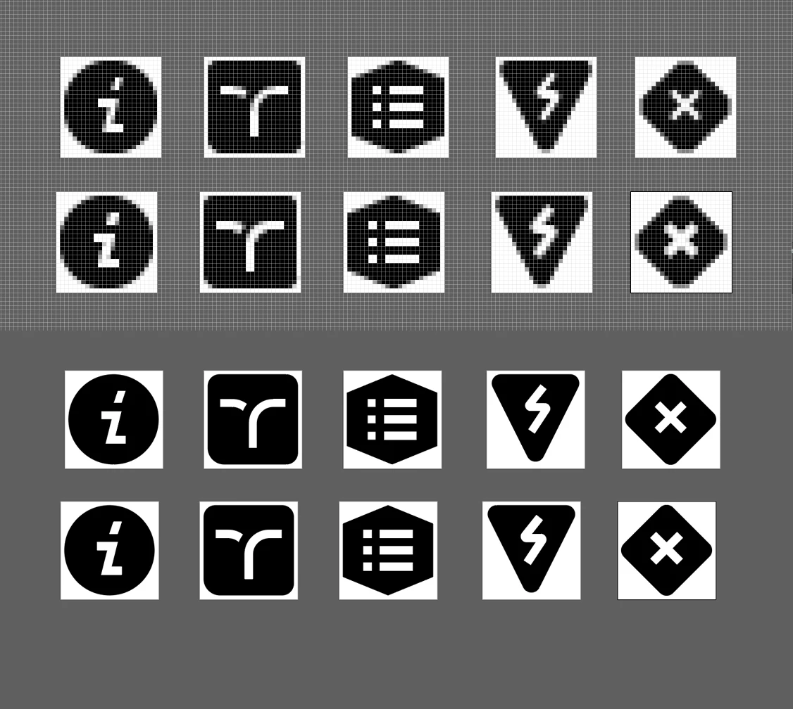
Thx for your time,

Till

    This topic has been closed for replies.

    1 reply

    Monika Gause
    Community Expert
    Community Expert
    October 20, 2019

    It looks like Illustrator applies antialiasing to the outside of the shape. So if you have a white shape it gets bigger. But if you have subtracted the negative shape from the black, then the black gets bigger.

    To summarize: you need to create your icons using the same technique.

    till hufmann
    Participant
    October 20, 2019

    Hmm, I see... I need a transparent and an opaque version... so I will need to put a white shape behind the transparent ones to make them look identical...