Muhammad Sattar
Known Participant
Nov 4, 2026 5:17 AM UTC
Answered

Spot White separation

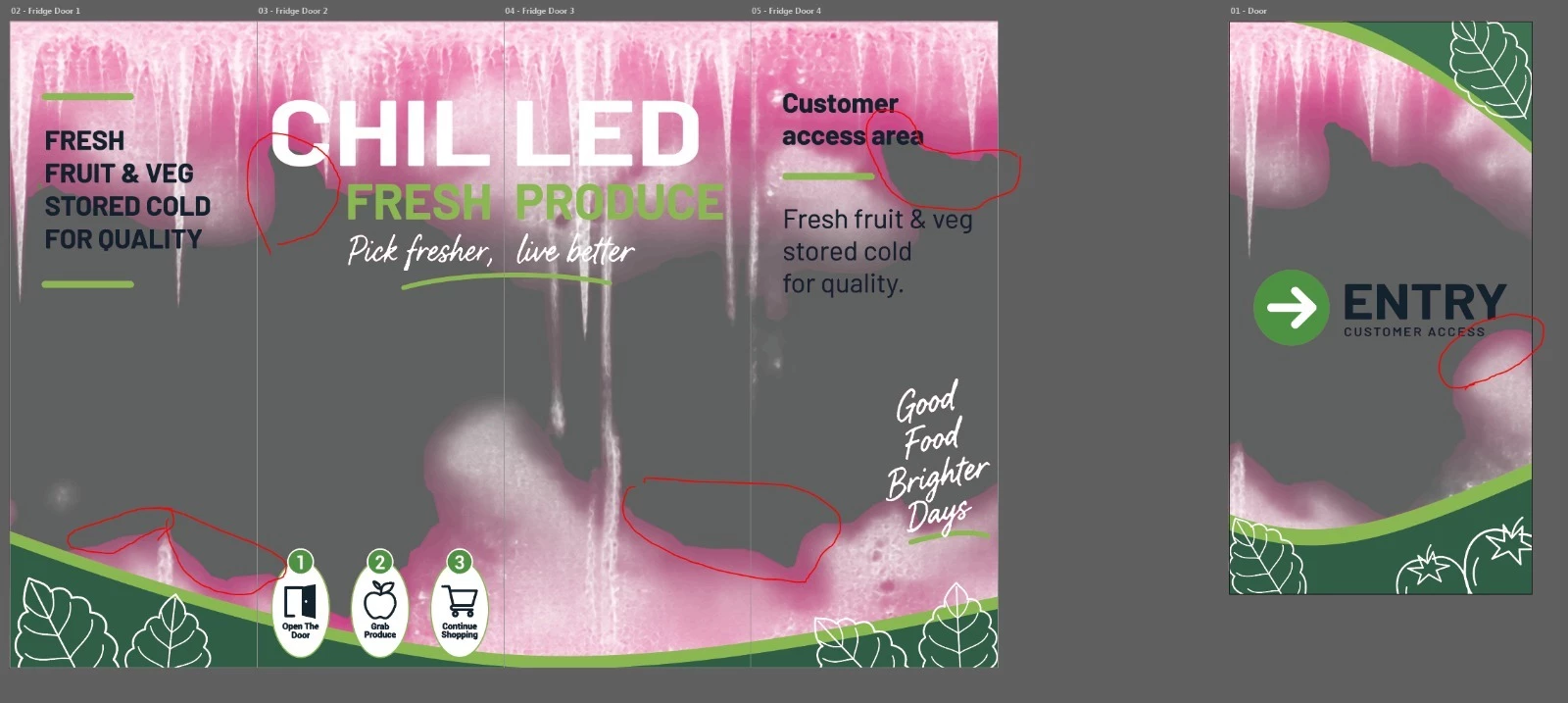
Hi everyone, I have a client project involving an existing Illustrator file for large format printing on glass fridge doors.

The design is complete. The client needs the Spot White separation to match the frosting effect, including solid areas and fading sections.

How would you recommend setting this up correctly in Illustrator for print production? Should the fading areas be handled using gradients, halftones, or another technique?

I'd appreciate advice from experienced prepress and print production professionals. Thanks!


    CORCTON34033231
    CORCTON34033231Correct answer
    Community Expert
    Nov 4, 2026 6:00 AM UTC

    Hi, yes — for white ink on glass, use a spot color, not a process (CMYK) color. White ink is a separate premixed ink, so it gets its own plate.


    1. In the Swatches panel, create a new spot color swatch, and name it exactly as your printer specifies (often just "White" — check with them first, as the name has to match their workflow).

    2. Use that spot color at 100% for solid white areas. For the fading areas, build a gradient from the same spot color, with stops at different tints (for example 100% to 0%). You don't draw halftone dots yourself — the gradient's tint values become the halftone on the white plate at output.

    3. Set overprint per object in the Attributes panel (Overprint Fill): turn it on where the white must print over other artwork, and leave it off where it should knock out instead. Then check it with Window > Separations Preview, with Overprint Preview on, toggling the white plate on and off.

    4. Keep the spot color intact when you send the file — don't convert it to CMYK — and confirm the plate setup with your printer, as they set the screen/halftone details at their end.


    Helpful Adobe docs:

    https://helpx.adobe.com/illustrator/using/printing-color-separations.html

    https://helpx.adobe.com/creative-cloud/apps/colors/spot-and-process-colors.html

    3 replies

    Community Expert
    Nov 5, 2026 3:47 AM UTC

    You should talk to the people who will do the large format printing work. Different printers and large format RIP applications may vary on how art files need to be set up for printing white ink as a spot color or “sandwiching” layers of white ink and layers of color for backlit displays and signage.

    Generally, any objects intended to be printed white will need to have a custom named spot color assigned to it. For example, I’ll use a user-defined “Spot1” named color to apply to objects that I want Onyx Thrive to output in white ink. I usually have to set the fill to overprint and even do counter-intuitive things with object stacking order. Anyway, it’s best to talk to the people who will do the print work.

    Translate
    Community Expert
    Nov 4, 2026 7:39 AM UTC

    Just to add to the advice already given by ​@CORCTON34033231 , it's quite common in prepress to use a contrasting colour for Spot White rather than displaying it as white in Illustrator.

    For example, you could create a Spot White swatch and make it ORANGE (in this case) on screen. That makes it much easier to identify the areas intended for white ink, particularly against a white artboard or transparent areas. The actual colour you see in Illustrator isn't necessarily the ink that gets printed. The printer's RIP maps the correctly named spot colour to the white ink channel, so check the naming convention with them.

    For the fading sections, I'd use tints of the same spot colour rather than reducing the object's transparency. For example, a gradient from 100% Spot White down to 0%, keeping the object's opacity at 100%. It's worth checking with the printer how their RIP handles spot-colour gradients.

    I'd also establish exactly what the client means by a frosting effect. A solid white ink isn't necessarily going to produce the appearance of etched or frosted glass. The opacity, screening and ink coverage will all influence the result.

    One other consideration is whether they're printing on the front or reverse of the glass, as that can affect the artwork orientation and print sequence.

    And I'd definitely recommend a physical proof, ideally with several different percentages of white ink on the actual glass. What looks like a smooth fade on screen might produce quite a different result once printed.

    Translate
    CORCTON34033231
    Community Expert
    CORCTON34033231Community ExpertCorrect answer
    Community Expert
    Nov 4, 2026 6:00 AM UTC

    Hi, yes — for white ink on glass, use a spot color, not a process (CMYK) color. White ink is a separate premixed ink, so it gets its own plate.


    1. In the Swatches panel, create a new spot color swatch, and name it exactly as your printer specifies (often just "White" — check with them first, as the name has to match their workflow).

    2. Use that spot color at 100% for solid white areas. For the fading areas, build a gradient from the same spot color, with stops at different tints (for example 100% to 0%). You don't draw halftone dots yourself — the gradient's tint values become the halftone on the white plate at output.

    3. Set overprint per object in the Attributes panel (Overprint Fill): turn it on where the white must print over other artwork, and leave it off where it should knock out instead. Then check it with Window > Separations Preview, with Overprint Preview on, toggling the white plate on and off.

    4. Keep the spot color intact when you send the file — don't convert it to CMYK — and confirm the plate setup with your printer, as they set the screen/halftone details at their end.


    Helpful Adobe docs:

    https://helpx.adobe.com/illustrator/using/printing-color-separations.html

    https://helpx.adobe.com/creative-cloud/apps/colors/spot-and-process-colors.html

    Translate