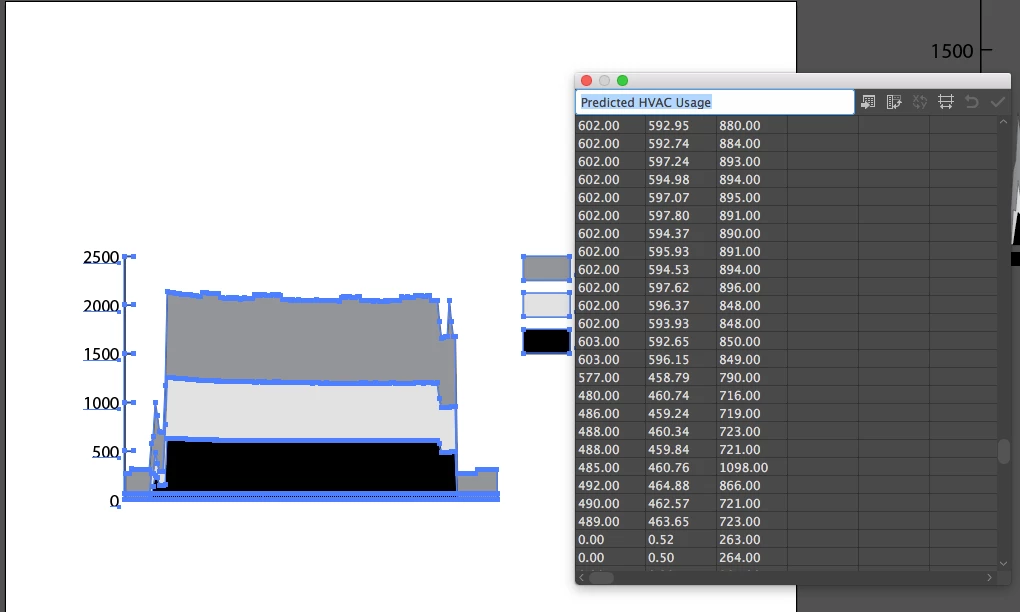
"Stacked" Area Graph?
I have three categories that I want to overlay on top of one another for exact comparisons. I see on the adobe instructions page it says
Area graphs
Values must be all positive or all negative. Each row of data entered corresponds to a filled area on the area graph. Area graphs add each column’s values to the previous column’s totals. Therefore, even if area graphs and line graphs contain the same data, they appear substantially different."
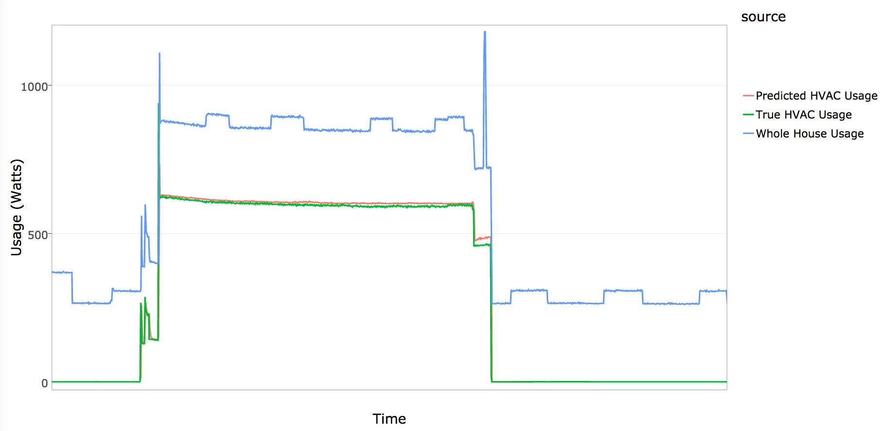
Is there NO option to allow you to overlay this data without it distorting your data/graph? If you look at the graph it has created with my Data you can see that the values of light grey and black should be VERY similar, and that the MAX number on my chart should be 1098. But this is NOT what is displayed in the graph. This essentially makes this tool useless. The other capture is approx what it SHOULD be looking like as it was captured in the data tracking program the data came from (but we can't export this in an image suitable for print, plus its ugly.) The only thing I have figured out so far is to make 3 separate graphs and layer them all on top of one another. This is not efficient when you have many to make.