Cushion Print Management
Participant
October 23, 2017
Answered

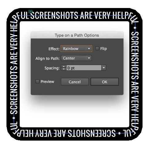
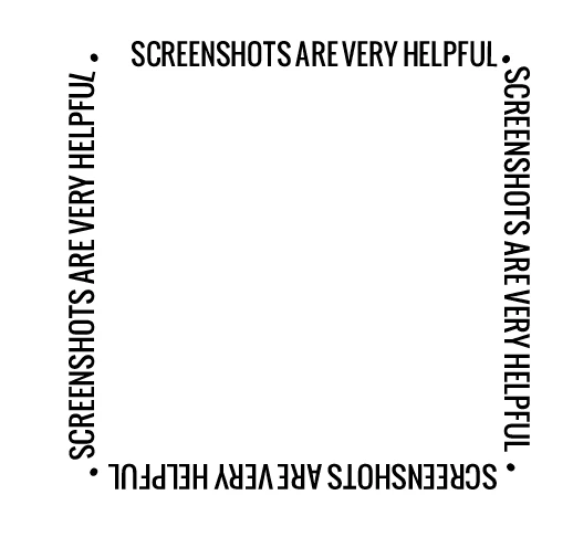
Text on an unusual curve

  • October 23, 2017
  • 6 replies
  • 742 views

Hi Forum

I hope you can help me?

I'm creating artwork for a square drinks coaster. It's 95mm square and with 25% radius corners.

The problem is that when i create the text on the curve it visually looks so wrong!

Letters are splayed out and look very awkward.

is there a way around this so that the letters visually look spot on?

Many thanks

Sammi

    This topic has been closed for replies.
    Correct answer Mike_Gondek10189183

    Make sure you are familiar with

    type >> type on a path > options

    this is very useful when making type follow a path.

    If you have tight curves is hard to make look good, so we really need to see what you are working on.

    As mentioned use manual kerning, tracking or horizontal scaling can help adjust or hide what is going on in the corners.

    6 replies

    barbara_a7746676
    Community Expert
    Community Expert
    October 23, 2017

    The larger the point size of the type and the more acute the radius on the corners, the more difficult to make the type look even. You may even need to do a little tweaking with the Touch Type tool.

    If you can manage it with the text you need to work with, Mike Gondik's idea to avoid the issue altogether would be a clever way to go.

    Mike_Gondek10189183
    Community Expert
    Mike_Gondek10189183Community ExpertCorrect answer
    Community Expert
    October 23, 2017

    Make sure you are familiar with

    type >> type on a path > options

    this is very useful when making type follow a path.

    If you have tight curves is hard to make look good, so we really need to see what you are working on.

    As mentioned use manual kerning, tracking or horizontal scaling can help adjust or hide what is going on in the corners.

    barbara_a7746676
    Community Expert
    Community Expert
    October 23, 2017

    Its normal for text on a curve to not look quite right, because all the kerning and tracking values built into a font are optimized for standard straight text.

    As Debbie suggested, you'll need to adjust the kerning values. You could start by selecting all the text and changing the kerning to Optical or Metrics (instead of Auto, which is the default). That should give you an improvement. If you need to tweak the kerning values further, click an insertion point between two characters and adjust accordingly..

    Participating Frequently
    October 23, 2017

    Try working with the various options in the Character panel, such as kerning and leading to correct the spacing.

    sishamIAGD
    Community Expert
    Community Expert
    October 23, 2017

    Can you supply a screenshot of your problem so we can best advise?

    kglad
    Community Expert
    Community Expert
    October 23, 2017

    is this an illustrator question?

    Cushion Print Management
    Participant
    October 23, 2017

    Any Adobe to be honest. Seems to happen in Illustrator, InDesign and Photoshop.

    Steve Werner
    Community Expert
    Community Expert
    October 23, 2017

    You're in the wrong forum. We need to know the application so we can send your question to the proper forum for an answer.