Known Participant
April 15, 2025
Answered

Turning raster logo into vector

  • April 15, 2025
  • 3 replies
  • 1856 views

I am having trouble turning my jpeg and png into linework (vector art) in Illustrator. When I hit image trace, I get this. Tried both files (jpeg and png)


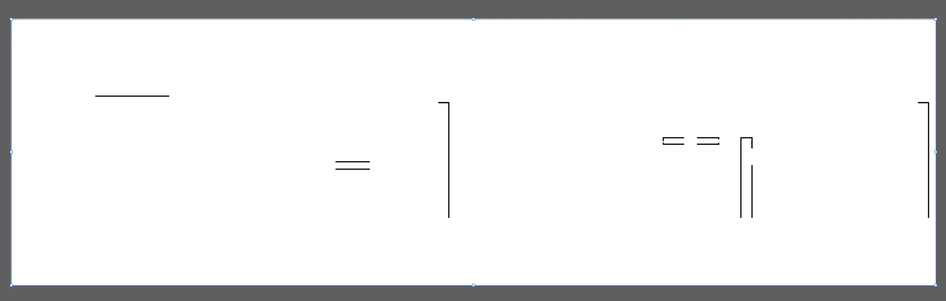
Then I went into Photoshop and removed the background. Imported it in illustrator and got this result. A little bit better but the type is a little wonky and needs alot of work.


Correct answer Monika Gause

THis one could fit: https://www.myfonts.com/de/collections/niveau-grotesk-font-hvd-fonts?queryId=undefined&index=universal_search_data&objectIDs=5458406002


I think the type in your logo is stretched.

3 replies

Brad @ Roaring Mouse
Community Expert
Community Expert
April 17, 2025

The font is Niveau Niveau Grotesk Light, stretched horizonatlly to 134% (give or take)

That being said, as an FYI, the logo is available in vector in several places on the Plastral website. I think you're making unnecessary work for yourself.

Here it is. Pantone 3395, btw

Known Participant
April 17, 2025


Thanks for the heads up! I actually did check the Plastral website earlier and looked through a few different sections, but unfortunately I wasn’t able to find a usable vector version of the logo.(Only a png.) 

Yes! I did waste a ton of time, but I also learned a few new things-so I'll take it as a win. I don't know where you found this logo on their website?  Mine version turned out pretty good, but I will definately use this one on my project.

Much appreciated! Thank you ☺


Brad @ Roaring Mouse
Community Expert
Community Expert
April 17, 2025

PDFs on the website are a great source. In this case, I extracted it from their main catalogue available there.

Tina_Irvine
Community Expert
Community Expert
April 15, 2025

Hi @Michelle243007171z7l,

You could try to bump up the contrast before image tracing it; however, it might be easier, and a better end result, if you try to match the typeface with "retype" in Illustrator (or "match font" in Photoshop since you mentioned that you also have this app), and redraw the icon yourself.

Known Participant
April 15, 2025

Thank you, I tried that, but found no matching fonts. That's a great idea if the font matched.

I did change the green to black and that seemed to help a bit. As you can see in the comment above. I don't know which is worse. Auto trace or my attempt to draw it. Seems like such a simple logo that illustrator should have no problem with it.🧐

Community Expert
April 15, 2025

Live tracing gives, at best, only quick and dirty results. Live tracing isn't bad to use on hand-drawn/sketched elements or other "organic" shapes. It doesn't work so great on lettering (unless someone wants the lettering to have a somewhat grungy, stressed appearance).


The "Plastral" letters look like they've been horizontally stretched out of their normal proportions. That will throw off any font ID tools, such as Retype in Illustrator or the What the Font tool at MyFonts.com. The letters do look familiar yet a bit odd; I suspect the font that was was something from a free fonts site like DaFont.

Monika Gause
Community Expert
Community Expert
April 15, 2025

After autotracing it, it makes no sense at all to open it back in Photoshop.


This is best traced manually. But if you want to do it automatically: first make the green black.

Then trace black and white. Ignore white.

THen expand the autotrace and make it green in Illustrator.

Known Participant
April 15, 2025

I don't know what is worse. My illustrating pen tool skills or illustrator's image trace.

illustrator:


mine 


this is not a program I work in very often. I was really hoping Illustrator would trace it better😕😕

Thank you for your help.

Participant
September 15, 2025

In my experience, Live Trace is a bit of a double-edged sword — it's great for quick, rough conversions but rarely delivers polished results. It's decent for tracing hand-drawn sketches or loose, organic artwork where precision isn't the priority. But when it comes to lettering? Especially if you're aiming for clean, sharp lines — Live Trace tends to make things look a bit distressed or grungy, which might work for certain aesthetics but usually misses the mark for typography.

Now, about the "Plastral" text — it looks like the letters have been stretched horizontally, messing with their natural proportions. That kind of distortion throws off font recognition tools like Illustrator’s Retype or MyFonts' WhatTheFont. These tools rely heavily on accurate shape and spacing, so any warping makes identification a guessing game at best.