Participant
November 20, 2024
Question

Warp Bottom to a point

  • November 20, 2024
  • 3 replies
  • 785 views

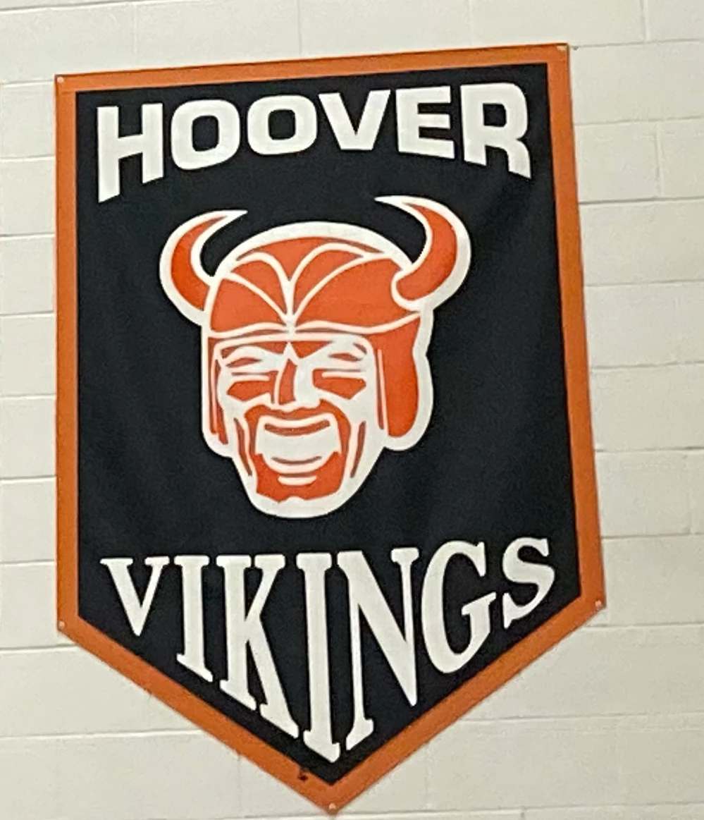
Can anyone give me insight on how to warp or create text (VIKINGS) like this sample?

Thank you

This topic has been closed for replies.

3 replies

kphotopage
Legend
November 21, 2024

David, hi.

Here I am working with live type.

I used Object>Envelope Distort>Make with Warp.

I used Arc Lower, then made a few adjustments.

Just took moments.


K

Participant
December 3, 2024

Hi, 

Hi Barbara,

Thank you for your input. That's what I thought about using but using arc lower, it's rounded. I'm not sure how you get it to come to the bottom point straight. How did you do that?

barbara_a7746676
Community Expert
Community Expert
December 3, 2024

After you use Arc Rounded, add a new mesh line using the Mesh tool. If you don't see the Mesh tool, click the 3 dots at the bottom of the Tools panel and choose Advanced.

With the Mesh selected, select the Mesh tool and click in the center to add a new mesh line.

With the Anchor Point tool, click the bottom center anchor point.

With Pen tool, you can hold down Alt (Windows) or Option (Mac) and individually manipulate the handles that stick out on the left and right.

You can also repolition the anchor, but it is a delilcate situation so be careful as you are manipulating handles and anchor points.

barbara_a7746676
Community Expert
Community Expert
November 21, 2024

Try using KITTL instead of Illustrator.

Participant
December 3, 2024

Hi Barbara,

Thank you for your input. That's what I thought about using but using arc lower, it's rounded. I'm not sure how you get it to come to the bottom point straight. How did you do that?

Monika Gause
Community Expert
Community Expert
November 20, 2024

You've got the have luck to nail that with an envelope.

Much easier when you outline the text, then split it up in two, and then use the free transform tool.

Community Expert
November 21, 2024

That's how I would tackle it. Although some manual re-drawing of glyphs is probably still going to be required to make parts of the letters look more natural.