Sam Miller
Participant
September 24, 2026
Answered

What is the best way to prepare packaging artwork for print in Illustrator?

  • September 24, 2026
  • 6 replies
  • 76 views

I’m working on packaging artwork in Adobe Illustrator and want to make sure the files are properly prepared before sending them to a professional printer.

I’m mainly trying to understand the best workflow for:

  • Setting up the correct document size and bleed

  • Using CMYK colors correctly

  • Handling spot colors when needed

  • Preparing dielines and keeping them separate from artwork

  • Checking images and fonts before exporting

  • Choosing the right PDF export settings for printing

For those who regularly prepare packaging or print-ready artwork in Illustrator, what workflow and export settings have worked reliably for you?

I’d especially appreciate advice on avoiding common prepress issues that only become apparent after the file reaches the printer.

Correct answer Dave Creamer of IDEAS

FIRST, ALWAYS TALK TO THE PRINTER.

Correct document size is a must. Anything that touches the edge of the document needs to extend past the edge 1/8 inch (3.2 mm). Set the bleed when setting up the document. 

Use only [edit: global] CMYK colors in a CMYK document. Avoid Pantone Solid colors unless you have the CMYK conversion numbers, keeping in mind that many of the colors look a lot duller in CMYK. Avoid RGB colors for the same reason. 

If using a TRUE spot/solid color, make sure it uses the same color system the printer uses. In the USA, it’s mainly Pantone. Spec them as spot, not process. Warn the customer that monitors and proofs may not show the color accurately. 

For dielines or die-cuts, create a custom layer and a custom spot color and name them appropriately. For example: “Dieline” would work for both. Create the line with the pen tool at about .5 pt; make sure the stroke is set to the Dieline spot color (no fill) and on the Dieline layer. Lock the layer when done. 

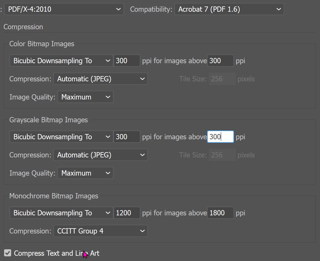
I always like to check the images in Photoshop before I place them. Depending on what you are printing, I use about 225-300 ppi (89-118 ppcm) at final size. I prefer linking them rather than embedding them. Illustrator has a Package feature to collect everything and they will be included in the final PDF.

A PDF/X-4 is the best option if the printer supports it. For compression, I use the following (but check with your printer):

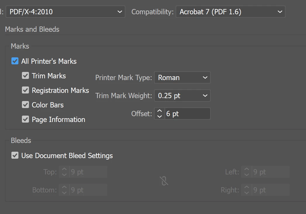
Check with the printer to see if they want all the marks turned on.

Leave color conversion set to No Conversion. Set the output intent to whatever the printer suggests.


Note: My metric conversions were done with google, so I may be off.

6 replies

Monika Gause
Community Expert
Community Expert
September 25, 2026

Depending on what kind of packaging it is, there might be additional requirements, particularly for placed images. Also: names for files, groups, layers, swatches might need to be very specific. You definitely need to ask your printer for accurate specifications. Do not jump past the step of asking the printer. It is professional behaviour to ask them, no need to feel ashamed for asking.

And: make sure to delete everything from the file that is not to be printed (this applies to sketches as well as helper objects used during layout. Do not just hide them - delete them)

Participating Frequently
September 25, 2026
  • Setting up the correct document size and bleed

    • Bleed is usually 3mm (in Europe), but depending to your specific production

    • Please speak to your “professional printer”; he will help you.

  • Using CMYK colors correctly

    • Use global Colors in Illustrator. But there are no «incorrect» CMYK colors

    • Please speak to your “professional printer”; he will help you.

  • Handling spot colors when needed

    • It’s a matter of budget, and again your specific need

    • Please speak to your “professional printer”; he will help you.

  • Preparing dielines and keeping them separate from artwork

    • Use a separate layer and use a spot color called «Dieline».

      • Please speak to your “professional printer”; he will help you.

  • Checking images and fonts before exporting

    • Why? If you export a PDF… (Or just juse «Packaging» in Illustrator)

    • Please speak to your “professional printer”; he will help you.

  • Choosing the right PDF export settings for printing

    • PDFX-4 is it. Or ask for the correct settings

    • Please speak to your “professional printer”; he will help you.

PS: I would recommend you an apprenticeship or an internship. It’s primarily about product usage here, not technical expertise.

Dave Creamer of IDEAS
Community Expert
Community Expert
September 25, 2026

Please check replies before posting. Most of this was mentioned. 

David Creamer: Community Expert (ACI and ACE 1995-2023)
Ton Frederiks
Community Expert
Community Expert
September 25, 2026

​@Sam Miller Packaging  workflow is not easy to decribe in forum posts. As David suggested: talk to your printer first. I would recommend following a training, like the ones on LinkedIn learning.

Your Crative Cloud subscription comes with 3 months of LinkedIn Premium, which includes the online courses. See Creative Cloud app > Benefits.

Sam Miller
Participant
September 24, 2026

Thanks, Dave. This is really helpful, especially the point about talking to the printer first and setting up the dieline as a separate spot color layer. The PDF/X-4 and color conversion advice is also useful. I’ll keep these points in mind when preparing packaging files for print.

Dave Creamer of IDEAS
Community Expert
Dave Creamer of IDEASCommunity ExpertCorrect answer
Community Expert
September 24, 2026

FIRST, ALWAYS TALK TO THE PRINTER.

Correct document size is a must. Anything that touches the edge of the document needs to extend past the edge 1/8 inch (3.2 mm). Set the bleed when setting up the document. 

Use only [edit: global] CMYK colors in a CMYK document. Avoid Pantone Solid colors unless you have the CMYK conversion numbers, keeping in mind that many of the colors look a lot duller in CMYK. Avoid RGB colors for the same reason. 

If using a TRUE spot/solid color, make sure it uses the same color system the printer uses. In the USA, it’s mainly Pantone. Spec them as spot, not process. Warn the customer that monitors and proofs may not show the color accurately. 

For dielines or die-cuts, create a custom layer and a custom spot color and name them appropriately. For example: “Dieline” would work for both. Create the line with the pen tool at about .5 pt; make sure the stroke is set to the Dieline spot color (no fill) and on the Dieline layer. Lock the layer when done. 

I always like to check the images in Photoshop before I place them. Depending on what you are printing, I use about 225-300 ppi (89-118 ppcm) at final size. I prefer linking them rather than embedding them. Illustrator has a Package feature to collect everything and they will be included in the final PDF.

A PDF/X-4 is the best option if the printer supports it. For compression, I use the following (but check with your printer):

Check with the printer to see if they want all the marks turned on.

Leave color conversion set to No Conversion. Set the output intent to whatever the printer suggests.


Note: My metric conversions were done with google, so I may be off.

David Creamer: Community Expert (ACI and ACE 1995-2023)