
Known Participant
August 16, 2026
Answered

What is the most efficent way to make a transitional serif?

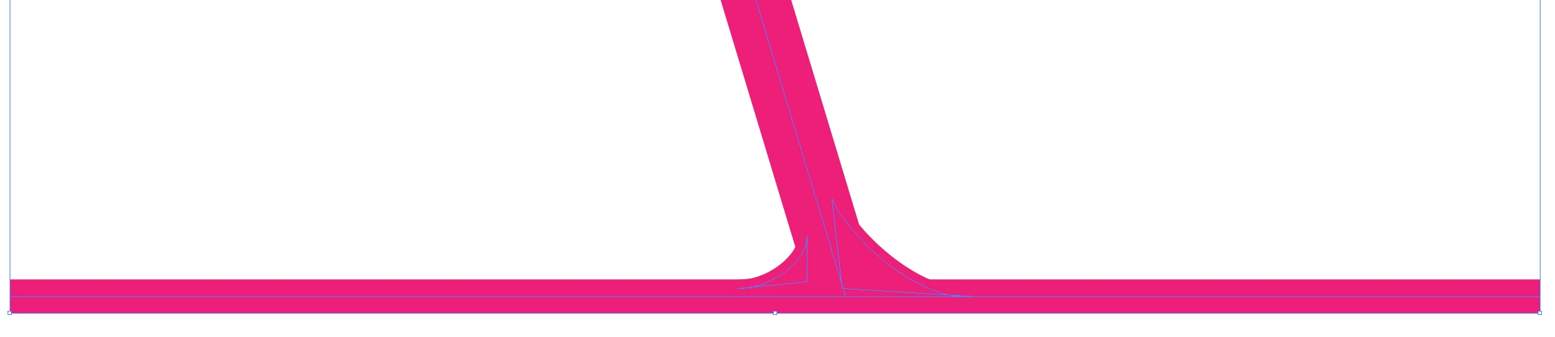
I have been using the arc tool to try to connect my serifs but they are not even when I put them on letters like “A”. Is there an better way to do this? 
 

    Monika Gause
    Monika GauseCorrect answer
    Community Expert
    August 16, 2026

    The best way is probably to use the pen tool and carefully adjust the handles.

    Also: it looks like you have a stroke on your shape. When you do not use strokes, it will be easier to snap your paths onto each other.

    3 replies

    Inspiring
    September 18, 2026

    I’d try using guides and the Align panel instead of drawing each serif manually with the Arc tool. Creating one clean serif shape and reusing or duplicating it can also help keep the proportions consistent across letters like “A”.

    Translate
    Participating Frequently
    August 16, 2026

    If you mean designing a transitional serif typeface in Adobe Illustrator, the easiest approach is to start with a classic serif reference, build consistent letter proportions, and use the Pen/Shape tools to create clean bracketed serifs. Keep the stroke contrast moderate and refine the curves with the Direct Selection tool.

    Translate
    Monika Gause
    Community Expert
    Monika GauseCommunity ExpertCorrect answer
    Community Expert
    August 16, 2026

    The best way is probably to use the pen tool and carefully adjust the handles.

    Also: it looks like you have a stroke on your shape. When you do not use strokes, it will be easier to snap your paths onto each other.

    Translate