Why does the Coca-Cola lettering feel so natural and “right”?
Two key lessons—hidden in one of the most iconic logos—can help illustrators understand why.
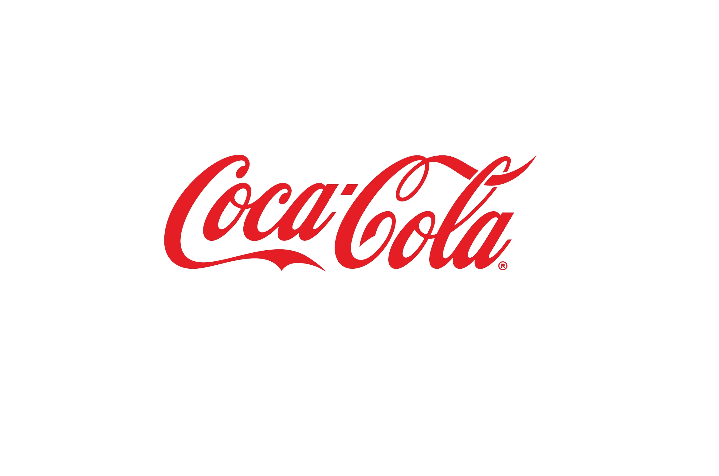
1. Consistent contrast
Look closely at the relationship between thick and thin strokes.
The contrast isn’t random—it’s controlled and repeated everywhere.
Main strokes, swashes, even the smallest cuts follow the same rule.
Those tiny details? They match the width of the thinnest strokes.
That’s what creates visual harmony.
2. Consistent modulation
Now follow the curves.
Each stroke flows from thin → thick → thin in a smooth, predictable rhythm.
And this happens across the entire word—lowercase and uppercase.
Why?
Because script lettering comes from handwriting.
To feel believable, it needs to look like it was drawn with the same tool, by the same hand.
✏️ Illustration takeaway:
If your lettering feels off, check your contrast and modulation.
Consistency—not perfection—is what makes it feel natural.