passlocks
Participating Frequently
January 31, 2023
Answered

Colors muting automatically?

  • January 31, 2023
  • 4 replies
  • 1488 views

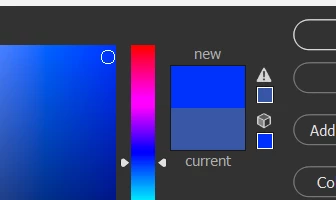
No matter how bright I try to make a color, it defults to one way less saturated and bright. Even if I click the color with the little cube on top of it. I'm a bit new to photoshop so I apologize if this is an easy fix.


This topic has been closed for replies.
Correct answer D Fosse

Actually, all these answers are correct depending on exact circumstances and what exactly you're clicking.

4 replies

D Fosse
Community Expert
D FosseCommunity ExpertCorrect answer
Community Expert
January 31, 2023

Actually, all these answers are correct depending on exact circumstances and what exactly you're clicking.

TheDigitalDog
Inspiring
January 31, 2023

The muted color is the color IN the color gamut based on either your CMYK settings or web-safe colors depending on the warning and settings. IOW, the color is too saturated for those color spaces to be reproduced. 

Author “Color Management for Photographers" & "Photoshop CC Color Management/pluralsight"
D Fosse
Community Expert
Community Expert
January 31, 2023

Yur document is CMYK and you're hitting the gamut limit in that particular CMYK color space you're using. It's the most saturated color that can be reproduced in that color space.


All color spaces have a gamut, both RGB and CMYK. The gamut boundary is a brick wall. That's where one ore more color channels hit 0 or 255 (100), and can't go any further.


All CMYK color spaces reflect real life printing processes, an offset press using real inks on real paper stock. That sets the limit.

jane-e
Community Expert
Community Expert
January 31, 2023

@passlocks 


The swatch with the triangle indicates whether or not the color is in gamut and will be printable — or not. If you select a non-printable color (as you have now) and click the triangle, it will jump to the closest printable color.


The lower swatch with the cube indicates whether or not the color is a web-safe color. It goes back to the days when monitors had 256 colors, 216 of which were websafe. Websafe colors were 0-20-40-60-80-100 percent of red, green and blue in all possible combinations.


What are you trying to achieve by selecting a websafe color? Is your final output for print or for web? What color mode are you working in?


Jane


passlocks
passlocksAuthor
Participating Frequently
January 31, 2023

That makes sense! I'm using it for web and as someone who's using photoshop for digitial art I've never ran into this with drawing programs before. I'm basically just trying to get as much saturation as possible. I messed with the settings and I got it how I want it! Thanks!!

jane-e
Community Expert
Community Expert
January 31, 2023

@passlocks 

The other responders thought you were working in CMYK, but for the web be sure you are in RGB. There is a checkbox at the bottom of the dialog that shows only websafe colors, but we haven't paid attention to websafe colors for decades.


The issue used to be that if, for instance, you used two similar shades of blue in an illustration, they would become the same shade of blue with monitors that could display only 256 colors, 216 of which were called websafe. The remaining 40 colors, btw, were not the same on macOS and Windows.


No one uses monitors with 256 colors anymore and websafe is no longer something we care about.


Jane