Participating Frequently
January 16, 2020
Question

colours get dulled down and washed out on photoshop export

  • January 16, 2020
  • 7 replies
  • 16422 views

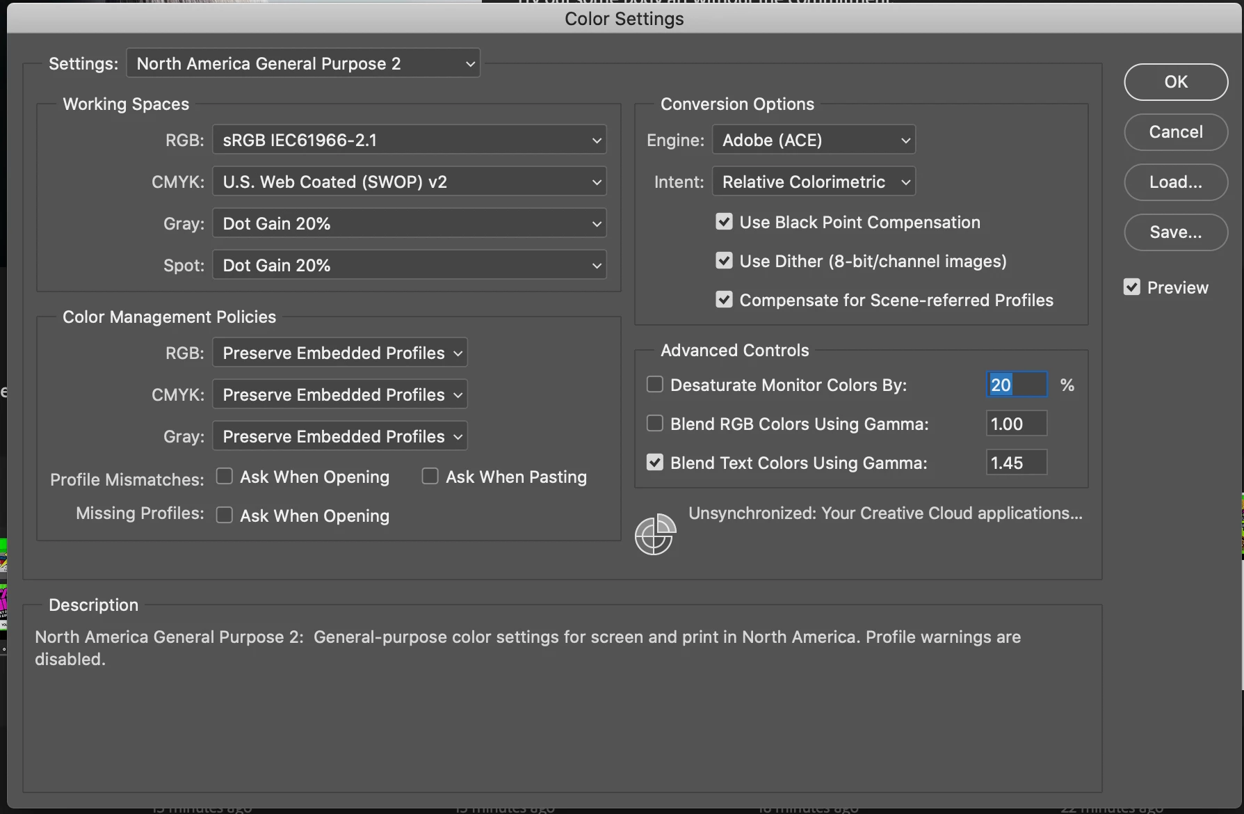
I have a photoshop issue. The colour in my RGB files are really bright and vibrant and when I 'save as' the colours remain good. But if I 'export as' the colours get dulled down and washed out as if the file was desaturated or converted to CMYK


This topic has been closed for replies.

7 replies

NB, colourmanagement
Community Expert
Community Expert
April 9, 2020

Hi

so you are working in sRGB, so you start with an sRGB image - right?

1: you 'save as' with the profile embedded (always embed the profile BTW) and re-open in Photoshop - it matches the original, great


2: you export with sRGB embedded and reopen in Photoshop - and the colour is desaturated?

is that right?


thanks

neil barstow, colourmanagement.net :: adobe forum volunteer

[please do not use the reply button on a message in the thread, only use the one at the top of the page, to maintain chronological order]


Participant
April 9, 2020

Thanks for your reply.


So I've just reopened it in Photoshop and everything seems right. On everything else, it's desaturated.


I understand that different devices will have different ways of viewing things, but this seems way off.

D Fosse
Community Expert
Community Expert
April 9, 2020

Again: Convert to sRGB and embed the profile. Done. That's it.


If you are viewing in an application without color management, it will be off in any case. Nothing to be done about that; if there is no color management, then there isn't. That's not a Photoshop problem. That's a shortcoming in that other application.


But sRGB has the highest likelihood of being roughly ballpark in most scenarios, even without color management. That's no guarantee, just a likelihood.


Always use color managed applications to view your images. Web browsers, image viewers, anything.

Participant
April 6, 2020

I seem to be having the same issue as the OP. But after testing all of the above, I don't get any difference.

My colour profiles match. I have tried enabling Legacy Compositing, flatten image before export etc.

This is all done inside Photoshop. No Windows Photo or anything was used. I have also tried all outcomes of using "Convert to sRGB" and "Embed Color Profile".


Hopefully, you can see on the attached images.

Participating Frequently
January 16, 2020

Thanks all just to let you know it is fixed and the fixed was to switch off SRGB and switch on embed colour profile on export. It may have also been a combination of this and convert profile to RGB under edit. Now my exports and as vibrant as my save as’s. Thanks for your help. Ritchie

D Fosse
Community Expert
Community Expert
January 16, 2020

A little late to this thread, but I have a nagging feeling it's not fixed at all - just swept under the carpet.


ritchies, are you still using your monitor profile as a document profile? You never answered that, but this is something you should never, ever, do. It disables all color management, removing all color references. The document profile should always be a standard color space - sRGB, Adobe RGB or ProPhoto.


If this is a newer Mac model with a P3 (wide gamut) display, disabling color management is a nuclear blast blowing all colors into the stratosphere.  In that case, converting the data to sRGB will certainly dull the colors down, because the sRGB gamut is considerably narrower than the display gamut.


Since you are using Export I assume this is for web/screen/mobile. Then you really must be in sRGB. That's what you need to post online. And you need color management to work to see that correctly on screen.


All of that's background. Here's the bottom line, and it's very simple and straightforward:

  • always keep the document in a standard color space (not your monitor profile)
  • always - always! - embed the profile
  • always convert to sRGB for web/screen/mobile
  • always make sure you have a valid monitor profile set up at system level


That's a lot of always'es - but these aren't optional suggestions. These are basics that you really need to observe.

davescm
Community Expert
Community Expert
January 16, 2020

I agree Dag - I tried posting an explanation earlier but it was ignored/misunderstood. The images probably look fine on the users own PC (i.e. the issue is indeed swept under the carpet) but will look strange elsewhere.


Ritchie take a careful read of Dag's post - he is absolutely right


Dave

davescm
Community Expert
Community Expert
January 16, 2020

You said

"I don't have those options on export"

Yes you do - scroll down and you will see them in Export As


Your screenshots show that you are using untagged images and images tagged with the monitor profile.

In colour settings check "Ask When Opening" for missing profiles. When downloading images from the web then decent tesst images should be tagged with the correct profile. If they are not, and you get the warning due to that box being checked, then it is a fairly safe bet to assign the sRGB profile to it (not the moniotor profile).


It seems that you may need to learn a little about colour management and what the various profiles are for.


Try this :

Colour Management simple explanation

Digital images are made up of numbers. In RGB mode, each pixel has a number representing Red, a number representing Green and a Number representing Blue. The problem comes in that different devices can be sent those same numbers but will show different colours. To see a demonstration of this, walk into your local T.V. shop and look at the different coloured pictures – all from the same material.

To ensure the output device is showing the correct colours then a colour management system needs to know two things.

1. What colours do the numbers in the document represent? 
This is the job of the document profile which describes the exact colour to be shown when Red=255 and what colour of white is meant when Red=255, Green = 255 and Blue =255. It also describes how the intermediate values move from 0 through to 255 – known as the tone response curve (or sometimes “gamma”).
Examples of colour spaces are (Adobe RGB1998, sRGB IEC61966-2.1)
With the information from the document profile, the colour management system knows what colour is actually represented by the pixel values in the document.

  1. What colour will be displayed on the printer/monitor if it is sent certain pixel values?
    This is the job of the monitor/printer&paper profile. It should describe exactly what colours the device is capable of showing and, how the device will respond when sent certain values.
    So with a monitor profile that is built to represent the specific monitor (or a printer profile built to represent the specific printer, ink and paper combination) then the colour management system can predict exactly what colours will be shown if it sends specific pixel values to that device.

    So armed with those two profiles, the colour management system will convert the numbers in the document to the numbers that must be sent to the device in order that the correct colours are displayed.

So what can go wrong :

  1. The colours look different in Photoshop, which is colour managed, to the colours in a different application which is not colour managed.
    This is not actually fault, but it is a commonly raised issue. It is the colour managed version which is correct – the none colour managed application is just sending the document RGB numbers to the output device regardless without any conversion regardless of what they represent in the document and the way they will be displayed on the output device.

  2. The colour settings are changed in Photoshop without understanding what they are for.
    This results in the wrong profiles being used and therefore the wrong conversions and the wrong colours.
    If Photoshop is set to Preserve embedded profiles – it will use the colour profile within the document.

  3. The profile for the output device is incorrect.
    The profile should represent the behaviour of the device exactly. If the wrong profile is used it will not. Equally if the settings on the device are changed in comparison to those settings when the profile was made, then the profile can no longer describe the behaviour of the device. Two examples would be using a printer profile designed for one paper, with a different paper. A second example would be using a monitor profile but changing the colour/contrast etc settings on the monitor.
    The monitor profile is set in the operating system (in Windows 10 that is under Settings>System>Display >Advanced) which leads to a potential further issue. Operating system updates can sometimes load a different monitor profile, or a broken profile, which no longer represents the actual monitor.


Colour management is simple to use provided the document profile is correct, always save or export with an embedded profile, and the monitor/printer profile is correct. All the math is done in the background.


I hope that helps


Dave

Dave


Participating Frequently
January 16, 2020

Thanks all just to let you know it is fixed and the fixed was to switch off SRGB and switch on embed colour profile on export. It may have also been a combination of this and convert profile to RGB under edit.

Now my exports and as vibrant as my save as’s. Thanks for your help. Ritchie

davescm
Community Expert
Community Expert
January 16, 2020

Hi

A few questions/thngs to check:


First did you make sure both of these were checked when exporting?

Second what file type did you export to? Jpeg should work fine but I believe there is a bug with Save As and png that is not embedding the color profile correctly


Third - what are you using to view the image when you see it as incorrect? Not all image viewers/browsers are colour managed, so some do show colours incorrectly.


Dave


Participating Frequently
January 16, 2020

I dont have those options on export!


exporting to jpg, save as works great but exporting dulls down


You can clearly see the difference in colour in the export box which sits over the top of the open file in photopshop on export.

You can also you can see the difference when you place the 2 saved files side by side in photoshop.

You can also you can see the difference when you toggle between the 2 files in the Mac Finder preview.

You can also you can see the difference when you view them in 2 browsers side by side.

So the diffence is clear in all viewing formats.


This can be easliy replicated by downloading a colourfull image from the net, for example an 'RGB colour bars', opening in photoshop, save one version out under 'Save as' then save another out by 'export as' as or right click 'export'. Then compare both files in any of the formats above and the 'exported' version has duller colours than the 'saved as' version.


There seems to be somthing about the 'export' fuction that resticts the luminosity of the 'save as' funtion. This is a problem because I am working with artboards so I need to use the export function.

c.pfaffenbichler
Community Expert
Community Expert
January 16, 2020

»You can also you can see the difference when you place the 2 saved files side by side in photoshop.«

As that is obhiously not true for everybody will you please already post the requested screenshot/s of both images (including the Status Bar indicating the Doxument Profile)? 

c.pfaffenbichler
Community Expert
Community Expert
January 16, 2020

Please set the Status Bar to »Document Profile« and post meaningful screenshots of the image in Photoshop and whahever application you use to view afterwards. 

What is the image’s Color Space and did you embed the Profile? 

Legend
January 16, 2020

You say the colours change. But how do you check? What app? Use ONLY Photoshop to check if colours are accurate. Many people use Windows Photo viewer, or a web browser, but since these are not colour managed they are not showing the correct colours.

Participating Frequently
January 16, 2020

You can clearly see the difference in colour in the export box which sits over the top of the open file in photopshop on export.

You can also you can see the difference when you place the 2 saved files side by side in photoshop.

You can also you can see the difference when you toggle between the 2 files in the Mac Finder preview.

You can also you can see the difference when you view them in 2 browsers side by side.

So the diffence is clear in all viewing formats.


This can be easliy replicated by downloading a colourfull image from the net, for example an 'RGB colour bars', opening in photoshop, save one version out under 'Save as' then save another out by 'export as' as or right click 'export'. Then compare both files in any of the formats above and the 'exported' version has duller colours than the 'saved as' version.


There seems to be somthing about the 'export' fuction that resticts the luminosity of the 'save as' funtion. This is a problem because I am working with artboards so I need to use the export function.


Ritchie

Participating Frequently
January 16, 2020