Participant
May 1, 2025
Answered

CS5 Color Space and Epson P400 on Windows 11

  • May 1, 2025
  • 1 reply
  • 869 views

I need a refresher course. I am printing photographs from CS5 to an Epson Surecolor P400 on Ilford Galerie paper and my prints are dark. I know CS5 is old, but I bought it years ago and that's what I have. 


I just don't understand whether to use the embedded working space, to let Photoshop or the printer handle color, or to choose the printer profile or the paper's profile .icc


I know these are basic questions but I have never had a clear understanding of which way to go and every tutorial seems to say conflicting things. 


Are there simple answers somewhere or good tutorials I can use? My monitors are set up well and my colors are good, but dark. I can get an excellent print, but I waste paper in the process. 


Help? 

Correct answer davescm

I only suggest that I have used auto adjustments for color and levels as these adjustments would be independent of anything my monitor is displaying. In fact using those auto levels doesn't change the levels in any substantial way. Surely if I use auto levels and the image looks great on my monitor, and my prints are still dark, there is something else amiss.

I do take your point that .jpg isn't the best for editing and I will try another file type, but I still don't understand how these changes would affect my printer's output insofar as printing too dark. 


But I will perform some more experiments. 

Thanks


'I only suggest that I have used auto adjustments for color and levels as these adjustments would be independent of anything my monitor is displaying.'


The auto adjustments may give a spread of values from dark to light and avoid you compressing everything at the dark , or light, end of the scale. But if you expect your print to match what you see on your monitor then, as D Fosse and Per Bernsten have already said, if your monitor is set up so that the white is too bright then your prints are always going to look darker in comparison even if the image values are well adjusted.


There are a few steps along the way to that match.

1. Your monitor, ideally it should be calibrated and profiled with a hardware device. But whether that is the case or not, as stated in the earlier posts, the white should be close in brightness to a sheet of your printer paper under normal viewing lighting. At first you may feel that your monitor looks too dim when you do this. But your eyes will quickly adjust to that and it is well worth it to ensure that your prints become predictable.


2. The document should have a colour profile which it sounds like yours does. That does not have to match the Photoshop default which is just there for when you start a new empty document with File - New.


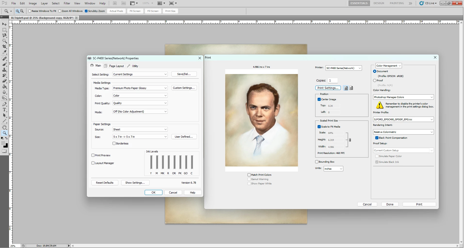
3. When printing you should use the printer profile that matches the Printer, Ink and Media used when the profile is made. So that means, in Photoshop's print dialogue, set 'Photoshop manages colours' and choose the appropriate printer profile for your printer and paper. In the Epson printer driver (accessed through Photoshop's 'printer settings' ) ensure the correct media is chosen and ensure Colour Management is set to 'Off' in that Epson driver - that is important as you do not want to have the colours adjusted twice).


Dave

1 reply

Per Berntsen
Community Expert
Community Expert
May 1, 2025

If you get a dialog about the embedded profile not matching the working space when opening an image, choose the embedded profile. The profile doesn't have to be the same as the working space, which is a fallback if the image is untagged (does not have an embedded profile).

To stop this dialog from appearing, go to Edit > Color settings, and set Color management policies up like in the screenshot below, which is from CS6.

Make sure that Ask when opening is unchecked for Profile mismatches.


The recommended procedure for printing is to let Photoshop manage colors, which requires color management in the printer driver to be turned off. Everything seems to be set up correctly in your screenshot, but it seems that you have converted the image to Epson sRGB. There is no need to do this, just leave the image in whatever color space it had initially. Also make sure that you're using the recommended (by Ilford) paper setting in the printer driver, and that

you are using the correct printing profile for the paper/printer combination you're using.


If printed colors are correct, but the print is too dark, your monitor is most likely too bright.

Adjust the brightness to match the print.

Participant
May 1, 2025

Thanks for your reply. My color profile for this particular image was Epson sRGB because it was from a scan from an Epson V600 scanner. I did not correct the mismatch. I remain unsure about adjusting my monitor settings as even holding the original up to the monitor looks nearly identical, and using auto color and level adjustments on the image in Photoshop on this scanned image still renders dark prints. 

I see that our color settings are only slightly different. Does this suggest anything to you?


Per Berntsen
Community Expert
Community Expert
May 1, 2025

Your color settings are fine.

But you will of course have to re-edit your images after decreasing monitor brightness.

They will now be too dark, and you have to brighten them.

Instead of using Auto color and levels, I suggest using adjustment layers, or use the Camera raw filter on a copy of the background layer as a smart object – especially if you have scanned in 8-bit, and also if your scans are jpgs.


The jpg format is not intended for editing – it's a final format. Every time you save the image, the quality will be reduced because of the aggressive and destructive compression. If you do lots of edits and saves on a jpg, it will begin to disintegrate, and you may end up with unacceptable quality.

For best results, scan 16-bit tiffs. When you have finished editing, convert a copy of the file to 8-bit for printing.