diggdug39
Known Participant
December 13, 2017
Answered

How would I make it

  • December 13, 2017
  • 7 replies
  • 1070 views

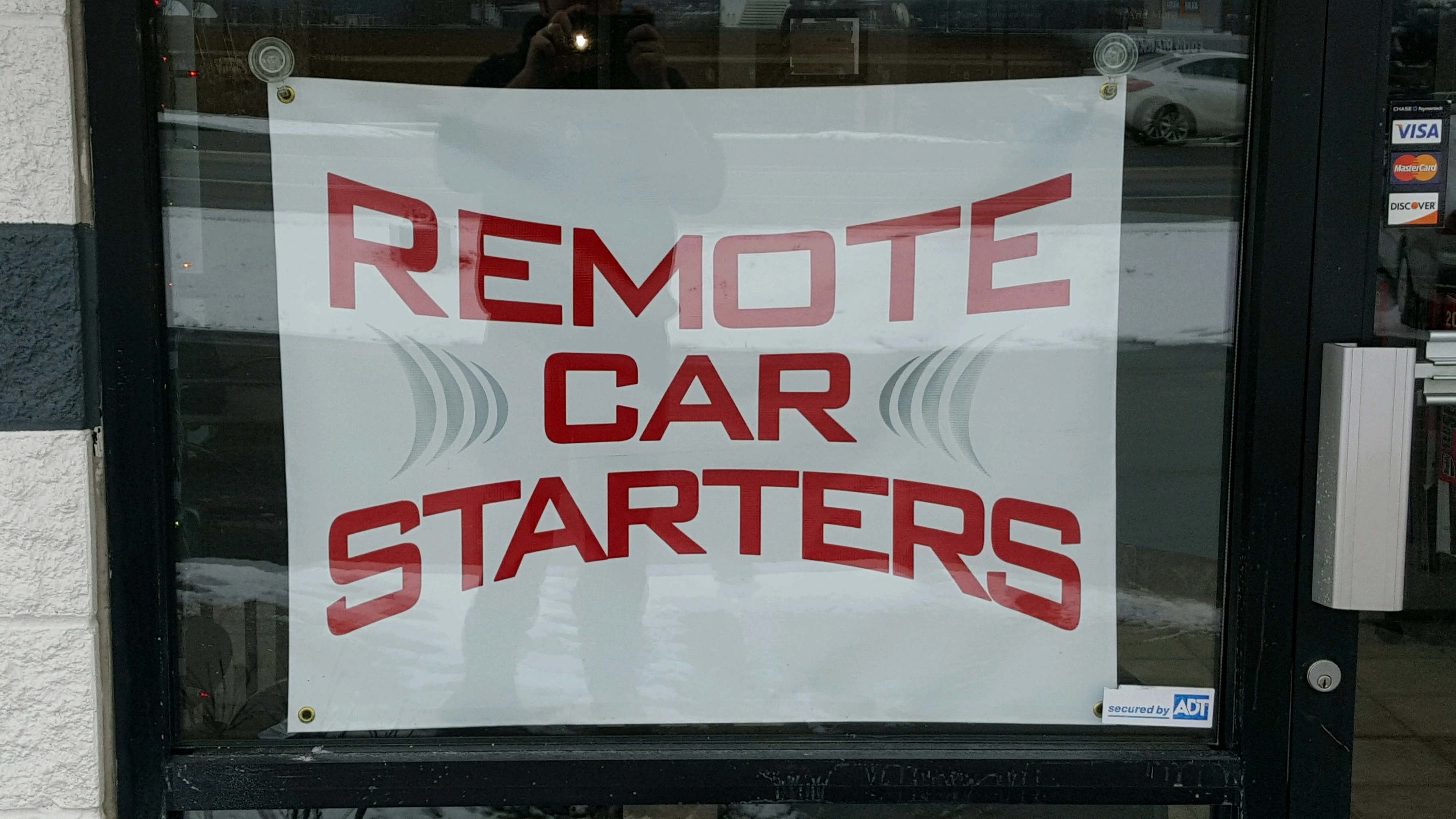
Hey fellow photoshoppers,

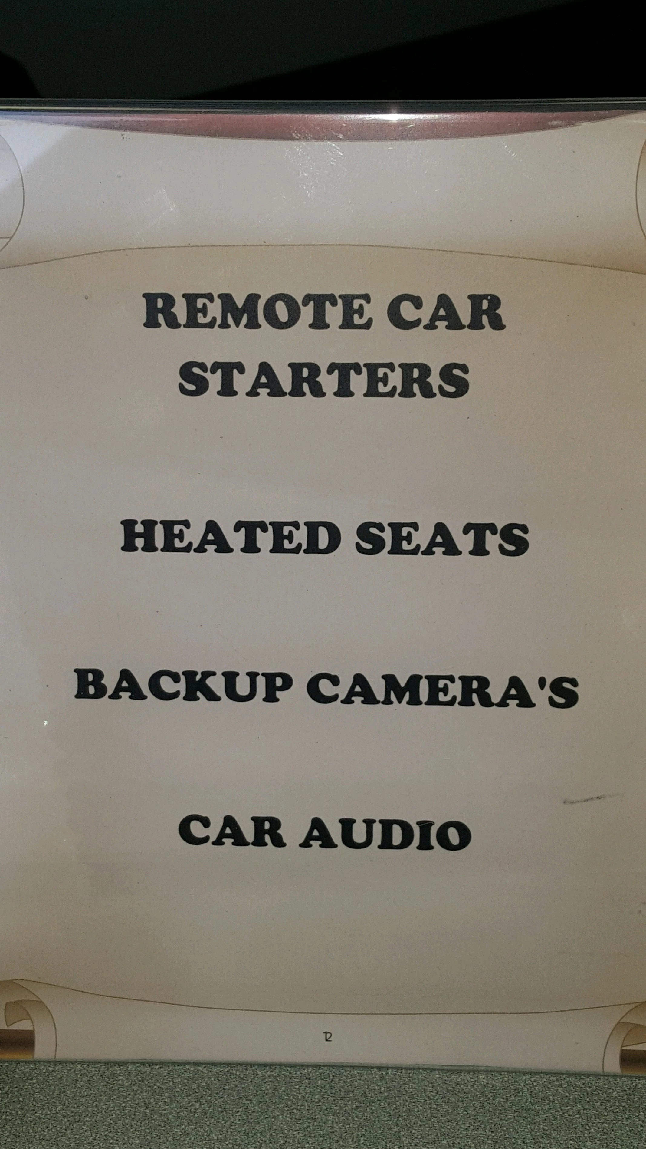
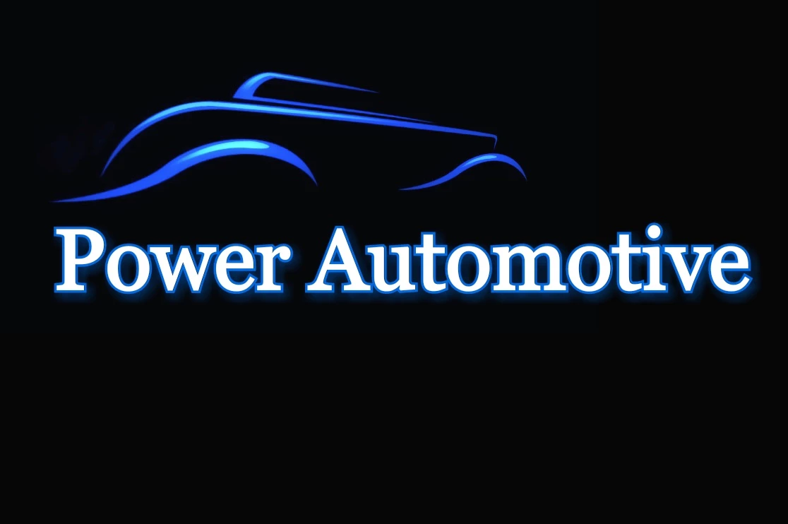
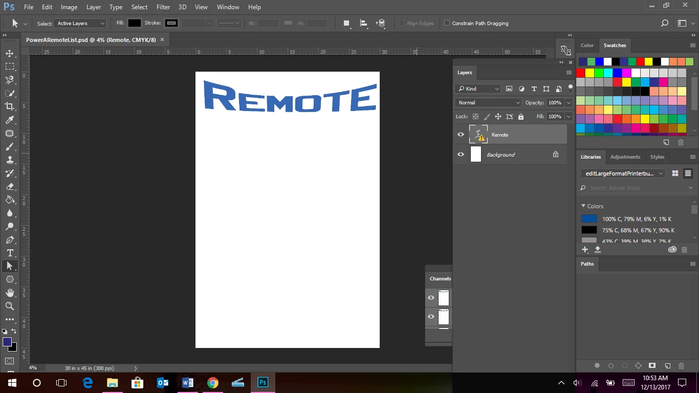
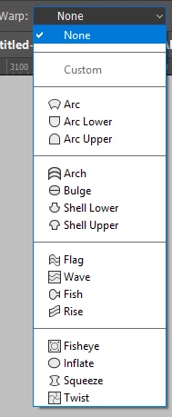
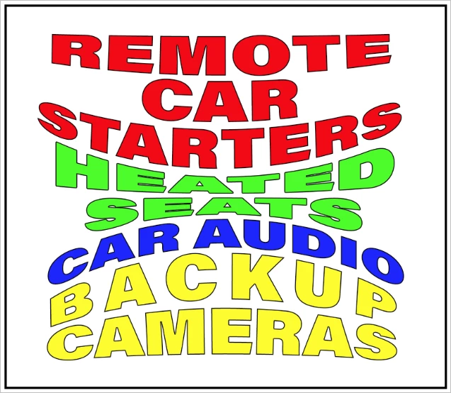
     I have been given the task of making this and have been asked to have mock ups of the text in two different colors, (red like in the text color Remote Car Starters and blue like in the Power Automotive image). The question I have is the part of the grey ribs on each side of the text Car while still being able to fit all this on one single sized space. The client wants all those services printed 45" by 30". I have started by warping the text with the word "Remote but I don't know how to do the whole image below and still be able to fit all the other services the client wants listed. 

This topic has been closed for replies.
Correct answer Trevor.Dennis

It seems to me that if your client needs all of those words arranged in the style indicated, then you will need to adapt the style.  Think of it like a jigsaw puzzle with warped outlines, and chose the Free Transform > Warp options that fit together.

So Arc Lower for the top line, and Arc Upper for the Bottom line.

Bluge for line 2, but with the handle move to give it a negative bulge.

Arch for line 3, and...

and adjust to get them all fitting:  There are heaps of other ways you could align warped type layers, but I couldn't resist the almost straight upper and lower edges being aligned to the boundary.

With the text crammed into that small space, I'd go with different colours to differentiate line to line, and add a small stroke to lift the lighter colours off the background (if it is white).

I've messed with the tracking to match line lengths for the last line, but didn't bother with line 1.

I love the new Variable Concept fonts as they make it so easy to find a weight and width that works when you are applying OTT warping to type layers.  As a design it is a bit in your face, but I believe ad people tend to work on the lines that they don't care how cringe making crass a poster is, so long as it compels people to look at it.

7 replies

diggdug39
diggdug39Author
Known Participant
December 29, 2017

I figured out how to get the shape and I understand that I need to go to options and pick subtract from front but when I combine the two shapes I lose my gradient that I have made to fill the crescent moon. How do I keep that gradient?

diggdug39
diggdug39Author
Known Participant
December 14, 2017

I'm trying to figure out how to make those ribs on the side of CAR. I tried the half moon and then duplicated it 3 more times but it doesn't look right.

michelew83603738
Community Expert
Community Expert
December 15, 2017

For the ribs, you need to slightly change the size of them to look correct. Are you now using Illustrator? If so, it is easy, you can right click, transform, scale and then decide how much larger you want it - say 105 -110% and make sure to copy, not just say ok! Then to make the 3rd copy, just Ctrl + D with the second copy selected.

Inspiring
December 14, 2017

As far as readability is concerned, I would not warp that many elements.  It is simply hard to read.  Make sure your boss changes "camera's" to cameras.  I would use their color choice and a layout that is easy to read and perhaps add bullets to the items.  Avoid Photoshop for this assignment.  I have a few questions ( and maybe you should ask your boss ): what is the view distance?  What is the background color?  Red and Blue are notoriously hard to read on a Black background. 

Trevor.Dennis
Community Expert
Community Expert
December 14, 2017

Do you have access to Illustrator?

Trevor.Dennis
Community Expert
Trevor.DennisCommunity ExpertCorrect answer
Community Expert
December 14, 2017

It seems to me that if your client needs all of those words arranged in the style indicated, then you will need to adapt the style.  Think of it like a jigsaw puzzle with warped outlines, and chose the Free Transform > Warp options that fit together.

So Arc Lower for the top line, and Arc Upper for the Bottom line.

Bluge for line 2, but with the handle move to give it a negative bulge.

Arch for line 3, and...

and adjust to get them all fitting:  There are heaps of other ways you could align warped type layers, but I couldn't resist the almost straight upper and lower edges being aligned to the boundary.

With the text crammed into that small space, I'd go with different colours to differentiate line to line, and add a small stroke to lift the lighter colours off the background (if it is white).

I've messed with the tracking to match line lengths for the last line, but didn't bother with line 1.

I love the new Variable Concept fonts as they make it so easy to find a weight and width that works when you are applying OTT warping to type layers.  As a design it is a bit in your face, but I believe ad people tend to work on the lines that they don't care how cringe making crass a poster is, so long as it compels people to look at it.

diggdug39
diggdug39Author
Known Participant
December 13, 2017

c.pfaffenbichler Can you explain how to do this in steps maybe? I also have to fit the rest of the lines of text from the list on the same 45" L by 30" W because they want it for a window ad with one example in blue text and one example in red text to see which one they like better. I don't even know if I have the right font for the same font used in the Remote Car Starters image.

                                                                                                                  Thank you for your help

c.pfaffenbichler
Community Expert
Community Expert
December 14, 2017
Can you explain how to do this in steps maybe?

I set the text, created a Shape Layer for the »brackets« and duplicates and transformed it as necessary, converted the text and the other elements to a Smart Object and applied a Warp set to »Bulge« (but that can be seen in the Options Bar in the screenshot anyway). 

c.pfaffenbichler
Community Expert
Community Expert
December 13, 2017

First off I would expect for output reasons it would be bette drone in a Vector Application like Illustrator.

If you decide to stick with Photoshop you could also convert the whole of the text and the »brackets« into one Start Object and Warp that.

JJMack
Community Expert
Community Expert
December 13, 2017

Just put each object in its own shape layer.  Then it should be easy to transform and postion each shape layer. Text layers can be converted to Shape layers. Make each word a shape layer.

JJMack