Participant
November 11, 2019
Answered

Icons for 2020 updates

  • November 11, 2019
  • 17 replies
  • 27619 views

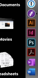
I just updated Photoshop, InDesign and Illustrator to the 2020 versions. Is it driving anyone else crazy that Photoshop has a new rounded-corner icon in the dock and the others still have the old square icons? Come on Adobe, we're designers here! You're stabbing me in the heart every time I look at my dock! 😉

This topic has been closed for replies.
Correct answer S_Gans

It's driving EVERYONE crazy! 😄  But, the real reaso is that now, all the apps that have a mobile version are being depicted with rounded corners. you'll see the same effect on Lightroom for now, too!

17 replies

Participant
January 13, 2020

Hi guys. We need create same icons by ourselfs while Adobe will update it. So I do that.


For replacing icons read this 

https://discussions.apple.com/thread/8234632

Legend
December 27, 2019

Its not driving me crazy and I think you guys are hilarious! Yes they overloaded the icon to designate apps with a mobile version which seems silly (as in, why bother) but also, who cares.

AtDrive
Participating Frequently
December 26, 2019

Here are some folder icons for Adobe 2020
Adobe-2020-Folder-Icons-Set-SVG 

Participating Frequently
December 24, 2019

Hi All,

As many of you, this was stressing me out unnecessarily, so I created a quick rounded corner version to soothe my eyes.

All you have to do is open this in preview, select all, copy it, then go to "Get Info" on the AI app, click the thumbnail and paste this new one in.

Took me like 30 mins, it's frustrating that Adobe can't do little things like this. I'm open to critique as I'm relatively new to Illustrator.

Terry Wayne Ranson
Participating Frequently
January 10, 2020

Thank you. I feel so much better now. 

gener7
Community Expert
Community Expert
November 13, 2019

I always like this way of putting it:

Inspiring
June 22, 2020

Change for change sake is a pervasive disease.  It's not just "modernisation", some of it ignores (a) who uses the 'tool' and (b) how they use it. An example we might all have come across ... in order to accommodate advertising, ATM screens were converted from monochrome to colour.  That made them harder to use for users with certain vision impairments; but in particular, they are harder to see in certiain lighting conditions, such as direct sunlight, owing to the reduction in contrast.  As least Microsoft facilitated the 'old' presentation of the Windows UI when they effected a radical change.


As I have posted separately, possibly the most outrageous change Adobe has made with the new ACR is altering the positions (actual and relative) of the [Open] and [Cancel] buttons.  Muscle memory has me clicking [Done] or [Cancel] when I want to Open the image(s). Grrr!

S_Gans
Community Expert
S_GansCommunity ExpertCorrect answer
Community Expert
November 11, 2019

It's driving EVERYONE crazy! 😄  But, the real reaso is that now, all the apps that have a mobile version are being depicted with rounded corners. you'll see the same effect on Lightroom for now, too!

Adobe Community Expert / Adobe Certified Instructor
Participant
November 11, 2019

Ah, that makes sense but they need to makes them consistent for the sake of our sanity!

Participant
November 11, 2019

It drives me completely mad. Cant understand how company like Adobe can let something like this happpen. It makes me just a step closer to switch to Affinity.