Participant
November 30, 2020
Question

Matching colors in product photography
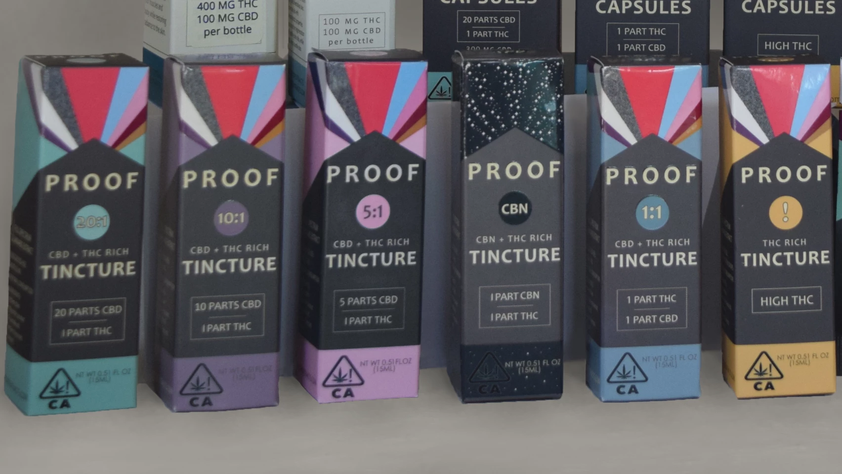
  • November 30, 2020
  • 2 replies
  • 343 views

Hi everyone,

I'm trying to make all of the grey areas on these boxes look like the same shade. Unforunately, our packaging comes out with different grey tones for these grey areas, even though the file I provide to the printer has consistent grey tones. Anyway, what's the best way to adjust these grey areas? The three boxes on the right look fine, but I'd especially like to change the grey area on the pink box, since it's the darkest and most distracting. I've used the color replacement tool and it doesn't really make a difference. Masking is difficult because of the text on the box, but I will do that if necessary... I'd have to use the pen tool because quick selection tool doesn't grab around the text correctly.

Thanks!

This topic has been closed for replies.

2 replies

Norman Sanders
Legend
December 1, 2020

If we assume the package design preparation consisted of one file, with layers added to create the separate packages and the colors are all CMYK mixtures, then the difference in gray in the packages is attributable to ink volume variation on the pressrun.


It is possible the variation in gray color caused by an attempt on press to be guided only by consistent unique product colors: the green, the light and the dark purple, etc. That, in turn, would cause the neutral gray panel -- common to all -- to vary.


In that case, the current four-color printing job would benefit from running instead on a six-color press with the gray a flat PMS color, plus a gloss varnish. The gray would be consistent and the varnish will reduce scuffing. It will keep the packages looking new on the shelf for a longer time.


If, on the other hand, this was produced with separate flat PMS colors (let’s say 6) and you had this much variation on the run then, perhaps, it would be prudent to have a serious talk about pressrun consistency with your lithographer.


In sum, the problem was created in the package printing, and that is where it would benefit most by being solved. If that is not a option, or if your only concern is product photography, confirm that the RGB values are identical for each package's gray panel. It is a masked Curve correction with the Info panel as your guide. Unfortunately, this image is not sharp enough for you to do a first rate job.


Simmer1
Community Expert
Community Expert
November 30, 2020

Hi,

These complex colour matching retouches can be tricky. 

Maybe try constructing your mask based around a colour range selection:

Here is a tutorial that may help also, even though it is meant to be for eye bags it's great for replacing colours and keeping texture:https://www.youtube.com/watch?v=3lL8XUUWg_Q 

Participant
November 30, 2020

Thank you!