Photoshop Design Error In Windows
Hello Adobe Team,
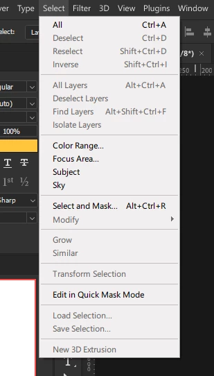
I'd like to share feedback regarding the design consistency of your products. After opening the menu window in Photoshop, I noticed its appearance does not match the design aesthetics of Windows 11, nor does it align with the more modern look of Adobe After Effects and Premiere Pro. The Photoshop menu window feels quite outdated and boxy.
A similar issue is present in the Effects panel of Adobe Illustrator, which also hasn't seen an update for many years.
If this is a design choice, then why is the experience different on Mac? On Mac, these windows even support dark mode and look much more modern. Why hasn’t this been implemented on Windows?
Is this intentional, or is it a technical issue that hasn't been resolved yet?
I'd appreciate any insights or plans for future UI improvements that would make these panels look more contemporary and cohesive with your other apps.
Thank you!