Stefan_HQ
Participating Frequently
May 18, 2026
Question

Rewritten Canvas Size dialogue presents pixels as floating points instead of integers and the reset button do not work

  • May 18, 2026
  • 3 replies
  • 29 views
As seen in the width input field: it presents the value as a float when it should be an integer

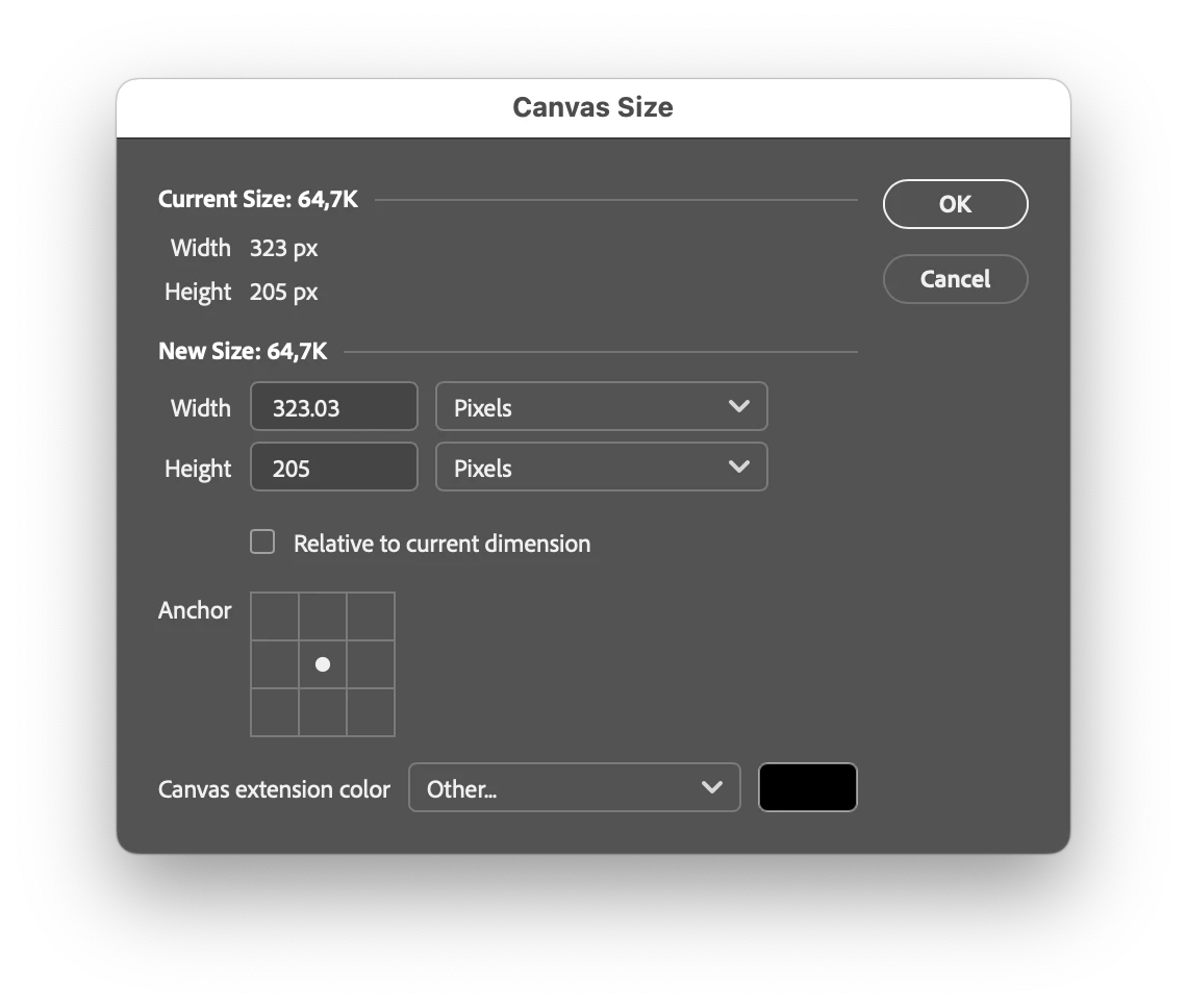
As pixels always are integer unit the fields should be of the integer data type if type of set to pixels.

  • Current issue: As of now its possible to enter float values which are accepted and you can close the dialogue but then the value gets rounded of to and int “behind the scenes”
  • if one scrubs or use the arrow keys to increase/decrease the value it changes it in decimal steps when it should be -+1 and -+10 and +-100 with modifier keys held in combination of the arrow keys


Also the reset button do not work. Clicking it results in nothing. So that feature is broken or simply not implemented apart from the button itself. (alt/option is held to make the cancel button change to the reset button)
 

  • With the broken behavior if one enters wrongly in a field the user needs to cancel close the dialogue and open it again - when it should be possible to reset the dialogue without leaving it.

    Both bugs also severly downgrades the UX.


(comment: what was the value reasoning to rewrite this dialogue - it seems to be no new features - only an updated left aligned layout vs the former center aligned. Also the style of the UI element differ from the other dialogues also they state display (hoover etc) and the overal layout also differ from the related Image size dialogue with oddly long type dropdown lists distracting from the more important value fields offering a less coherent user experience = from a user value this is a downgrade)

Former dialogue presents same style of controls, and an overal more balanced and clear layout with proper grouping of sections. 


    3 replies

    Waqas15
    Participant
    May 19, 2026

    It sounds like there may be a bug in the rewritten Canvas Size dialog. Pixel dimensions are usually expected to be displayed as integers, so showing floating-point values can definitely be confusing. The reset button not functioning properly also suggests that the dialog may not be correctly restoring the original canvas settings.

    Hopefully this gets fixed in a future update, since accurate sizing controls are important for image editing workflows and design tools, including projects involving schriftarten zum kopieren.

    Stefan_HQ
    Stefan_HQAuthor
    Participating Frequently
    May 19, 2026

    Yes lol that is exactly what I wrote. So its great you agree. Upvote this please <3

    Also I have not tested but it would not surprise me if Picas etc do not work correct either. I think the developer just put the input field to floats as default and totally forgot to add the part where the unit typ change also changes the setting of the input field. If so it should be a quick fix.

    I agree with you. I dont get that if they want to improve and modernize the UI did not add a “edit boundaries” button or mode where you can adjust the canvas just as you would do with an artboart and crop. Its like and unholy mix of crop / artboard which itselves are also unholy mixes.

    I would have take just renamed the classic crop to crop/resize canvas and add the few things resize canvas have that its missing like anchor point and background color and the numerical relative input.

    Then you have the same features as resize canvas but its on the top toolbar - interactive - with undo set and full visual feedback. Basically a new UI version of “resize canvas” should be an update to crop and then kill off this dialogue

    And to be fair its odd UI wise that you can use crop to extend an image with generative fill. But when you adjust and artboard you do not have that.

    As I can see crop and reize canvas is exactly the same - and with artboard its the same but it also allow you to select multiple artboards and connect them etc.

    For me best would be that in artboard mode you could do all it can now but not resize > select artboard > select crop - adjust it > back to artboard mode.

    Then cropping becomes an exclusive adjust canvas/artboard tool applied in different cases but with same UI and functionality. And its just about if you use it destructive on a basic image or an artboard (which could allow more non destructive approach as then there more is about cropping the view.

    my 5 cents of UX wisdom…
     

    (it would probably clean up and remove parts of the codebase in a more OO-way as well… )

    CMass
    Community Manager
    Community Manager
    May 19, 2026

    Hey ​@Stefan_HQ , 


    Thank you for sharing all the details of the issue you’re seeing. In order to troubleshoot the issue we need to know what version of Photoshop you’re seeing this issue in and what Operating System you’re using. You can find this information by going to Help > System Info. Copy and paste everything into a text file and attach it to your response. 

    For now I’m moving your post to questions until we can get more details that will allow us to test for this on our side. 

    ^CMass

    Stefan_HQ
    Stefan_HQAuthor
    Participating Frequently
    May 19, 2026

    Sure here you go. Btw I was actually suprised that there was no such field in the actual bug report submission form. Normally I expect it to be like some dropdowns of version / os etc in such.

    Stefan_HQ
    Stefan_HQAuthor
    Participating Frequently
    May 18, 2026

    I noted another bug report related to this dialogue and it seems that its part of the “modern UI” setting in technology preview. 

    I am all for that some dialogues are rewritten to use a more recent Design system to be more in line with newer products. Still as almost the rest of photoshop is using the “old theme” its hard for a user to see the product value beyond a new styling.

    As a user I agree that the style of Spectrum can be clearer and the inclusion of some feedback states is stronger so that is all great.

    What is not so great is when core thing as layout and balance is not as good. Sure element grouping box is an old concept and not a big thing - Still then you need to make sure there is enough space and balance in the overal dialogue between the elements - and anyone can compare the two dialogues and see that the old one makes it easier to find and identify the elements linked to their importance.

    Putting all elements except the last “canvas extension color” close left aligned with the result that the last row is not aligned with the rest is far from ideal - and then just adding widht by making the dropdown twice the width of their longest type name is going against all design rules. 

    It would have been better if you just had shortened “canvas extension color” to “extension color” (canvas is not needed as you do not write “canvas width” etc) then the left alignment would have been smaller while still having all aligned and not super wide dropdowns.

    And to follow Spectrums guides (which you break yourself in this new design.) you should have in the new design moved OK / Cancel down to bottom right under the last element, This would both result in you following the new design language that is the point of the rewrite and it would also be more coherent with the Image size dialogue who has those button positioned in that way.

    I assume that you have some more global level UI Director who is signing of on UI rewrites/rewampes of old dialogues to make sure they really follow your new shared design language. Here at least that did not happen.

    I am not talking about the bugs reported here they are just bugs and should not have appeared - and it seems they are not technical bugs but more that the specification of the new dialogue overlooked or - as I suspect - did not understand some of the featurs of the old one - and missed even some like the reset button - basically when you rewamp old interfaces without really changing features you really need to push stronger for deeper QA and review - ideally involving users that goes back some years that truly have experience of the old interface - just a suggestion.

    I hope I do not sound to sour. Its more that if cost are invested in pure style UI updated with no new features - instead of more urgent bug fixing - then at least I expect them do not introduce new bugs or break workflows and to coherently follow the new Design system which is the whole point of the rewrite.