Participating Frequently
September 21, 2025
Answered

Shadows for self-made letters/font don't work or yield only dissatisfactory results/quality!

  • September 21, 2025
  • 3 replies
  • 407 views

Hello,

I am working on modding a very old videogame (a FPS classic from the early 2000's) since almost 5 years and since the beginning of 2024, I also frequently or occasionally use Adobe PS for altering various textures of the game.

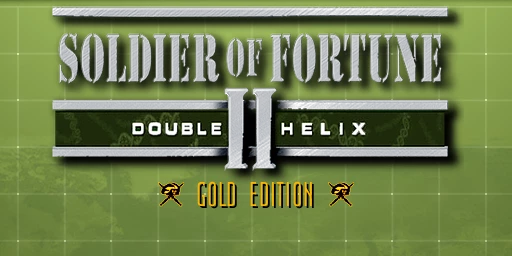
Currently, I'm working on the game's title logo to change it from "Gold Edition" to "Platinum Edition" - since the letters "P", "A", "U", "M" are not readily available, I had to create them myself using PS.


The letters themselves are finally finished, but two of them - "P" and "A" - lack shadows (the letter "U" and "M" are already drop-shadowed, so I didn't have to do any further editing) and I still have not found a way to make them drop PROPER shadows ("proper" means, the shadows must look exactly in shape & style like the ones of tthe "U" and "M" letters).


I've tried multiple approaches (1: "fx" -> "Color Overlay" and then "Filter" -> "Blur Gallery"  2: "fx" -> "Drop Shadow"  3: Duplicate Layers  4: Displacement Mapping) and they either didn't work or they didn't yield the required results - probably also, because maybe I didn't implement some of them (Duplicate Layers, Displacement Mapping) not properly.


Anyway, I'm done trying to figure it our myself and decided to bring up this topic, so you can hopefully help or advise me 😉

I think, the approach "Displacement Mapping" is the most appropriate one because I've seen this image on the Wikipedia article about Displacement Mapping. (image attached on this posting)


The shadows of both letters ("P" & "A") should exactly or at least very close like the shadow of the letter "U". (all three letters are attached in this posting)


Thanks,

T.S.O.M.


Correct answer Ged_Traynor

@The Spirit of Morpheus you need to have achieved a certain rank before you can edit your own post

https://community.adobe.com/t5/using-the-community-discussions/how-to-edit-posts/m-p/12771413#M58079

3 replies

Participating Frequently
October 1, 2025

Perhaps showing a bit of bias here, but I'm tempted to contradict @Trevor.Dennis's advice and recommend treating this 'text' as pixel art. Being low-resolution, it would be easy enough to match or mimic the existing font style on a new layer, doing away with what looks to me like an excess of anti-aliasing on the existing text.


Furthermore, I wouldn't treat the shadow as a drop shadow as Photoshop would define it - duplicate the text layer, recolour it to black, and offset manually by 2 pixels vertically and horizontally.


Photoshop's handling of text at high resolutions, particularly anything intended for print, is acceptable... but for low res, screen-based presentation it's horrifically imprecise, and its anti-aliasing options rarely achieve a worthwhile result.

Participating Frequently
October 1, 2025

Yeah, I noticed that as well - the drop shadow method seems to work very badly with low-res textures. (like mine, in this case)


But I still would like to know, how @Trevor.Dennis did His version of the "Platinum Edition" font shadow - I'd like to try it out myself 🙂


T.S.O.M.

Trevor.Dennis
Community Expert
Community Expert
September 23, 2025

I think you are wanting to change 'GOLD EDITION' to 'PLATINUM EDITION'

You say this is an old game, which means low res, and little anti aliasing.  That doesn't make it easy.

I am guessing that you want to keep the blocky graphics to keep the look and feel of the game?


Rather than rebuild letters, I think you'd be better off finding a good match for the font.

I looked for 'ultra condensed light' and found some posibilities.  The one below is SF Movie Poster (I think)


Looking at the original at 200% the shadow is very plain and straight forward.

Which is what I did here. You can see that the font I used is a bit too condensed.

If you can be more specific with lots of detail about what I am missing, I am sure someone, or me, will try to help.

Participating Frequently
September 24, 2025

I had already downloaded a myriad of different free fonts (which I deemed suitable or possibly appropriate) from various different font websites and the most suitable so far is gello regular - but it still isn't enough, because some letters (like "M" or "N") still look very different than their counterparts from the original game texture (the "sof2_logo.png" image file attached to my OP) and, contrary to the font of the original texture, they are missing the shadows. I've already taken the necessary letters - "P" and "A" - from that gello font, opened them in PS and edited them to match the original game font. (see my OP)


That means: there is no need to use that font any further - both letters are already finished (see my OP) and ready EXCEPT for the missing shadows...

I still think, the displacement method (or alternatively: the "Duplicate Layer" method, then greyshade the 2nd image, then move it 2 pixels to the right & down and finally unify layers to blend over each other -> hence creating a soft shadow effect) should be the best method, but I guess I'm implementing it not correctly because I have almost no experience with displacement filters and very little experience with layers -> up until now, every attempt I made with displacement ended up looking like garbage... xD

Here is an example of such an attempt:


T.S.O.M.

Participating Frequently
October 1, 2025

*bump*

No opinions on my approach? (see the last 2 screenshots...)


T.S.O.M.

Participating Frequently
September 22, 2025

Erm.... ZERO responses?

And BTW, how can I edit an already submitted posting of mine? My last posting had a few typos I wanted to correct, but couldn't find any "Edit posting" button or something like that...

T.S.O.M.

Trevor.Dennis
Community Expert
Community Expert
September 23, 2025
quote

Erm.... ZERO responses?

And BTW, how can I edit an already submitted posting of mine? My last posting had a few typos I wanted to correct, but couldn't find any "Edit posting" button or something like that...

T.S.O.M.


By @The Spirit of Morpheus


I am not sure if it times out or what.  You only had the one post in the thread, so you should have been able to edit.  I have mod rights so I can't say for sure where that button should be, but for me I have to hit  More.


This will bump your thread, and I'll try take a look later, (I am about to eat).

Ged_Traynor
Community Expert
Ged_TraynorCommunity ExpertCorrect answer
Community Expert
September 23, 2025