Known Participant
June 11, 2021
Answered

[Suggestions from experts] What are the steps that I should follow to get a realistic compositing

  • June 11, 2021
  • 2 replies
  • 3405 views

Hello ,
Based on the experience of experts,

What are the steps that I should take to get a more realistic composition between product image and background image.


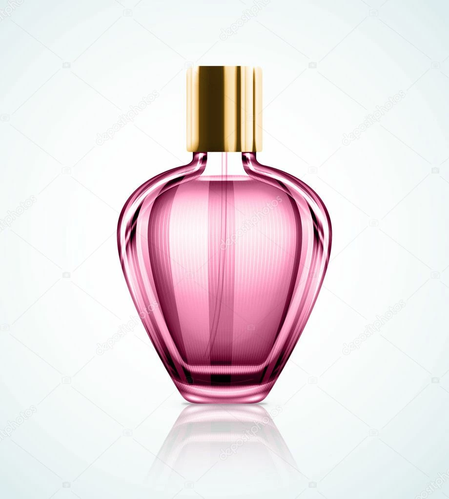
For example I have a picture of this perfume bottle: 

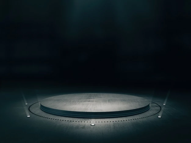
And this background image:

How can I make them more realistically, So that it is difficult for the viewer to know that this is the work of Photoshop.

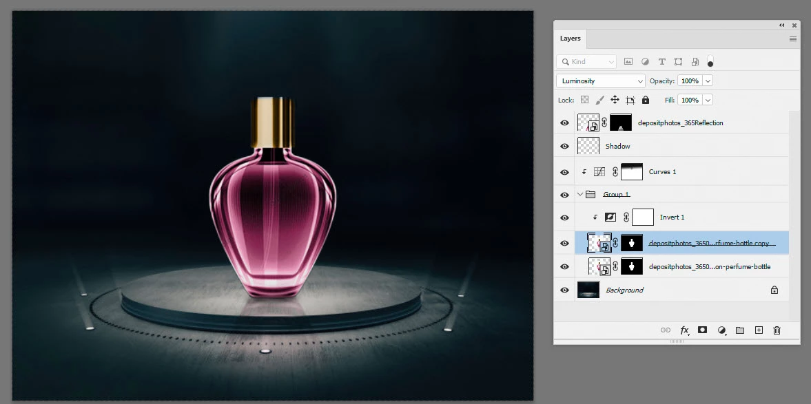
I watched and applied some tutorials but didn't get the desired result As you can see below (I think there are techniques that make this compositing more realistic) :


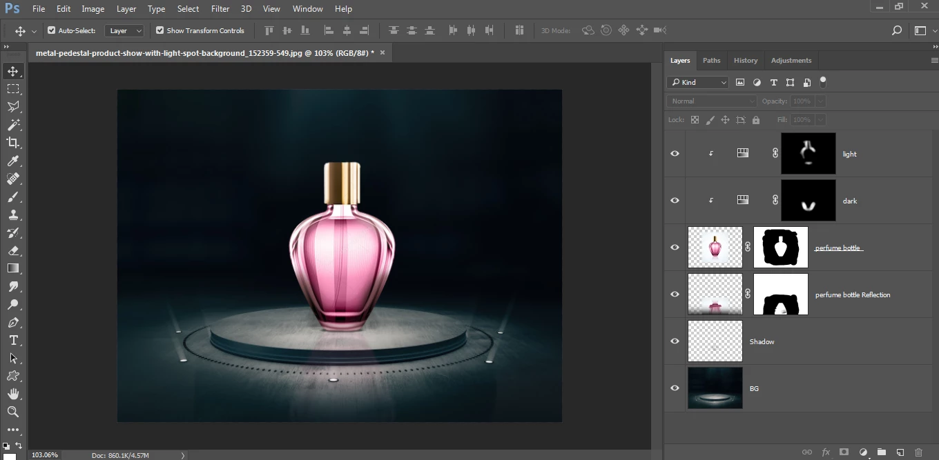
Usually This is what I tried to apply according to the tutorials I saw:
1- Matching the colors of the layers as much as possible using:
Adjustments > Hue/Saturation or Adjustments > Selective Color or Adjustments > Brightness/Contrast or Adjustments > Curves


2- Make a shadow or reflection to the layer (in my case the perfume bottle)


3- Color manipulation to get the desired image using:
Filter > Camera Raw Filter...


My question is, are there steps that I did not mention above to make the design more realistic, and is this approach above good for making a good compositing, or is there another approach or other techniques that can help me with this and you recommend and you can summarize it for me if you please..


Thank you guys, I would be grateful for any suggestion, ideas or help.

This topic has been closed for replies.
Correct answer davescm

The light is too bright through the bottle.  Try inverting a copy of the bottle and setting the blend mode to Luminosity.  Something like this:

2 replies

D Fosse
Community Expert
Community Expert
June 11, 2021

You have to consider the background. It's extremely difficult to fake this and make it convincing. If at all possible, shoot it with actual background. I guarantee you, it's much faster, much simpler, and will always look better.


davescm
Community Expert
Community Expert
June 12, 2021

In reality, if I did not have the actual bottle, I'd be more likely to model it in 3D and light and render it in a good 3D app. If I get time tomorrow I'll put up an example.


Dave

D Fosse
Community Expert
Community Expert
June 12, 2021

Yes, these things are done in one of two ways: either photograph it and spend some time setting up the optimal lighting (using studio flash units) - or build it from scratch in a 3D application.


Everything you see in ads, all those dazzling images, are made using one of those two methods. Both require special skills.


Doing it in Photoshop is possible, but only if you're willing to spend an incredible amount of time and energy. As I said, it's extremely difficult. For most practical purposes, it's not cost-effective.


davescm
Community Expert
davescmCommunity ExpertCorrect answer
Community Expert
June 11, 2021

The light is too bright through the bottle.  Try inverting a copy of the bottle and setting the blend mode to Luminosity.  Something like this:

hisoka.95Author
Known Participant
June 11, 2021

Great idea, and it gave me a very wonderful effect, thank you..


Would you recommend I use Curves instead of Hue/Saturation for color matching.

davescm
Community Expert
Community Expert
June 11, 2021

It's a matter of preference. Personally I like curves.


Dave