Inspiring
February 17, 2020
Question

Why do my coloura not look the same in Photoshop?

  • February 17, 2020
  • 1 reply
  • 378 views

Hi to all,


I am havig an ongoing problem where my colours are not matching to what i need in photoshop.

For instance, when i pick up the colour on the left (bottle cap) with the eye dropper, and then paint the bottle cap on the right, the result on the right bottle cap turns out way lighter and brighter instead of the colour it should be.

Does any
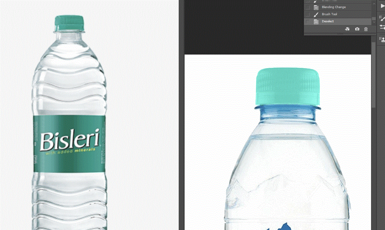
body know why this is please?

Would buying a higher quality monitor make any difference or is the problem something else all together?


Thanks

Jenny

This topic has been closed for replies.

1 reply

D Fosse
Community Expert
Community Expert
February 17, 2020

This is a GIF with indexed color, as far as I can tell with only 64 colors. Is that just the screenshot, or the original file as well?


In any case, do this in RGB, and make sure they are both in the same color space (sRGB, Adobe RGB etc). sRGB is the safe choice if you're not sure. This is determined per document, not in Color Settings which is just defaults.

Inspiring
February 17, 2020

Thanks for your reply.

The attached image is just the screenshot. I have now added the original photos also.


How would i know if they are both in the same colour space please?

Is this referring to changing the settings in color setting or something else?


|In my color settings it is stating srgb


D Fosse
Community Expert
Community Expert
February 17, 2020

Open both in Photoshop, and check here:


If it says "Untagged", Edit > Assign Profile. Again, sRGB is most likely the correct profile for an untagged file. If they both have a profile, but different ones, convert one with Edit > Convert to Profile.


With this done, you can be sure that numbers match and the same numbers produce the same color.


All that said, I don't think your original result is incorrect or unexpected. This is what you get if you paint in Color blend mode. Your "target" example is indeed very pale and light in tonality, like it's made of semi-translucent plastic.


In everyday speech, "color" is a very broad and generic term that includes brightness. In Photoshop, and in color theory, the term is much more narrowly defined, and the color component is strictly separate from the brightness/luminosity component. And that's how it has to be.


So if you pick from a dark purple color, and apply that to a bright yellow object, in color blend mode - the result would necessarily be a pink lilac, because the object is still bright.