Yes, for now you can revert to the "traditional" user interface.
You can revert to the classic GUI interface by following the instructions here for both Mac and Windows users:
https://community.adobe.com/t5/acrobat-discussions/acrobat-2023-how-to-revert-to-classic-gui-user-interface/td-p/14052807
And the above sentence tells a lot about the new interface:
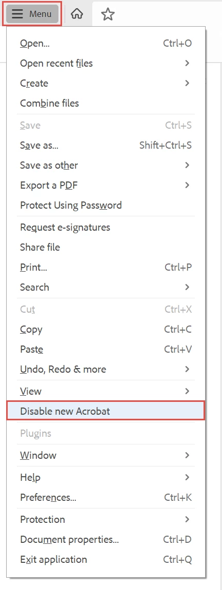
- A hamburger menu — although commonly used on mobile, are not necessary on desktop applications where the screen has enough "real estate" to provide a full menu. So users are not looking for or expecting a hamburger menu.
- A hamburger menu that didn't have a label, so people looking for the 35-years-plus "File" menu were lost. And users certainly weren't looking for 3 horizontal bars to reach the controls for saving, printing, and exiting.
- A menu system that is made up of little grey icons without labels. What do they mean? What do they do? WTHK! And they can't be organized into a menu/panel of just the tools needed.