Participating Frequently
September 13, 2024
Question

Rendering Issue with Aptos Narrow Font in Adobe Acrobat and Illustrator

  • September 13, 2024
  • 5 replies
  • 9146 views

Hi,


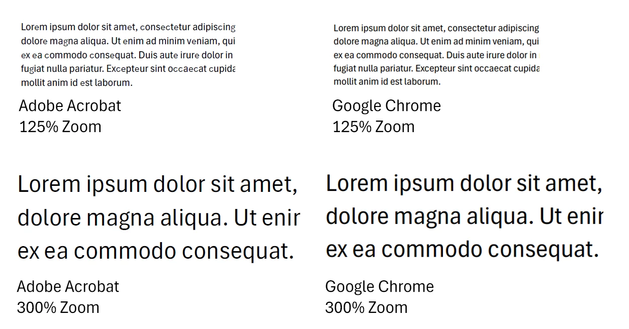
Our company recently adopted the Aptos Narrow font as the official font for all documentation. However, we've encountered an issue where the font renders incorrectly in PDF format using Adobe Acrobat at certain zoom levels. Interestingly, Google Chrome and Microsoft Edge renders the font correctly at any zoom level.


Additionally, I have observed the same rendering issue in Adobe Illustrator while designing. Once the text is converted to outlines, the problem is resolved. Printing appears unaffected, so the issue seems to be limited to onscreen rendering in Adobe applications.


Given the importance of maintaining a professional appearance, this rendering issue negatively impacts the visual quality of our corporate documentation shared in PDF.


Could you please advise when Adobe plans to address this issue?


Thank you for your attention to this matter.


Best regards,
Andre

5 replies

Participant
November 10, 2025

This issue is not just "Aptos Narrow", but "Aptos" too.

"c", "e", and "g" have rendering issues when viewed from Acrobat.  The same file renders fine in other pdf viewers tested (PC: Edge, Chrome, Android Mobile: OneDrive, Google Drive, Kindle, Samsung)


Participant
June 16, 2025

Still having this issue. Anyone found any workarounds?

Andre_SAuthor
Participating Frequently
July 22, 2025

Unfortunately Adobe is silent on this.

Participant
July 24, 2025

And will be as long as they feel like it. They long ago abandoned building good products to chase predatory profits and the spectre of infinite growth. I have given up on them ever producing or supporting good products ever again. There are free alternatives.

Participant
December 31, 2024

I am having the same issues. We have spent a month updating client's Certification Forms. Embarrassingly all the PDFS with Aptos letters have uneven hights, it's OK on print, but all the digital forms sent to their new clients look terrible!!!
I gues the font was not tested for Acrobat.

Participant
February 5, 2025

I have found the same problem (uneven font size) when viewing Aptos fonts across different platforms. I checked that the font was embedded correctly - but issue continued. I changed font ... and the issue was resolved.

Participant
April 16, 2025

I have had the same experience.  I went into the setup on all Microsoft applications and changed the default font to Arial rather than Aptos and the problem disappeared!  Amazing that the issue has persisted for such a long time.

Participant
October 3, 2024

Bump on this topic. Has this matter been resolved? I also have the same issue as OP where letters "e" and "c" look horrible at certain zoom levels in Acrobat. 

Considering this is a paid subscription product, I expect Adobe to resolve this.

Andre_SAuthor
Participating Frequently
November 18, 2024

Hi

No, I am still struggling to get proper support from Adobe. After numerous communications about this not being a client side configuration issue, Adobe constantly want to have a first line support person (twice) remote and play around with local Acrobat configurations, the last person corrupting my Adobe installation by deleting registry entries.

Kevin Stohlmeyer
Community Expert
Community Expert
September 13, 2024

@Andre_S Aptos is the default Microsoft font that comes with the latest updates to Office.

I'm moving your post to the Acrobat forum for better support.

Andre_SAuthor
Participating Frequently
September 17, 2024

Thank you @Kevin Stohlmeyer