
Taking 'Editable Text and Images' (Clearscan) further?
Adobe Acrobat Pro DC 2019 with 'Recognize Text' set to 'Editable Text and Images' (formerly 'Clearscan') does an amazing job generating custom fonts for a scanned book, and achieves a file size significantly smaller than 'Searchable Images' (the longer a book gets). However, it seems the more pages a book has, the more custom fonts are created, rather than just leveraging the 'close enough' offered by the previously generated custom characters. Would really love if the Adobe team would look at ways of 'cleaning' and/or 'consolidating' the custom fonts generated by the 'Editable Text and Images' feature, so the file sizes can drop even further (while relatively maintaining the look of the original printed font).
Case Study
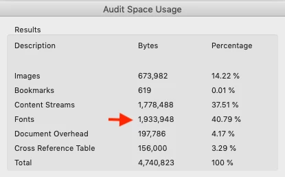
I have a few books that I've bought, de-spined, and scanned at 1200dpi (with a Fujitsu ScanSnap), and audited the font list and internal space usage (via File > Properties > Fonts, and File > Save as Other > Optimized PDF... > Audit space usage...) to see how, the longer a book gets, the more custom font faces are generated, and the more the file size lifts (even with the default fallback font set in the preferences). See below.
Book 1, 199 Pages
Book 2, 366 Pages
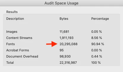
The two books are by the same publisher and author (with the same printed font) and while some of the file size lift (in book 2 vs book 1) could be due to poor print quality in the second book, with all Adobe's 'font smarts,' why not create something to say "this letter 'd' looks 90% like one of these 3 previously rendered 'd's so lets just use the closest one in place of another custom 'd'?"
After digging around the Preflight and Optimize PDF settings, I've been unable to find any other approaches like the one I'm suggesting above. And as the list in File > Properties > Fonts isn't editable, I'm at a loss for how to proceed beyond looking for other OCR software outside the Adobe family. Overall objective here is to take the PDFs mobile, allowing for highlighting and annotated on the go, and the smaller the file sizes (of course) the faster the sync.
Any tips or tricks are welcome. Thanks for thoughts, M