

Question
Clarity and Aesthetics in Data Visualization
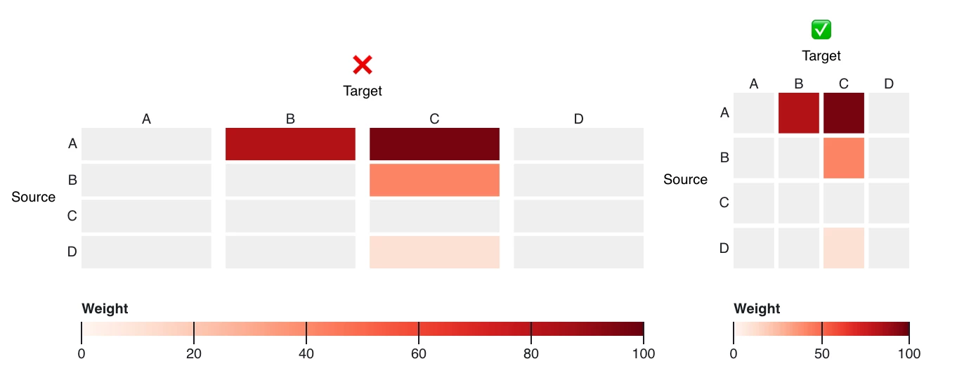
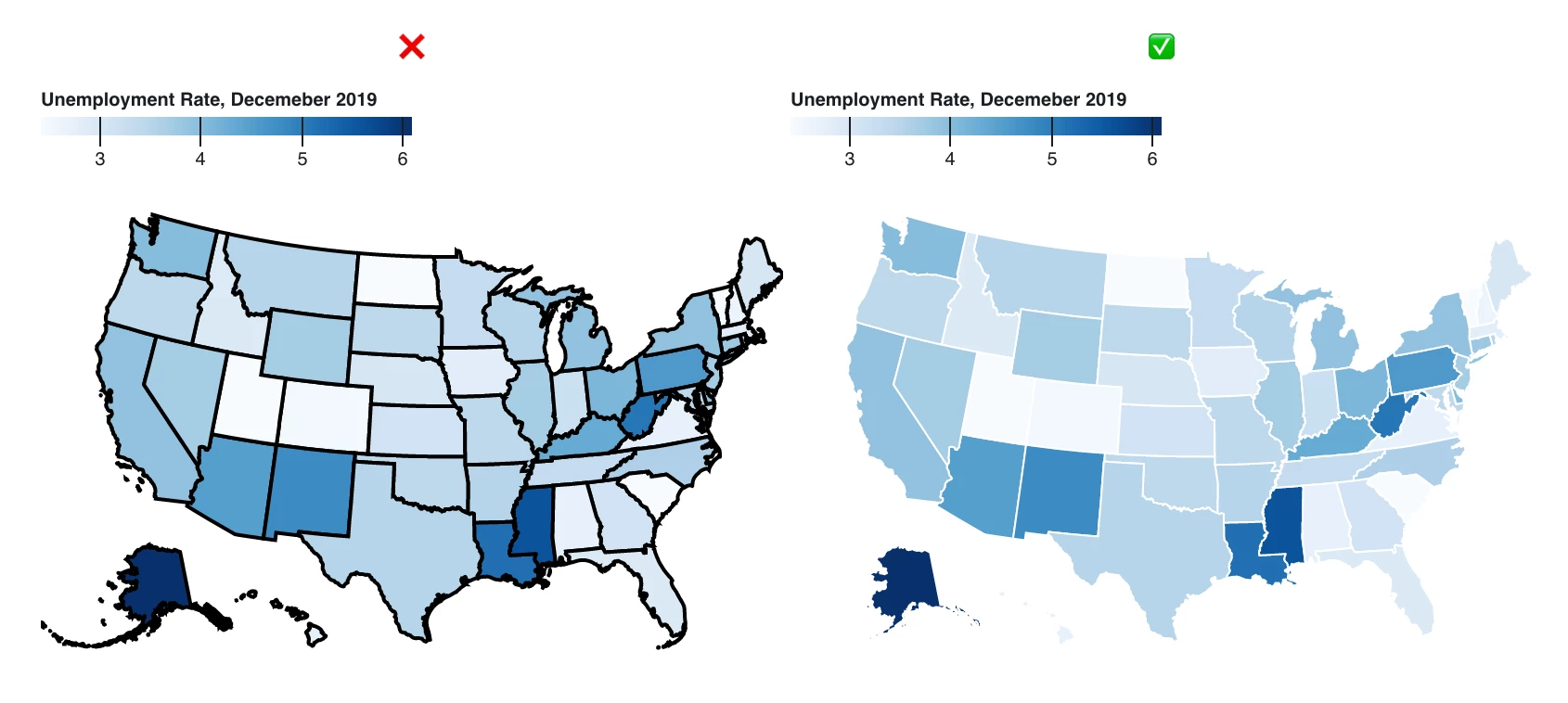
I recently came across this post by Enrico Bertini with a great set of guidelines to make your data presentations visually appealing and easy to understand. The author provides many excellent examples, provided by PhD student Daniel Kerrigan, such as these two on spacing objects and use of heavy borders. I'd love to hear your thoughts and any other guidelines you might have when it comes to designing data!
Clarity and Aesthetics in Data Visualization: Guidelines - by Enrico Bertini - FILWD (substack.com)
