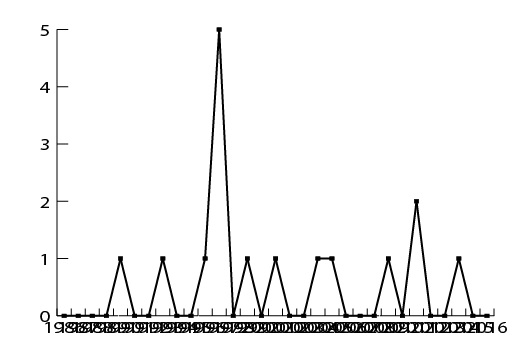
You could select all the text on the x-axis using the direct selection tool (just drag a rectangle over the text) and then apply Effect > Distort & Transform > Transform. Rotate by whichever angle is appropriate. You could also move the text with the effect.
Then you might want to use a different font size.
But that's about all you can do automatically.
Your next options are expanding the graph and then editing it. It's no longer attached to the data then.


 4
Replies
4
Replies


 AdChoices