

- Home
- Photoshop ecosystem
- Discussions
- Re: 100% zoom is too small on screen
- Re: 100% zoom is too small on screen

Copy link to clipboard
Copied
Hello, I'm using photoshop CC on amacbook pro retina. I mainly use photoshop for web design and when I open a document that is 300x200 px, the 100% view is too small on screen. Any ideas, It was this way on PS cs6 also before I upgraded. I just tried to delete the prefs file and restarted PS and it did not change. I have also tried to change my screen resolution to "best for retina" and it is still the same.
Steve


 1 Correct answer

...and just for kicks, I started to read from the beginning of this endless thread. It turns out that the whole "problem" was fully explained inside 20 posts or so. The rest of the thread, 360 or so posts by now, is just repetition, over and over and over again.
This one, post #20, from Noel Carboni, gave me an acute sense of déjà vu...
And two posts later, he went all in with a detailed and comprehensive rundown on every aspect of high resolution displays. Read it, everyone, please. And when you
...
Explore related tutorials & articles
 395
Replies
395
395
Replies
395
Copy link to clipboard
Copied
Christoph, have you come to understand my point of view here?
Basically it appears Apple is doing some kind of default zoom scaling magic where it upscales images by 200% in the browser. Maybe everything is upscaled, and maybe it's not always 200% (there are of course user zoom settings).
Perhaps there is somehow different magic happening with fonts and/or design element sizing/spacing and/or something that makes the designer's combination of graphics and fonts in Photoshop then generation of a web page non-trivial.
But not TOO different, since folks have said that the pixel-doubling (of everything) behavior of prior versions of Photoshop was much to their liking.
Now a few Mac users are crying because Adobe won't do the same magic as Apple to facilitate their web design. Are they unwilling to change their approach because of resistance to change or an unwillingness to retrain?
These Mac users seem to be allergic to appropriately resampling their captured images and employing the 200% zoom feature in Photoshop for some reason, citing instead a need to have Adobe automatically do something extra special just for them, apparently so they don't have to confront the technical horror of having to understand how pixels interact with their high density displays through Apple's magic implementation.
The sad thing is that people who won't take the time to understand how things really work and adapt are missing out on creating higher quality web graphics that actually take advantage of Retina and other high density displays.
This is proof that no matter how hard you close your eyes and wish, you have to adapt to changing technology or fall by the wayside.
"Everything Should Be Made as Simple as Possible, But Not Simpler"
Am I off base?
-Noel

Copy link to clipboard
Copied
Christoph, have you come to understand my point of view here?
How could one disagree on this point? (Edit: I mean the point about the nature of pixels and the difficulty grasping it seems to provide to some people.)
Nathan, do you not understand what is going on?
In the screenshot you posted Photoshop’s diplay was pixel perfect, the browser preview was resampled – just check the vertical lines – where the anti-aliasing was one pixel in Photoshop it is two in the browser.
And the 45˚ angled borders are sharper in Photoshop.
So if Photoshop were to simulate that preview how would you be able to unequivocally determine edge pixels’ values?
Anyway, if Photoshop should simulate that display (as an option, hopefully not by default) they would have to employ the same algorithm to get the same result. Has Macintosh made it public?

Copy link to clipboard
Copied
I understand exactlly what is going on. What I don't understand is what the argument AGAINST Photoshop giving web designers an option for proofing on Retina/HPD displays. There is a nice new program out now called Sketch. It does what I want for web design. Adobe is behind the curve here and it is frustrating. Here is a screenshot of Sketch, and how it does what a web designer wants:

Copy link to clipboard
Copied
It may be due to different compression of the screenshots, but if I compare this to the browser image I get different appearances (see screenshot). Different rescaling algoritm maybe?

Copy link to clipboard
Copied
I have no idea, and it doesn't really make any difference to me. All I need to know are the pixel dimensions, and see what it will look like in my browser. NOT the way Photoshop does like the below screenshot.

Copy link to clipboard
Copied
I have no idea, and it doesn't really make any difference to me.
If you want a perfect preview I would assume it should.
If Sketch provides a preview that does not fit the actual result in the browser what good is it really?
I am not sure what the last screenshot is supposed to illustrate.
Is the lower one non-retina and the other one retina display?
Copy link to clipboard
Copied
Yes, lower is NON retina, upper is Renita, just like all the others i have posted.

Copy link to clipboard
Copied
Nathan, don't get sucked into an arguement, there's a reason why Noel is the top contributor!
 Have you tried the low resolution mode? It's a pain when working on large Photo's but for websites it makes life easier.
Sorry about the scale, Photoshop and Retina display's what can you do 
To help clarify your/our problem further, remember that the iPad Air and Retina iPad Mini both have Retina displays, and the same "resolution" despite being a couple of inches smaller, Apple have given a pixel a metric size instead of treating it as a unit - On one device it's smaller then the other.
Photshop will catch up, it has to at some point when there are more than just Dell style displays and Retina displays (I think Toshiba offer something now too).
Keep making noise about the problem and in the meantime let me know if the low resolution mode helps?
Copy link to clipboard
Copied
Astley Marketing wrote:
don't get sucked into an arguement, there's a reason why Noel is the top contributor!
Indeed there is. It's by having other people mark my responses as "Helpful" or "The Answer". It has a little something to do with knowing what I'm doing.
Opening Photoshop in "Low Resolution" mode makes it impossible for the user to see their image rendered at the full crispness and clarity their extra special high resolution Retina display offers. Advising people to design that way is just silly - you're depriving your web users of that same crispness and clarity. If you think that low resolution images displayed by Safari or Photoshop at 200% are fine then you have no real understanding of the concept of "high resolution" and I question whether you know how web design or browsing works.
So can we start to discuss the problem of how best to design graphics in a world of high resolution displays now?
-Noel
Copy link to clipboard
Copied
This is not a pop at you Noel, when I first got the MBPR I just couldn't believe the problem existed, and it still annoys me that you are trying to provide an opinion (and seek an answer) when you clearly aren't using a Retina display and experiencing the issue. Is it impossible for you to see that as Retina is new(ish) technology Adobe haven't adapted Photoshop to increase productivity yet - yet they do in all other areas of altering pixels on an image/video.
As I've said before I'm not looking for something that applies by default to everyone, but I would like the option to work at 1:1 ratio to the end result size whilst at 100% zoom. Simple! Allow me to select "Use display density" when creating a new file.
Opening Photoshop in "Low Resolution" mode makes it impossible for the user to see their image rendered at the full crispness and clarity their extra special high resolution Retina display offers.
So you know, standard images output from Photoshop or any graphics package at 'web resolution' (trying to avoid an arguement about ppi) are not clear on the 15 inch Retina display, HTML text is fantastic, but images are fractionally blurred and in some cases you can see the square pixels despite no real issue with the original image size.
You have to 'up' the display settings to get the clarity back which makes the Retina unusable with extremely fine text and this just isn't how web users will view the end result in most cases. To fix this you can serve higher resolution images and allow standard HTML/CSS mark-up to ensure that the resulting image display's clearly, but for those of use who like streamlined websites and low page load times this isn't always a good idea. Plus we can't be designing at half size and then re-doing it all just to make the images bigger, or double-size and explaining to clients that they have to zoom out (or live with blurred images if saving at 50% scale).
Something is getting missed in all these messages Noel... if you would like, drop me a Skype id and I can go through the issue in better detail, then you could perhaps use your status here on the forum to promote it as a problem, if you feel there is one - which I'm confident you will.
I've used Photoshop for over 15 years day-in-day-out since version 5.5, for photgraphy and web, and this problem means that either the Retina display is useless to a web designer, or Photoshop is falling short of it's potential. Let me know, fresh start, help solve this.

Copy link to clipboard
Copied
I have absolutely no intention of getting sucked into this way over done discussion, but ITSM that we are all responsible for choosing the right tools to do the job. It makes absolutely no sense to buy a notebook with >3000 pixels across a 13 inch screen, and expect to use Photoshop on it, and it also STM that, by itself, a MBPR is not the right tool for web design.
In video, we don't rely on our computer screens when grading the finished product. We use a calibrated TV display. But here's the thing... neither display is right all the time, so you have both. So if I was a Mac user, a Retina display would be irresistible, and I would have to have one. Especially as there is a HDPI solution for it. But I'd also have a second or third screen to proof my work if I was a web developer. Heck! How many times do you see a website that works on one monitor, crash and burn on another? I'd have thought there would be a best practice to avoid such disasters, and I sure as heck wouldn't want to be associated such fragile work.
I also thought that there was technology about now that made web code highly transportable between a raft of platforms, phones, tablets resolutions etc. I've seen it demo'd on an Adobe app, but web design is not my thing, so I can't remember what it was.
Anyway... I have got some screws that need tightening — leastways, I have just as soon as I have finished complaining to the people who made the spanners I bought to tighten the screws with.
Copy link to clipboard
Copied
Astley Marketing wrote:
So you know, standard images output from Photoshop or any graphics package at 'web resolution' (trying to avoid an arguement about ppi) are not clear on the 15 inch Retina display, HTML text is fantastic, but images are fractionally blurred and in some cases you can see the square pixels despite no real issue with the original image size.
I would prefer to keep the conversation here. Let's just take things one at a time. If you feel I'm not educated enough in the Mac specifics then please indulge me and show me. In the process of doing so you'll make your case that Photoshop needs some new functionality. Or I will show you how better to use what you've got.
Are the two left-side images on my little ultra-simple test web page (linked-to in post 82 above) fractionally blurred? Or are they crisper/sharper than the ones on the right? A screen grab showing what you see on a Retina display would be welcome.
-Noel
Copy link to clipboard
Copied
Noel, I know almost nothing about web coding, but I am deeply troubled by what appears to be magic!!! How are we able to keep zooming in on the left hand image untill the browser is being viewed at many 100s percent, and yet the left hand image does not become pixelated? Is this something clever going on with your site, or could it be done on normal () folk's websites?
http://noel.prodigitalsoftware.com/temp/WebImage/Test.html
Yep. Definitely magic.
Copy link to clipboard
Copied
This isn't anything clever, you just use a larger image than is needed for the space it will take up on screen at standard browser zoom (100%) and compress the image through the HTML or CSS markup. I.e. a 300px x 300px space with a 600px x 600px image in it - then force (doesn't take much forcing) the browser to display the image at 300px x 300px. That way at 200% zoom there is still enough pixels to keep it sharp. Some older browsers can't cope with this very well and create jagged lines, and overly large images can still look terrible even on some modern browsers. CSS media-queries and Javascript allow you to cater for the differing screen sizes and capabilities.
It's all very off topic though, because we aren't discussing higher quality visuals on a website, the problem is designing and proofing to a client at the correct scale so that what you design is what they see. Copying an image from a website and making a change to it.
Here's a scenario, I hope it helps describe the problem better than the other dosen examples....
Say you want to create a new banner for a website.
You could;
Route A: Right click and copy the existing banner image, create a new file in Photoshop (photoshop sets the stage size based on the clipboard) and paste the copied image in, it's half the size on screen to the one displayed to you on the website, but still the same size file dimensions.
Or you could;
Route B: Screen shot the entire webpage, create a new file in the same way as above and paste. Then crop down to the banner area or work on top of it to proof it to the client. When you output the banner area as a file it's now twice the size of the actual original file on the server, the client sees a huge image and it won't fit the area on the website.
So we either work comfortably, but wrong and ignore the blurring from scaling the output file before proofing and/or uploading. Or at a reduced size and know that the end result will be ok.
A zoom adjuster would be more than enough of a fix, allow us to set 100% soom to 197.5% (or whatever Apple have decided it is). But for maximum usablity, store this as part of the file, that way I can happily work on print images utilising the great Retina display, and happliy design for web, safe in the knowledge that the end result will fit correctly.
I can cope with fractionally blurred pixel edges in Photoshop, they're only squares of colour and I know that they are correct!
Copy link to clipboard
Copied
As stated by Astley Marketing, it's not magic - just the presentation of a larger image that's been downsized in the browser by HTML attributes to a particular size to fit in the page. Modern browsers, when zoomed, will resample the original image to fit the space, so you see as much detail as the size will allow. It's not fundamentally different from viewing a document at a lower than 100% zoom level in Photoshop, then zooming in.
Thing is, one can often use a higher level of compression on a large image presented at a small size and the result still looks pretty good, so the penalty in larger download volume isn't as big as you'd think. On my little test page the higher resolution images are only 2x to 3x larger JPEGs than the lower resolution shots.
The pertinent discussion point I'm trying to make is this: In the modern era of zoomable browsers - be it Safari on a Mac with Retina display or a newer iPad or IE on a Windows 8 tablet, or even a system with a "web resolution" display, it may be getting ever more wrong to publish "at web resolution".
I think providing higher resolution imagery is a good way to differentiate one's site from others. If I'm looking to buy something I haven't seen in person, and I visit several different sites selling it, I'm generally most impressed by the one that publishes in higher resolution (e.g., thinking, "they aren't trying to hide something"). If I want to look closely and do a "reverse pinch" gesture on my tablet, then I see much more detail and can pan around, I'm more likely to buy than if I do the gesture and see a mushy zoom of the low res image.
Though it may not seem so, this is actually pertinent to this discussion about web design.
The landscape of web publishing is changing in this era of a wider range of mobile devices and computers. It's what I've been getting at here in this thread (and being misinterpreted) - it may be that web designers need to re-examine things that have "always been the way they are" in order to embrace current technology. It might just be that to question the processes that up to now have been set in stone.
What I don't know - and it's not because I don't have a Retina display, but because it hasn't been described in detail - is exactly how the designers who feel Photoshop is failing them actually do their work.
-Noel
Copy link to clipboard
Copied
Noel Carboni wrote:
What I don't know - and it's not because I don't have a Retina display, but because it hasn't been described in detail - is exactly how the designers who feel Photoshop is failing them actually do their work.
Try this... It's a large image so I've hosted it here.
Low resolution mode eradicates this problem, but isn't really a good solution - It's like giving a novel writter a pen with very little ink!
Copy link to clipboard
Copied
Thanks, but it's the things that are unsaid (e.g., "forcing me to design") that are still unclear. Clearly you have expectations in your step by step workflow that are not being met. I just don't know what they are. Details matter.
Please know that I fully understand that the pixels in your screen grab don't match the pixels in your layout materials. I have understood it since the very first post in this thread.
There's no fundamental difference between screen grabbing Safari on a Retina display and someone with a "standard" ppi display doing screen grabs when their browser is zoomed-in.
The problem seems to be one of expectations... You expect your screen grab to exactly match the content that went into the design and is being viewed through the browser. Therein lies the problem.
You need to start to accept the fact that the pixels in the data going into the web page really have nothing to do with the pixels being displayed in the browser. We've just been talking about sizes here, but there are also things like color management that make this true.
It's clear that you have developed the expectation that's now not being met because coincidentally in the earlier days of web design, the sizing DID match - and you developed your workflow and habits around that.
I'm afraid I would still find it impossible to write a step by step replacement web design workflow for you, since you haven't been specific about just when you make use of screen grabs, what you're expecting to paste where, who communicates what sizing to whom in what coordinates, etc.
At this point I can only surmise that using pixel sizing for expression of the layout is at the very core of your needs, though I question whether even that is valid. There's nothing fundamentally wrong with using physical units such as points or inches.
Given these things, I can make another potential suggestion that might help you in the short term:
What would happen if you made it a habit to zoom your browser out to 50% to do your screen grabs. It's just a few keystrokes. Then paste the results into Photoshop and view your design at 200% zoom there.
An alternative to this would be to always downsample your screen grabs in Photoshop. You could even set up a function key to do that for you automatically.
-Noel

Copy link to clipboard
Copied
Noel Carboni wrote:
There's no fundamental difference between screen grabbing Safari on a Retina display and someone with a "standard" ppi display doing screen grabs when their browser is zoomed-in.
But there is a distinct difference in how the pixels are interpreted between Photoshop and the browser on a retina screen - which creates a disconnection while designing. Ideally, the interpretation should be identical from a designer's viewpoint.
Noel Carboni wrote:
You need to start to accept the fact that the pixels in the data going into the web page really have nothing to do with the pixels being displayed in the browser. We've just been talking about sizes here, but there are also things like color management that make this true.
At this point I can only surmise that using pixel sizing for expression of the layout is at the very core of your needs, though I question whether even that is valid. There's nothing fundamentally wrong with using physical units such as points or inches.
I would beg to differ with you on this point: points and inches have no business being used in screen-based design. There are far too many widely varying screen widths, heights, pixel densitites in use at the moment. Arguably even pixel units are on the way out due to ever-increasing pixel densities. Design for content, not physical screen sizes.
Having said that, software like Photoshop has a lot of catching up to do before it can be used efficiently for a content oriented paradigm. Photoshop still works with pixels as a base unit for screen design.
And let's not talk about colour management for browsers - that's a complete disaster, and turning off colour management for web design is best practice (in my opinion). Get rid of any embedded colour profiles in web images.
Noel Carboni wrote:
Given these things, I can make another potential suggestion that might help you in the short term:
What would happen if you made it a habit to zoom your browser out to 50% to do your screen grabs. It's just a few keystrokes. Then paste the results into Photoshop and view your design at 200% zoom there.
An alternative to this would be to always downsample your screen grabs in Photoshop. You could even set up a function key to do that for you automatically.
-Noel
But the problem is not that the OP wants to work at a specific resolution, but merely that Photoshop and the browser's view match up in relative display size (thus have an identical matching interpretation of the pixel content versus display size). At least, that is how I understood her/his question and responses.
Copy link to clipboard
Copied
But the problem is not that the OP wants to work at a specific resolution, but merely that Photoshop and the browser's view match up in relative display size (thus have an identical matching interpretation of the pixel content versus display size). At least, that is how I understood her/his question and responses.
That is spot on!!!! THAT IS THE PROBLEM! Nothing else.
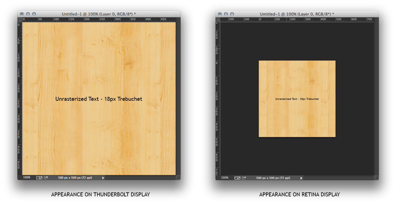
I have a Retina that I work on in tandem with a "Normal" Thunderbolt Display at the desk. When I move from the desk to view the same design in PS it changes. Here is a screenchot (downsampled for illustraion purpose only). I simply drag the Document Window from one screen to the next and as you can see, the image "shrinks" (NOT THE DOCUMENT WINDOW). I undsertand WHY for photos, but it makes no sense for web application when most of my objects in the layout will be rendered via the browser not bitmaps.

Copy link to clipboard
Copied
Because they are displaying at 100% on monitors with very different resolutions.
Copy link to clipboard
Copied
Thank you for an official Adobe response.
I fully understand that 100% zoom is one image pixel to one display pixel, but for those of us affected by this we do need something sort of mechanism to remove the effect.
In light of NathanPowell's example (who has an exasperated version of my problem) if only a zoom setting was added then the difference in scale between monitors would still occur - so I guess that's out (if that was the only update)! A checkbox preference to "Adjust window scale to compensate for displays" (plus all the magic behind the scenes) and a way to set a custom zoom multiplier would suit us both/all. But the zoom multiplier would still be a great starting point.
Copy link to clipboard
Copied
Thank you Chris!
With this understanding, the window chrome is also being displayed on monitors with different resolutions, however it appears unchanged.
We are looking for a solution whereas we design at 1 display px to 1 display px the way the window chrome behaves. This is essential for web design productivity.
Is there a solution for this in Photoshop? Is there something in the works for a future release?
Copy link to clipboard
Copied
"100%" means "show me the image pixels one for one on the display's pixels". You are supposed to choose your zoom level appropriate to your display medium, and how closely you want to look. It's as simple as that. Everything is working properly.
If you zoom to 200% (or something near it) on the Retina display, you'll be seeing your image in near the same size as on the thunderbolt display.
If you set the ppi of the document to match the ppi of the intended output device - be it print or display - the point size of the text will always be accurate.
A browser NECESSARILY must interpret the instructions in the markup language and apply math to fit the display since the pixel density of different displays is different, and users may apply different zooms.
It used to be, everyone kind of ignored the relatively small differences, but now displays are available that are hugely different in pixel density and all browsers offer zooming. The old days are not coming back.
Thus your expectations do not and will not match reality. Only one can change.
Please take the time to try to understand what those of us who understand how things work are saying. We understand you. It is you who do not understand that you must re-examine some of your own assumptions in order to move on.
-Noel
Copy link to clipboard
Copied
Then how do you account for VECTOR? Unrasterized text?
Copy link to clipboard
Copied
The document containing the vector or text data has a resolution.
100% means to show the document pixels (including the rasterized text and vectors) 1:1 as display pixels. Moving that to another display will change the physical size of the displayed image according to the other display's resolution (the same as if you moved it from a 72 dpi display to a 120 dpi display).
The window chrome is defined a bit oddly in MacOS (it would take a while to explain the OS scaling "logic"), and doesn't change size so easily.

Find more inspiration, events, and resources on the new Adobe Community
Explore Now
 AdChoices