- Home
- Photoshop ecosystem
- Discussions
- How do I make the edges sharp when filling an obje...
- How do I make the edges sharp when filling an obje...
How do I make the edges sharp when filling an object drawn with the pen tool
Copy link to clipboard
Copied
Hi!
When I draw with the pen tool I understand that its a path and vector based. When filling it I was hoping for the same sharp edge.
This is not happening, My edge is somewhat sharp but when I some in I see that there are at least two lighter colours around the edges.
How do I make it sharp?
Thanks!
/Joanna
Explore related tutorials & articles
Copy link to clipboard
Copied
Please post a screenshot including all pertinent Panels (Layers, Properties, Options Bar, …).
Did you create a Shape Layer or a Selection?
Copy link to clipboard
Copied
How far are you zoomed in ?
It sounds like the anti-aliasing which is used to maintain smoothness on edges that are not perfectly vertical/horizontal. Otherwise they would step.
View at 100% they will hardly be visible. If you transform the shape the anti aliasing will not get bigger - it will just be applied at the new shape size so should still remain all but invisible at 100% zoom.
Dave
Copy link to clipboard
Copied
For sharp fills from pen tool you need to consider if you
- have the correct resolution for your file
- desire antialiasing
- are you zoomed in too far
When you zoom in on a black fill you will the anitalising will look like this. The edge pixels opacity gets lighter to help with angles & curves to appear sharp and not stair stepped.

at a distance you do not see the tined black pixels and the angled line looks sharp

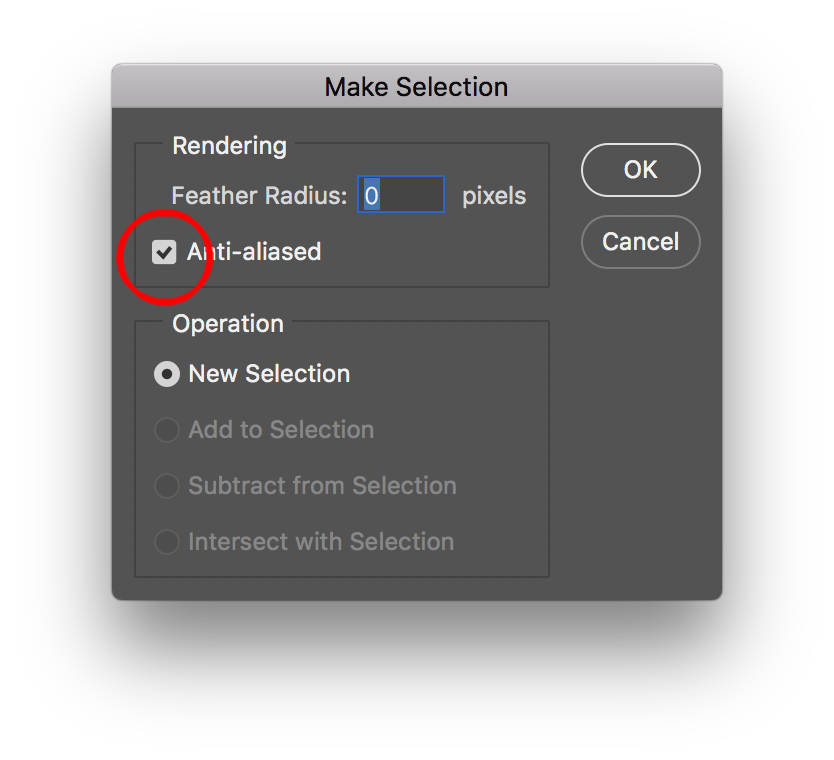
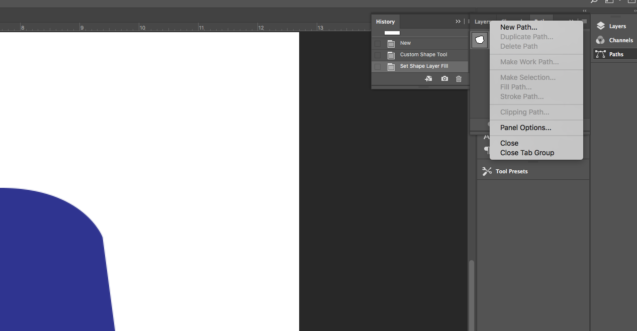
now if you prefer to turn off anti-aliasing, you can do that in the paths flyout menu >> make selection

but there are very few graphical needs where people prefer this result, so Adoerb defautl anti alising to on

So likely want to increase your file resolution using image file. Btu we would need to see a scresnshot of your artwork, and to know if you are designing for web and print and what your current resolution is.
Copy link to clipboard
Copied

Hi!
My image is 750x750 pixels with a resolution set to 150
Not sure if this is correct size in the end ? Another question worth asking....
I'm making a gif animation that should be used on Facebook and instagram.
When I use the menu from path..."make selection" is grey (?) I can't click on to it to try and turn anti alias off.
However, when 100 procent zoom it look good, so I guess I have just zoomed in too close, that is probably the answer.
Would still like to know what I do wrong tho as I can't click the make selection and also maybe what preferred file size to use when making a gif for web?
Thank you so much for quick reply, so grateful !!
//Joanna
Copy link to clipboard
Copied
Hi
Just for clarity :
You cannot turn anti-aliasing of on a shape .
You can turn off anti aliasing when making a selection from a path and then fill that selection with pixels. However that is no longer a scalable vector shape and you would need to retain the saved path and if you resize your document go through the steps of making a selection from the path and refilling.
To make the selection from the shape path you need to select the path in the paths panel.
My recommendation though is just work with the editable vector shape and ignore the anti-aliasing which at 100% will look better - particularly on slight angles - see below.
See the examples below both from the same path at 100% zoom. The top has no anti-aliasing the bottom has anti-aliasing - you decide which looks better. ![]()

Dave
Copy link to clipboard
Copied
I use it as a shape for now. Is this print screen ok?


Copy link to clipboard
Copied
The lighter colors around the edge are good as that is your anti-aliasing.
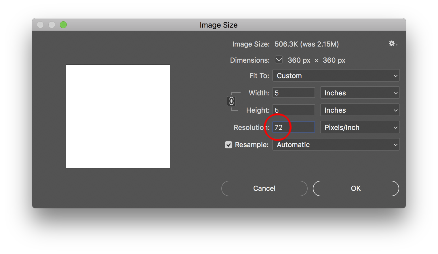
If you are designing for print then you can increase your resolution here from lets say 72 to 300 in this example. Very importantn to have the checkbox enabled for resample.

If you are going to print 300 dpi is the standard for photographic images at a 150 line screen litho printing. If what you show is your final art, you should be working in Adobe Illustraror, as that is not a photograph but a shape.
Get ready! An upgraded Adobe Community experience is coming in January.
Learn more
